Android Design Support Library 사용하기
Android Design Support Library
한국시간기준으로 2015년 5월 29일 새벽1시에 Google I/O 2015 Keynote를 발표했습니다.
Android M Preview가 발표되고, Google은 Android Design Support Library을 발표했습니다.
주된 내용은 Loolipop 발표시 Material Design을 소개하며 Design Guideline에 있는,
기존 표준 API나 Support Library API에서는 자동으로 구현되지않는 부분을 라이브러리화 한것입니다.
Spec
- Android 2.1이상
Support
- Navigation View
- Foating labels for editing text
- Floating Action Button
- Snackbar
- Tabs
- etc
Setup
compile 'com.android.support:design:22.2.0'
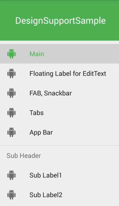
Navigation View
간단하게 소개하면, Navigation Drawer의 메뉴 Layout 입니다.
지금까지 개발자는 DrawerLayout의 메뉴 레이아웃을 RelativeLayout, ListView 등을 이용해서 커스텀하여 작업했습니다.
대신, Navigation View 는 각각의 메뉴 구조를 menu resource를 이용해서 작업합니다.
<android.support.v4.widget.DrawerLayout
	xmlns:android="http://schemas.android.com/apk/res/android"
	xmlns:app="http://schemas.android.com/apk/res-auto"
	android:layout_width="match_parent"
	android:layout_height="match_parent"
	android:fitsSystemWindows="true">

	<!-- your content layout -->

	<android.support.design.widget.NavigationView
		android:id="@+id/main_drawer_view"
		android:layout_width="wrap_content"
		android:layout_height="match_parent"
		android:layout_gravity="start"
		app:headerLayout="@layout/drawer_header"
		app:menu="@menu/main_drawer"/>

</android.support.v4.widget.DrawerLayout>
주요내용
-
headerLayout(옵션) : Drawer 상단 Header Layout
-
menu : Menu Resource를 이용하여 메뉴구성
간단한 메뉴 리스트 구성방법
- group의
checkableBehavior프로퍼티의single값을 이용해서 사용자 선택시 하나의 메뉴의 체크값만 유지하도록 지정합니다.
<group
	android:checkableBehavior="single">
	<item
		android:id="@+id/navi_group1_item0"
		android:checked="true"
		android:icon="@drawable/ic_android_black_24dp"
		android:title="Main"/>
	<item
		android:id="@+id/navi_group1_item1"
		android:icon="@drawable/ic_android_black_24dp"
		android:title="Floating Label for EditText"/>
	<!-- etc -->
</group>
Sub Menu 구성방법
- Item별 Group 메뉴의 Sub Header를 구성하는것도 가능합니다.
<item
	android:id="@+id/navigation_subheader"
	android:title="Sub Header">
	<menu>
		<item
			android:id="@+id/navigation_sub_item_1"
			android:icon="@drawable/ic_android_black_24dp"
			android:title="Sub Label1"/>
		<item
			android:id="@+id/navigation_sub_item_2"
			android:icon="@drawable/ic_android_black_24dp"
			android:title="Sub Label2"/>
	</menu>
</item>
Item Select Listener
OnNavigationItemSelectedListener을 이용하여setNavigationItemSelectedListener에 설정으로 선택시 이벤트 처리가 가능- Click된 MenuItem을 제공하고, 프로그래밍 코드로 NavigationDrawer를 닫거나 임의의 액션 처리가능
NavigationView navigationView = (NavigationView) findViewById(R.id.main_drawer_view);
navigationView.setNavigationItemSelectedListener(this);

@Override
public boolean onNavigationItemSelected(MenuItem item) {
    // Your Self
    return super.onOptionsItemSelected(item);
}
Floating labels for editing text
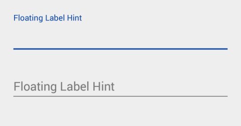
TextInputLayout 을 사용해 EditTextView 를 Wrapper하는것으로 Floating Label을 자동으로 구현해줍니다.
Floating 되는 Label 은 android:hint 에 적용된 문자열이 표시됩니다.
<android.support.design.widget.TextInputLayout
	android:layout_width="match_parent"
	android:layout_height="wrap_content"
	android:layout_marginTop="10dp">

	<android.support.v7.widget.AppCompatEditText
		android:layout_width="match_parent"
		android:layout_height="wrap_content"
		android:hint="@string/floating_hint"/>
</android.support.design.widget.TextInputLayout>
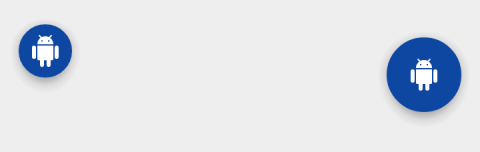
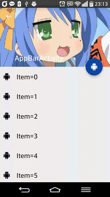
Floating Action Button
Action 버튼을 표현하기 위한 둥근원형의 버튼입니다.
- 배경색은 테마의
colorAccent값을 취득하여 표시 - 표시 아이콘은
src이나setImageDrawable등을 이용 - 미니사이즈 지원,
fabSize=mini
<android.support.design.widget.FloatingActionButton
	android:id="@+id/actionButton"
	android:layout_width="wrap_content"
	android:layout_height="wrap_content"
	android:layout_gravity="right|bottom"
	android:layout_marginTop="10dp"
	android:src="@drawable/ic_android_white_24dp"
	app:borderWidth="0dp"
	app:rippleColor="@color/color_ripple_color"/>
Shadow Problem
Floating Action Button 을 사용시 문제가 되는것을 발견했습니다.
FloatingActionButton elevation only working pre-21, not post-20!
해결방법 borderWidth="0dp" 을 적용하시면됩니다.
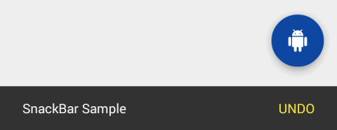
Snackbar
Snackbar 는 화면 하단에 표시되는 단일액션을 포함한 View입니다.
Snackbar
  .make(parentLayout, R.string.snackbar_text, Snackbar.LENGTH_LONG)
  .setAction(R.string.snackbar_action, myOnClickListener)
  .show(); // Don’t forget to show!
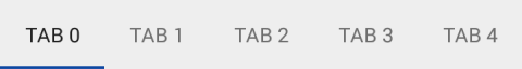
Tabs
DesignSupportLibrary 의 TabLayout 은, TAB 의 폭을 일정하게 혹은 일정하지않는 스크롤이 가능한 TAB 으로 구현가능합니다.
TabLayout tabLayout = ...;
tabLayout.addTab(tabLayout.newTab().setText("Tab 1"));
ViewPager 를 사용하는 경우, PagerAdapter의 getPageTitle()으로부터 직접 TAB 이 작성됩니다.
CoordinatorLayout 과 floating action buttons
CoordinatorLayout 의 자식 레이아웃에 Floating Action Button 을 추가하고, Snackbar.make 의 parentView 에 CoordinatorLayout 을 적용하면, SnackBar 가 애니메이션 처리될시 Floating Action Button의 위치가 CoordinatorLayout 에 의해 자동적으로 이동됩니다.
layout_anchorGravity 을 이용해서 뷰를 상대적으로 배치가능하도록 지원하며, layout_anchor 를 이용해 기준이 되는 View 를 지정할수있습입니다.
Android 3.0 이상을 지원합니다.
CoordinatorLayout and the app bar
the AppBarLayout can respond to those events by using the children’s scroll flags to control how they enter (scroll on screen) and exit (scroll off screen). Flags include:
- scroll: 스크롤할 모든뷰에 설정되어야합니다. 미사용시 화면 상단에 고정됩니다.
- enterAlways: 하단으로 스크롤시 ‘quick return’ 을 지원
- enterAlwaysCollapsed: collapsed (minHeight) 상태로 화면 상단밖으로 사라지고 다시 나타나는 형태를 지원
- exitUntilCollapsed: collapsed (minHeight) 까지 스크롤이 발생
Collapsing Toolbars
기존에 화면을 스크롤시 남은 스크롤 부분과 특정 뷰의 외관을 커스터마이징을 원하는 경우 AppBarLayout 을 사용하면, Toolbar 와 필요한 View 가 ScrollingViewBehavior 로 마킹되고, 해당 View 들은 스크롤에 반응합니다.
<android.support.design.widget.AppBarLayout
	android:layout_height="192dp"
	android:layout_width="match_parent">
	<android.support.design.widget.CollapsingToolbarLayout
		android:layout_width="match_parent"
		android:layout_height="match_parent"
		app:layout_scrollFlags="scroll|exitUntilCollapsed">
		<android.support.v7.widget.Toolbar
			android:layout_height="?attr/actionBarSize"
			android:layout_width="match_parent"
			app:layout_collapseMode="pin"/>
	</android.support.design.widget.CollapsingToolbarLayout>
</android.support.design.widget.AppBarLayout>
CollapsingToolbarLayout 의 layout_collapseMode="pin" 을 사용할 경우, 스크롤시 Toolbar 가 화면 상단에 고정되는 것을 지원합니다.
CollapsingToolbarLayout 와 Toolbar 함께 사용하는 경우 AppBarLayout 레이아웃 표시에 따라, 전체가 표시시 타이틀이 크게 표시되며, Collapsed 시 기본 사이즈로 변경됩니다.
exitUntilCollapsed

enterAlwaysCollapsed
샘플 소스
etc
Currnte Pages Tags
Android Design Support Library Navigation View Floating Action Button Snackbar Tabs
Subscribe
Subscribe to this blog via RSS.
Categories
Recent Posts
- Posted on 30 Dec 2025
- Posted on 11 Oct 2025
- Posted on 27 Aug 2025
-
[발표자료] Google I/O Extended Incheon 2025 ~ What's new in Android development tools
Posted on 16 Aug 2025