[정리] Compose 가이드 문서 ~ 터치&입력
https://developer.android.com/develop/ui/compose/touch-input
포인터 입력 ~ 개요
사용자 상호작용에서 동작을 감지하는 데 도움이 되는 API 제공
- 상위 수준 API : 일반적으로 사용되는 제스처를 처리하도록 설계(
clickableModifier를 사용하면 클릭을 쉽게 감지) - 하위 수준 API :
PointerInputScope.detectTapGestures또는 [`PointerInputScope.detectDragGestures. 추가 기능이 포함되지 않은 덜 일반적으로 사용되는 제스처 감지기
포인터 입력 ~ 제스처 이해
정의
- Pointer : 애플리케이션과 상호작용하는 데 사용할 수 있는 실제 객체(손가락/스타일러스)
- 좌표를
가리킬수 있는 장치 (키보드 X) - 포인터 유형 : PointerType
- 입력 장치는 포인터로 간주되려면 좌표를 ‘가리킬’ 수 있어야 하므로 키보드는 포인터로 간주할 수 없습니다. Compose에서는 포인터 유형이
PointerType를 사용하여 포인터 변경사항에 포함됩니다.
- 좌표를
- Pointer event : 특정 시점에 애플리케이션과 하나 이상의 포인터가 상호작용하는 하위 수준 상호작용
- 이벤트 정보 :
PointerEvent
- 이벤트 정보 :
- Gesture : 단일 작업으로 해석될 수 있는 포인터 이벤트의 시퀀스
- tap, drag, transform
다양한 수준의 추상화
Component 지원
기본 component 내부에 제스처 처리가 포함됨
예시)
- LazyColumn : 컨텐츠를 스크롤하여 드래그 동작
- Button : 눌렀을 때 Ripple 효과 표시
- SwipeToDismiss : element를 닫는 스와이프 로직이 포함
내부 제스처 처리 외에 컴포넌트에서 호출자가 제스처를 처리해야 함
- Button : 자동으로 탭을 감지하고 클릭 이벤트를 트리거. onClick 람다를 Button에 전달하여 제스처에 반응
- Slider : onValueChange 람다를 추가하여 사용자가 슬라이더 핸들을 드래그하는 것에 반응
// Talkback: "Click me!, Button, double tap to activate"
Button(onClick = { /* TODO */ }) { Text("Click me!") }
// Talkback: "Click me!, double tap to activate"
Box(Modifier.clickable { /* TODO */ }) { Text("Click me!") }
Modifier를 사용하여 임의의 Composable에 특정 제스처 추가
제스처를 처리하는 Modifier
- 탭 처리 :
clickable,combinedClickable,selectable,toggleable,triStateToggleable - 스크롤 처리 :
horizontalScroll,verticalScroll,scrollable - 드래그 처리 :
draggable,swipeable - 멀티 터치 제스처 :
transformableModifier를 사용하여 이동, 회전, 확대/축소 등
pointerInput Modifier를 사용하여 임의의 Composable에 커스텀 제스처 추가
원시 포인터 이벤트에 액세스할 수 있는 pointerInput Modifier를 사용하여 제스처 핸들러를 만들 수 있다
@Composable
private fun LogPointerEvents(filter: PointerEventType? = null) {
   var log by remember { mutableStateOf("") }
   Column {
      Text(log)
      Box(
         Modifier
            .size(100.dp)
            .background(Color.Red)
            .pointerInput(filter) {
               awaitPointerEventScope {
                  while (true) {
                     val event = awaitPointerEvent()
                     // handle pointer event
                     if (filter == null || event.type == filter) {
                        log = "${event.type}, ${event.changes.first().position}"
                     }
                  }
               }
            }
      )
   }
}
pointerInputModifier에 하나 이상의 키를 전달- 키 중 하나의 값이 변경되면 Modifier 컨텐츠 람다가 다시 실행
- (샘플) filter 값이 변경되면 이벤트가 로깅되도록 포인터 이벤트 핸들러를 다시 실행해야 함
awaitPointerEventScope: 포인터 이벤트를 기다리는 데 사용는 Coroutine Scope를 생성awaitPointerEvent: 다음 포인터 이벤트가 발생할 때까지 Coroutine을 정지
전체 제스처 감지
AwaitPointerEventScope에서 제공하는 메소드
- Press, tap, double tap, long-press :
detectTapGestures - Drag :
detectHorizontalDragGestures,detectVerticalDragGestures,detectDragGestures,detectDragGesturesAfterLongPress - Transforms :
detectTransformGestures
최상위 감지기이므로 하나의 pointerInput Modifier 내에 여러 감지기를 추가할 수 없다.
var log by remember { mutableStateOf("") }
Column {
   Text(log)
   Box(
      Modifier
         .size(100.dp)
         .background(Color.Red)
         .pointerInput(Unit) {
            detectTapGestures { log = "Tap!" }
            // 연결되지 않음
            detectDragGestures { _, _ -> log = "Dragging" }
         }
   )
}
내부적으로 코루틴을 차단하며 두 번째 감지기에는 도달하지 않는다
Composable에 제스처 리스너를 두 개 이상에 별도의 pointerInput Modifier 인스턴스 사용으로 해결
var log by remember { mutableStateOf("") }
Column {
   Text(log)
   Box(
      Modifier
         .size(100.dp)
         .background(Color.Red)
         .pointerInput(Unit) {
            detectTapGestures { log = "Tap!" }
         }
         .pointerInput(Unit) {
            // 드래그 이벤트가 올바르게 트리거 됨
            detectDragGestures { _, _ -> log = "Dragging" }
         }
   )
}
제스처당 이벤트 처리
제스처는 포인터를 아래로 내리는 이벤트로 시작
각 원시 이벤트를 통과하는 while(true) 루프 대신 awaitEachGesture helper 메서드를 사용 가능
모든 포인터가 해제되면 제스처가 완료되었음을 나타내는 awaitEachGesture 메소드가 포함된 블록을 다시 시작
@Composable
private fun SimpleClickable(onClick: () -> Unit) {
   Box(
      Modifier
         .size(100.dp)
         .pointerInput(onClick) {
            awaitEachGesture {
               awaitFirstDown().also { it.consume() }
               val up = waitForUpOrCancellation()
               if (up != null) {
                  up.consume()
                  onClick()
               }
            }
         }
   )
}
특정 이벤트 또는 하위 제스처 대기
- awaitFirstDown
- waitForUpOrCancellation
- awaitTouchSlopOrCancellation, awaitDragOrCancellation
- awaitHorizontalTouchSlopOrCancellation, awaitHorizontalDragOrCancellation, awaitVerticalTouchSlopOrCancellation, awaitVerticalDragOrCancellation
- awaitLongPressOrCancellation
- drag, horizontalDrag, verticalDrag
멀티터치 이벤트에 계산 적용
이벤트 디스패치 및 히트 테스트
모든 포인터 이벤트가 모든 pointerInput Modifier로 전송되는 것은 아니다
- 포인터 이벤트는 composable hierarchy로 전달. 새 포인터가 첫 번째 포인터 이벤트를 트리거하는 순간 시스템은 ‘적격한’ composable의 히트 테스트를 시작하며 composable은 포인터 입력 처리 기능이 있는 경우 적합한 것으로 간주
- 트리의 동일한 수준에 사용 가능한 Composable이 여러 개 있는 경우 Z-index이 가장 높은 Composable만 ‘hit’가 됨
PointerInputModifierNode구현을 만들고sharePointerInputWithSiblings를 true로 설정하여 이 제스처를 재정의 가능
- 동일한 포인터의 추가 이벤트는 동일한 composable 체인으로 전달되고 이벤트 전파 로직에 따라 흐른다. 체인에 있는 각 Composable은 포인터의 모든 이벤트를 수신하며, 체인에 없는 Composable은 포인터가 경계 내에 있는 경우에도 포인터 이벤트를 수신하지 않는다
이벤트 소비
기본 Component에 포함된 제스처와 일반 제스처 Modifier에는 이러한 소비 동작이 포함되어 있지만 고유한 커스텀 제스처를 작성하는 경우 이벤트를 수동으로 소비해야 한다. PointerInputChange.consume 메소드를 사용하여 처리.
이벤트를 소비해도 다른 Composable로 이벤트 전파는 중지되지 않는다. 대신 Composable은 소비된 이벤트를 명시적으로 무시해야 하며, 커스텀 제스처를 작성 시 이벤트가 다른 Component에 의해 이미 사용되었는지 확인해야 함
Modifier.pointerInput(Unit) {
   awaitEachGesture {
      while (true) {
         val event = awaitPointerEvent()
         if (event.changes.any { it.isConsumed }) {
            // 포인터가 다른 제스처 핸들러에 의해 소비
         } else {
            // 소비되지 않은 이벤트 처리
         }
      }
   }
}
이벤트 전파
상세 내용 : https://developer.android.com/develop/ui/compose/touch-input/pointer-input/understand-gestures#event-propagation
제스처 테스트
composeTestRule.onNodeWithTag("MyList").performTouchInput {
   swipeUp()
   swipeDown()
   click()
}
탭한 후 누르기
사용자가 Composable과 상호작용할 수 있는 방법
| Gesture | 설명 |
|---|---|
| Tap (or click) | 포인터가 아래로 이동했다가 위로 이동 |
| Double tap | 포인터가 아래, 위, 아래, 위로 이동 |
| Long-press | 포인터가 내려가고 더 오래 유지 |
| Press | 포인터가 내려감 |
탭 또는 클릭에 응답
clickable : Composable이 탭/클릭에 반응하는 Modifier
- 포커스 지원, 마우스 및 스타일러스 마우스 오버, 눌렀을 때 커스텀한 시각적 표시와 같은 추가 기능도 추가
- 마우스나 손가락뿐만 아니라 키보드 입력을 통한 클릭 또는 접근성 서비스를 사용할 때도 가장 넓은 의미에서 ‘clicks’에 응답
@Composable
private fun ImageGrid(photos: List<Photo>) {
   var activePhotoId by rememberSaveable { mutableStateOf<Int?>(null) }
   LazyVerticalGrid(columns = GridCells.Adaptive(minSize = 128.dp)) {
      items(photos, { it.id }) { photo ->
         ImageItem(
            photo,
            Modifier.clickable { activePhotoId = photo.id }
         )
      }
   }
   if (activePhotoId != null) {
      FullScreenImage(
         photo = photos.first { it.id == activePhotoId },
         onDismiss = { activePhotoId = null }
      )
   }
}
clickable Modifier의 추가 동작
interactionSource및indication: Composable을 탭할 때 Ripple 효과를 그린다- 시맨틱 정보를 설정하여 접근성 서비스에서 Component와 상호작용하도록 허용
- 포커스를 허용하고
Enter등에 상호작용하도록 하여 키보드 또는 조이스틱 상호작용을 지원 - 마우스를 가져가면 나타나는 마우스나 스타일러스에 반응하도록 Component를 만듦
Context Menu를 표시하려면 길게 누르세요.
combinedClickable : 일반 클릭 동작 외에 두 번 탭 또는 길게 누르기 동작을 추가 가능
var contextMenuPhotoId by rememberSaveable { mutableStateOf<Int?>(null) }
val haptics = LocalHapticFeedback.current
LazyVerticalGrid(columns = GridCells.Adaptive(minSize = 128.dp)) {
   items(photos, { it.id }) { photo ->
      ImageItem(
         photo,
         Modifier
            .combinedClickable(
               onClick = { activePhotoId = photo.id },
               onLongClick = {
                  haptics.performHapticFeedback(HapticFeedbackType.LongPress)
                  contextMenuPhotoId = photo.id
               },
               onLongClickLabel = stringResource(R.string.open_context_menu)
            )
      )
   }
}
if (contextMenuPhotoId != null) {
   PhotoActionsSheet(
      photo = photos.first { it.id == contextMenuPhotoId },
      onDismissSheet = { contextMenuPhotoId = null }
   )
}
scrim을 탭하여 Composable 닫기
@OptIn(ExperimentalComposeUiApi::class)
@Composable
private fun Scrim(onClose: () -> Unit, modifier: Modifier = Modifier) {
   val strClose = stringResource(R.string.close)
   Box(
      modifier
         // 포인터 입력 처리
         .pointerInput(onClose) { detectTapGestures { onClose() } }
         // 접근성 서비스 처리
         .semantics(mergeDescendants = true) {
            contentDescription = strClose
            onClick {
               onClose()
               true
            }
         }
         // 물리적 키보드 입력
         .onKeyEvent {
            if (it.key == Key.Escape) {
               onClose()
               true
            } else {
               false
            }
         }
         // scrim 그리기
         .background(Color.DarkGray.copy(alpha = 0.75f))
   )
}
확대하려면 두 번 탭하세요
pointerInput Modifier를 detectTapGestures와 함께 사용하여 탭 위치를 계산 포함할 수 있다
var zoomed by remember { mutableStateOf(false) }
var zoomOffset by remember { mutableStateOf(Offset.Zero) }
Image(
   painter = rememberAsyncImagePainter(model = photo.highResUrl),
   contentDescription = null,
   modifier = modifier
      .pointerInput(Unit) {
         detectTapGestures(
            onDoubleTap = { tapOffset ->
               zoomOffset = if (zoomed) Offset.Zero else
                  calculateOffset(tapOffset, size)
               zoomed = !zoomed
            }
         )
      }
      .graphicsLayer {
         scaleX = if (zoomed) 2f else 1f
         scaleY = if (zoomed) 2f else 1f
         translationX = zoomOffset.x
         translationY = zoomOffset.y
      }
)
Scroll
Scroll Modifier
verticalScroll/horizontalScroll Modifier는 컨텐츠의 경계가 최대 크기 제약 조건보다 클 때 스크롤할 수 있는 방법을 제공
@Composable
private fun ScrollBoxes() {
   Column(
      modifier = Modifier
         .background(Color.LightGray)
         .size(100.dp)
         .verticalScroll(rememberScrollState())
   ) {
      repeat(10) {
         Text("Item $it", modifier = Modifier.padding(2.dp))
      }
   }
}
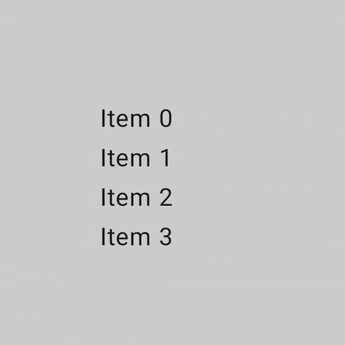
ScrollState를 사용하면 스크롤 위치를 변경하거나 현재 상태를 가져올 수 있다. 기본 값 생성은 rememberScrollState()를 사용
@Composable
private fun ScrollBoxesSmooth() {
   // 첫 번째 composition에서 100px 부드럽게 스크롤
   val state = rememberScrollState()
   LaunchedEffect(Unit) { state.animateScrollTo(100) }

   Column(
      modifier = Modifier
         .background(Color.LightGray)
         .size(100.dp)
         .padding(horizontal = 8.dp)
         .verticalScroll(state)
   ) {
      repeat(10) {
         Text("Item $it", modifier = Modifier.padding(2.dp))
      }
   }
}
Scrollable modifier
scrollable은 스크롤 동작을 감지하지만 콘텐츠를 오프셋하지 않는다.
@Composable
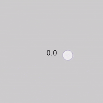
private fun ScrollableSample() {
// 실제 composable 상태
var offset by remember { mutableStateOf(0f) }
Box(
Modifier
.size(150.dp)
.scrollable(
orientation = Orientation.Vertical,
// Scrollable state : 스크롤 delta를 사용하고 오프셋을 업데이트하는 방법을 설명
state = rememberScrollableState { delta ->
offset += delta
delta
}
)
.background(Color.LightGray),
contentAlignment = Alignment.Center
) {
Text(offset.toString())
}
}
Nested scrolling
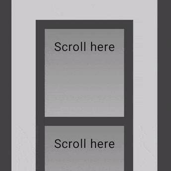
자동 nestedScroll
단순한 중첩 스크롤의 경우 아무 조치를 취하지 않아도 됨
자동 중첩 스크롤은 verticalScroll, horizontalScroll, scrollable, Lazy API 및 TextField에서 제공
사용자가 중첩된 Component의 내부 하위 Component를 스크롤하면 이전 Modifier가 중첩된 스크롤을 지원하는 상위 Component에 스크롤 델타를 전파
@Composable
private fun AutomaticNestedScroll() {
   val gradient = Brush.verticalGradient(0f to Color.Gray, 1000f to Color.White)
   Box(
      modifier = Modifier
         .background(Color.LightGray)
         .verticalScroll(rememberScrollState())
         .padding(32.dp)
   ) {
      Column {
         repeat(6) {
            Box(
               modifier = Modifier
                  .height(128.dp)
                  .verticalScroll(rememberScrollState())
            ) {
               Text(
                  "Scroll here",
                  modifier = Modifier
                     .border(12.dp, Color.DarkGray)
                     .background(brush = gradient)
                     .padding(24.dp)
                     .height(150.dp)
               )
            }
         }
      }
   }
}
nestedScroll Modifier 사용
여러 컴포넌트 간에 고급 스크롤을 만들어야 하는 경우 nestedScroll Modifier 사용하면 중첩된 스크롤 계층 구조를 정의하여 더 유연하게 만들 수 있다.
nestedScroll 주기
nestedScroll 시스템의 일부인 모든 컴포넌트(또는 노드)를 통해 계층 트리의 위아래로 전파되는 스크롤 델타의 흐름
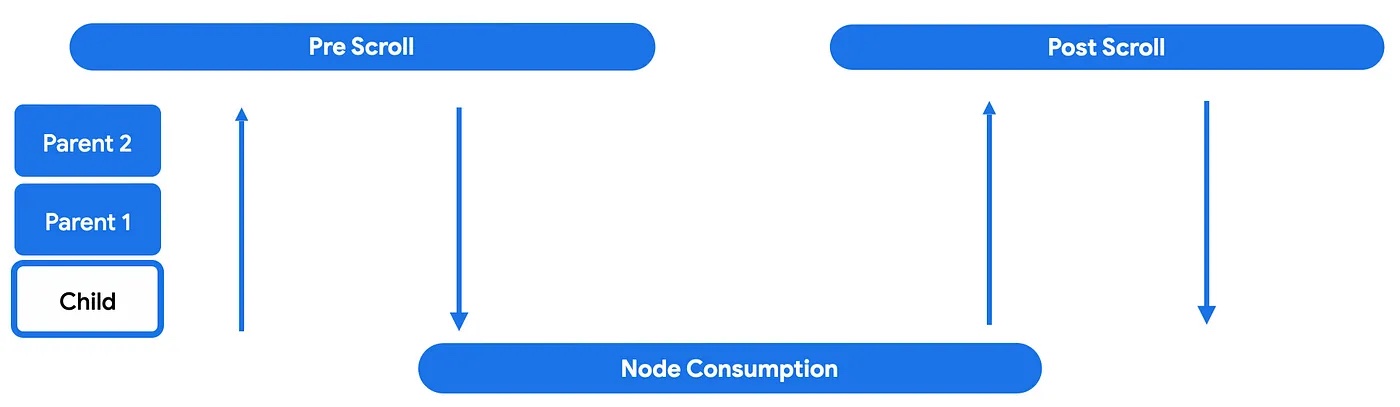
상세 내용 : https://developer.android.com/develop/ui/compose/touch-input/pointer-input/scroll#nested-scroll-phases
nestedScroll 주기 참여
val disabledNestedScrollConnection = remember {
   object : NestedScrollConnection {
      override fun onPostScroll(
         consumed: Offset,
         available: Offset,
         source: NestedScrollSource
      ): Offset {
         return if (source == NestedScrollSource.SideEffect) {
            available
         } else {
            Offset.Zero
         }
      }
   }
}
추가 샘플 : https://cs.android.com/androidx/platform/tools/dokka-devsite-plugin/+/master:testData/compose/samples/ui/samples/NestedScrollSamples.kt;l=100
nestedScroll 상호 운용성
스크롤 가능한 composables에는 nested-scroll-by-default 규칙이 있다.
- 모든 스크롤 가능한 컨테이너는 NestedScrollConnection을 통해 상위 컴포넌트로서, NestedScrollDispatcher를 통해 하위 컴포넌트로서 중첩된 스크롤 체인에 참여해야 한다
하위 ComposeView를 포함하는 협력 상위 View
협력 상위 View : 이미 NestedScrollingParent3를 구현하고 있기 때문에 중첩된 협력 하위 composable에서 스크롤 델타를 수신할 수 있는 뷰
- 예 : androidx.coordinatorlayout.widget.CoordinatorLayout
스크롤 가능한 View 상위 컨테이너와 nested scrollable 하위 composable 간에 중첩 스크롤 상호 운용성이 필요한 경우 rememberNestedScrollInteropConnection()을 사용할 수 있다. nestedScroll Modifier와 함께 사용해야 함
- rememberNestedScrollInteropConnection :
NestedScrollingParent3를 구현하는View상위 컴포넌트와 Compose 하위 컴포넌트 간의 nested scroll 상호 운용성을 지원하는NestedScrollConnection을 허용하고 기억
하위 AndroidView를 포함하는 상위 composable
rememberNestedScrollInteropConnection()을 사용하여 대응 필요
Drag, swipe, fling
draggable Modifier : 한 방향으로 드래그하는 상위 수준 진입점. 드래그 거리를 픽셀 단위로 보고
@Composable
private fun DraggableText() {
   var offsetX by remember { mutableStateOf(0f) }
   Text(
      modifier = Modifier
         .offset { IntOffset(offsetX.roundToInt(), 0) }
         .draggable(
            orientation = Orientation.Horizontal,
            state = rememberDraggableState { delta ->
               offsetX += delta
            }
         ),
      text = "Drag me!"
   )
}
전체 드래그 동작을 제어해야 하는 경우, pointerInput Modifier를 통해 detectDragGestures 사용
@Composable
private fun DraggableTextLowLevel() {
   Box(modifier = Modifier.fillMaxSize()) {
      var offsetX by remember { mutableStateOf(0f) }
      var offsetY by remember { mutableStateOf(0f) }

      Box(
         Modifier
            .offset { IntOffset(offsetX.roundToInt(), offsetY.roundToInt()) }
            .background(Color.Blue)
            .size(50.dp)
            .pointerInput(Unit) {
               detectDragGestures { change, dragAmount ->
                  change.consume()
                  offsetX += dragAmount.x
                  offsetY += dragAmount.y
               }
            }
      )
   }
}
스와이프
swipeable Modifier : 컴포넌트를 드래그하여 놓으면 한 방향으로 정의된 두 개 이상의 앵커 포인트를 향해 애니메이션이 적용
- 일반적인 용도 : ‘스와이프하여 닫기’ 패턴 구현
- 이 Modifier는 컴포넌트를 이동하지 않으며 동작만 감지
swipeableAPI는 Jetpack Compose 1.6.0-alpha01에서 Foundation의anchoredDraggableAPI로 대체
앵커에 애니메이션 처리하는 데 유용한 메소드( snapTo, animateTo, performFling) 및 드래그 진행 상태를 확인할 수 있는 속성을 제공
@OptIn(ExperimentalMaterialApi::class)
@Composable
private fun SwipeableSample() {
   val width = 96.dp
   val squareSize = 48.dp

   val swipeableState = rememberSwipeableState(0)
   val sizePx = with(LocalDensity.current) { squareSize.toPx() }
   val anchors = mapOf(0f to 0, sizePx to 1) // Maps anchor points (in px) to states

   Box(
      modifier = Modifier
         .width(width)
         .swipeable(
            state = swipeableState,
            anchors = anchors,
            thresholds = { _, _ -> FractionalThreshold(0.3f) },
            orientation = Orientation.Horizontal
         )
         .background(Color.LightGray)
   ) {
      Box(
         Modifier
            .offset { IntOffset(swipeableState.offset.value.roundToInt(), 0) }
            .size(squareSize)
            .background(Color.DarkGray)
      )
   }
}
Swipeable를 AnchoredDraggable로 마이그레이션
https://developer.android.com/develop/ui/compose/touch-input/pointer-input/migrate-swipeable
멀티터치: 화면 이동, 확대/축소, 회전
화면 이동, 확대/축소, 회전에 사용되는 멀티터치 동작을 감지하려면 transformable Modifier를 사용
자체적으로 컴포넌트를 변환하지 않으며 제스처만 감지
@Composable
private fun TransformableSample() {
   // 모든 변환 상태 설정
   var scale by remember { mutableStateOf(1f) }
   var rotation by remember { mutableStateOf(0f) }
   var offset by remember { mutableStateOf(Offset.Zero) }
   val state = rememberTransformableState { zoomChange, offsetChange, rotationChange ->
      scale *= zoomChange
      rotation += rotationChange
      offset += offsetChange
   }
   Box(
      Modifier
         // 회전과 같은 다른 변환을 적용하고, 피자 조각 이모티콘을 확대/축소
         .graphicsLayer(
            scaleX = scale,
            scaleY = scale,
            rotationZ = rotation,
            translationX = offset.x,
            translationY = offset.y
         )
         // offset 후 멀티터치 변환 이벤트를 수신하려면 transformable 항목을 추가
         .transformable(state = state)
         .background(Color.Blue)
         .fillMaxSize()
   )
}
키보드 입력 ~ 단축키 도우미
Android 7.0 (API 수준 24) 이상에서 사용 가능
https://developer.android.com/develop/ui/compose/touch-input/keyboard-input/keyboard-shortcut-helper
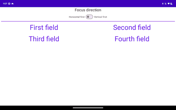
포커스 ~ 개요
기본 포커스 순회 순서
Column {
   Row {
      TextButton({ }) { Text("First field") }
      TextButton({ }) { Text("Second field") }
   }
   Row {
      TextButton({ }) { Text("Third field") }
      TextButton({ }) { Text("Fourth field") }
   }
}
포커스 ~ 포커스 순회 순서 변경
1차원 순회 순서 재정의
focusProperties Modifier를 사용하여 순회 순서를 지정할 수 있다.
val (first, second, third, fourth) = remember { FocusRequester.createRefs() }

Column {
   Row {
      TextButton(
         {},
         Modifier
            .focusRequester(first)
            .focusProperties { next = second }
      ) {
         Text("First field")
      }
      TextButton(
         {},
         Modifier
            .focusRequester(third)
            .focusProperties { next = fourth }
      ) {
         Text("Third field")
      }
   }

   Row {
      TextButton(
         {},
         Modifier
            .focusRequester(second)
            .focusProperties { next = third }
      ) {
         Text("Second field")
      }
      TextButton(
         {},
         Modifier
            .focusRequester(fourth)
            .focusProperties { next = first }
      ) {
         Text("Fourth field")
      }
   }
}
2차원 순회 순서 재정의
각 컴포넌트에 대해 focusProperties Modifier를 추가하여 특정 방향에 대한 경로를 재정의할 수 있다.
TextButton(
   onClick = {},
   modifier = Modifier
      .focusRequester(fourth)
      .focusProperties {
         down = third
         right = second
      }
) {}
포커스 ~ 포커스 동작 변경
포커스 그룹을 통해 일관된 탐색 제공
Composable 그룹이 포커스를 받는 것이 중요한 상황에서는 focusGroup() Modifier가 있는 상위 컴포넌트에서 Composable를 래핑
LazyVerticalGrid(columns = GridCells.Fixed(4)) {
   item(span = { GridItemSpan(maxLineSpan) }) {
      Row(modifier = Modifier.focusGroup()) {
         FilterChipA()
         FilterChipB()
         FilterChipC()
      }
   }
   items(chocolates) {
      SweetsCard(sweets = it)
   }
}
Composable을 포커스 가능하게 만들기
버튼이나 clickable Modifier가 사용된 Composable은 포커스를 가질 수 있다.
Composable에 focusable 동작을 추가하려면 focusable Modifier를 사용
var color by remember { mutableStateOf(Green) }
Box(
   Modifier
      .background(color)
      .onFocusChanged { color = if (it.isFocused) Blue else Green }
      .focusable()
) {
   Text("Focusable 1")
}
Composable을 포커스 불가능하게 만들기
canFocus property를 사용하여 Composable를 포커스를 제외할 수 있다.
var checked by remember { mutableStateOf(false) }

Switch(
    checked = checked,
    onCheckedChange = { checked = it },
    // 포커스를 맞출 수 없게 하지만, 터치/클릭 이벤트에 응답하는 것을 막지 않는다.
    modifier = Modifier
        .focusProperties { canFocus = false }
)
FocusRequester를 사용하여 키보드 포커스 요청
포커스를 명시적으로 요청 가능
- 가장 먼저
FocusRequester객체를 키보드 포커스를 이동하려는 Composable과 연결 - 다음으로
Modifier.focusRequesterModifier를 설정 - FocusRequester의 requestFocus메서드를 호출하여 실제 포커스 요청
Composable컨텍스트 외부에서 호출해야 함. 그렇지 않으면 Recomposition할 때마다 다시 실행
val focusRequester = remember { FocusRequester() }
var text by remember { mutableStateOf("") }

TextField(
   value = text,
   onValueChange = { text = it },
   modifier = Modifier.focusRequester(focusRequester)
)

Button(onClick = { focusRequester.requestFocus() }) {
   Text("Request focus on TextField")
}
캡처 및 포커스 해제
captureFocus() : 포커스를 캡처. 이미 포커스가 설정된 경우에만 포커스를 캡처 가능
freeFocus() : 포커스 해제
val textField = FocusRequester()

TextField(
   value = text,
   onValueChange = {
      text = it

      if (it.length > 3) {
         textField.captureFocus()
      } else {
         textField.freeFocus()
      }
   },
   modifier = Modifier.focusRequester(textField)
)
포커스 Modifier의 우선순위
Modifier
   .focusProperties { right = item1 }
   .focusProperties { right = item2 } // <-- 동작하지않음
   .focusable()
Entry/Exit 포커스 Redirect
방향 키에 따른 동작 수정
val otherComposable = remember { FocusRequester() }

Modifier.focusProperties {
   exit = { focusDirection ->
      when (focusDirection) {
         Right -> Cancel
         Down -> otherComposable
         else -> Default
      }
   }
}
포커스 검색이 탐색 중인 레벨을 벗어나면 Exit, 그렇지 않으면 Entry이다
포커스 진행 방향 변경
다음 항목으로 또는 정확한 방향으로 포커스를 이동하려면 onPreviewKey Modifier를 활용
LocalFocusManager를 사용하여 moveFocus Modifier를 사용하여 포커스를 진행
val focusManager = LocalFocusManager.current
var text by remember { mutableStateOf("") }

TextField(
   value = text,
   onValueChange = { text = it },
   modifier = Modifier.onPreviewKeyEvent {
      when {
         // tab 키 누름이 감지되면 포커스가 포커스 목록의 다음 컴포넌트로 이동
         KeyEventType.KeyUp == it.type && Key.Tab == it.key -> {
            focusManager.moveFocus(FocusDirection.Next)
            true
         }

         else -> false
      }
   }
)
포커스 ~ 포커스에 반응
더 쉬운 초점 시각화를 위한 시각적 신호 제공
remember는 Recomposition 간에 테두리 색상을 저장하는 데 사용되며, 컴포넌트의 윤곽선은 포커스를 얻거나 잃을 때마다 업데이트
var color by remember { mutableStateOf(Color.White) }
Card(
   modifier = Modifier
      .onFocusChanged {
         color = if (it.isFocused) Red else White
      }
      .border(5.dp, color)
) {}
고급 시각적 신호 구현
IndicationInstance/Indication를 통해서 가능
private class MyHighlightIndicationInstance(isEnabledState: State<Boolean>) :
   IndicationInstance {
   private val isEnabled by isEnabledState
   override fun ContentDrawScope.drawIndication() {
      drawContent()
      if (isEnabled) {
         drawRect(size = size, color = Color.White, alpha = 0.2f)
      }
   }
}

class MyHighlightIndication : Indication {
   @Composable
   override fun rememberUpdatedInstance(interactionSource: InteractionSource):
      IndicationInstance {
      val isFocusedState = interactionSource.collectIsFocusedAsState()
      return remember(interactionSource) {
         MyHighlightIndicationInstance(isEnabledState = isFocusedState)
      }
   }
}

val highlightIndication = remember { MyHighlightIndication() }
var interactionSource = remember { MutableInteractionSource() }

Card(
   modifier = Modifier
      .clickable(
         interactionSource = interactionSource,
         indication = highlightIndication,
         enabled = true,
         onClick = { }
      )
) {}
포커스 상태 이해
- isFocused : Modifier가 연결된 Composable에 포커스가 있다면 true
- hasFocus : isFocused와 유사. 항목만 확인하는 대신 컴포넌트 또는 그 하위 컴포넌트 중 하나에 포커스가 있는지 확인
- isCaptured : 포커스가 홀드될 때마다 true를 반환
Modifier.onFocusChanged {
   val isFocused = it.isFocused
   val hasFocus = it.hasFocus
   val isCaptured= it.isCaptured
}
포커스 ~ 사용자 상호작용
Interactions
Modifier.clickable을 통해 사용자가 버튼을 클릭했는지 확인 가능
사용자가 UI 컴포넌트와 상호작용하면 시스템은 Interaction 이벤트를 생성하여 동작을 표현
PressInteraction.Press: 버튼을 터치PressInteraction.Release: 버튼 내에서 손가락을 떼면 클릭이 완료되었음을 생성PressInteraction.Cancel: 버튼을 누른 것이 취소되었고 완료되지 않았음
Interaction 상태
상호작용을 추적하는 간단한 방법은 Interaction 상태를 관찰하는 것
- collectIsPressedAsState
- collectIsFocusedAsState
- collectIsDraggedAsState
- collectIsHoveredAsState
val interactionSource = remember { MutableInteractionSource() }
val isPressed by interactionSource.collectIsPressedAsState()

Button(
   onClick = { /* do something */ },
   interactionSource = interactionSource
) {
   Text(if (isPressed) "Pressed!" else "Not pressed")
}
Interaction 사용 및 내보내기
InteractionSource는 Interactions의 읽기 전용 스트림
Interaction를 방출하려면 InteractionSource에서 확장되는 MutableInteractionSource를 사용해야 함
// 소비자 Modifier
fun Modifier.focusBorder(interactionSource: InteractionSource): Modifier {
   // ...
}

// 생산자 Modifier
fun Modifier.hover(interactionSource: MutableInteractionSource, enabled: Boolean): Modifier {
   // ...
}
자체 인터랙티브 상위 수준 컴포넌트를 만드는 경우 MutableInteractionSource를 파라미터로 노출하는 것을 추천
- 상태 호이스팅 권장사항을 따르는 것 외에도 다른 종류의 상태 (예: enabled 상태)를 읽고 제어할 수 있는 것과 동일한 방식으로 컴포넌트의 시각적 상태를 쉽게 읽고 제어할 수 있다.
// This InteractionSource will emit hover and focus interactions
val interactionSource = remember { MutableInteractionSource() }

Box(
   Modifier
      .size(100.dp)
      .hoverable(interactionSource = interactionSource)
      .focusable(interactionSource = interactionSource),
   contentAlignment = Alignment.Center
) {
   Text("Hello!")
}
Modifier.clickable는 hoverable 및 focusable보다 훨씬 높은 수준의 추상화
- Modifier.clickable를 사용하면 하위 수준의 API를 결합하지 않고도 마우스 hover, focus, press interactions을 처리하는 컴포넌트를 만들 수 있다
// InteractionSource는 hover, focus, press 인터랙션을 방출
val interactionSource = remember { MutableInteractionSource() }
Box(
   Modifier
      .size(100.dp)
      .clickable(
         onClick = {},
         interactionSource = interactionSource,

         // ripple 효과 표시
         indication = ripple()
      ),
   contentAlignment = Alignment.Center
) {
   Text("Hello!")
}
InteractionSource 사용
상호작용을 추가/삭제가 가능
- 예: 사용자가 컴포넌트에서 손가락을 떼는 경우
val interactionSource = remember { MutableInteractionSource() }
val interactions = remember { mutableStateListOf<Interaction>() }

LaunchedEffect(interactionSource) {
   interactionSource.interactions.collect { interaction ->
      when (interaction) {
         is PressInteraction.Press -> {
            interactions.add(interaction)
         }
         is PressInteraction.Release -> {
            interactions.remove(interaction.press)
         }
         is PressInteraction.Cancel -> {
            interactions.remove(interaction.press)
         }
         is DragInteraction.Start -> {
            interactions.add(interaction)
         }
         is DragInteraction.Stop -> {
            interactions.remove(interaction.start)
         }
         is DragInteraction.Cancel -> {
            interactions.remove(interaction.start)
         }
      }
   }
}
컴포넌트를 누르고 있는지 또는 드래그하고 있는지 알려면 interactions가 비어 있는지만 확인하면 됨
val isPressedOrDragged = interactions.isNotEmpty()
가장 최근 상호작용이 무엇인지 알고 싶다면 목록의 마지막 항목을 보면 됨
val lastInteraction = when (interactions.lastOrNull()) {
   is DragInteraction.Start -> "Dragged"
   is PressInteraction.Press -> "Pressed"
   else -> "No state"
}
같은 프레임 내에서 누르기가 시작되고 끝나면 텍스트가 ‘Pressed!’로 표시되지 않는다.
val interactionSource = remember { MutableInteractionSource() }
val isPressed by interactionSource.collectIsPressedAsState()

Button(onClick = { /* do something */ }, interactionSource = interactionSource) {
   Text(if (isPressed) "Pressed!" else "Not pressed")
}
https://developer.android.com/develop/ui/compose/touch-input/user-interactions/handling-interactions#replace-effect

https://developer.android.com/develop/ui/compose/touch-input/user-interactions/handling-interactions#build-advanced
포커스 ~ 상호작용 > 드래그 앤 드롭
Drag and Drop을 지원하는 Modifier
dragAndDropSource: Drag 동작의 시작점으로 Composable을 지정dragAndDropTarget: Drop 데이터를 허용하는 Composable을 지정
드래그 이벤트 시작
dragAndDropSource Modifier는 포인터 입력 이벤트를 수신할 때까지 대기한 후 이벤트 핸들러에 전달된 람다를 실행
startTransfer(): 드래그 앤 드롭 세션을 시작- DragAndDropTransferData를 사용하여 전송 가능한 데이터를 정의
Modifier.dragAndDropSource {
   detectTapGestures(onLongPress = {
      // 데이터를 전송
      startTransfer(
         DragAndDropTransferData(
            ClipData.newPlainText(
               "image Url", url
            )
         )
      )
   })
}
드롭 데이터 수신
Composable이 드래그 앤 드롭 이벤트를 수신할 수 있도록 Composable dragAndDropTarget Modifier를 할당
val callback = remember {
   object : DragAndDropTarget {
      override fun onDrop(event: DragAndDropEvent): Boolean {
         // 이벤트가 소비되면 true를 반환
         return true
      }
   }
}

Modifier.dragAndDropTarget(
   shouldStartDragAndDrop = { event ->
      // 필터 역할을 하며 Modifier가 허용할 수 있는 데이터 종류를 지정
      event.mimeTypes().contains(ClipDescription.MIMETYPE_TEXT_PLAIN)
   }, target = callback
)
드래그 앤 드롭 이벤트 처리
object : DragAndDropTarget {
   override fun onStarted(event: DragAndDropEvent) {
      // When the drag event starts
   }

   override fun onEntered(event: DragAndDropEvent) {
      // When the dragged object enters the target surface
   }

   override fun onEnded(event: DragAndDropEvent) {
      // When the drag event stops
   }

   override fun onExited(event: DragAndDropEvent) {
      // When the dragged object exits the target surface
   }

   override fun onDrop(event: DragAndDropEvent): Boolean = true
}
Subscribe
Subscribe to this blog via RSS.
Categories
Recent Posts
- Posted on 15 Mar 2026
- Posted on 10 Mar 2026
- Posted on 30 Dec 2025
- Posted on 11 Oct 2025