[정리] Compose 가이드 문서 ~ Text and typography
https://developer.android.com/develop/ui/compose/text
Compose 텍스트 처리
| 기본 | Material 고수준 | |
|---|---|---|
| 텍스트 | BasicText | Text |
| 텍스트 입력 | BasicTextField | TextField |
텍스트 표시 및 스타일 지정
Display text
@Composable
fun SimpleText() {
   // 기본 텍스트
   Text("Hello World")
   // Resource에서 가져오기
   Text(stringResource(R.string.hello_world))
}
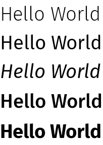
Style text
@Composable
fun BlueText() {
   // 색상
   Text("Hello World", color = Color.Blue)
   // 크기
   Text("Hello World", fontSize = 30.sp)
   // 스타일
   Text("Hello World", fontStyle = FontStyle.Italic)
   // Bold 및 굵기
   Text("Hello World", fontWeight = FontWeight.Bold)
}
그림자 처리
TextStyle을 사용하여 대응
- TextStyle 파라미터 : color, fontSize, fontFamily, fontWeight, fontStyle, letterSpacing, background, textDecoration
@Composable
fun TextShadow() {
   val offset = Offset(5.0f, 10.0f)
   Text(
      text = "Hello world!",
      style = TextStyle(
         fontSize = 24.sp,
         shadow = Shadow(
            color = Color.Blue, offset = offset, blurRadius = 3f
         )
      )
   )
}
텍스트에 여러 스타일 추가
AnnotatedString을 사용하여 여러 스타일을 설정 가능
- Text
- SpanStyleRange : 텍스트 스타일 (SpanStyle)
- ParagraphStyleRange : 정렬/방향/줄간격/텍스트 들여 쓰기 등 스타일 (ParagraphStyle)
buildAnnotatedString DSL을 사용해서도 쉽게 사용
@Composable
fun MultipleStylesInText() {
   Text(
      buildAnnotatedString {
         withStyle(style = SpanStyle(color = Color.Blue)) {
            append("H")
         }
         append("ello ")
         withStyle(style = SpanStyle(fontWeight = FontWeight.Bold, color = Color.Red)) {
            append("W")
         }
         append("orld")
      }
   )
}

Brush로 고급 스타일링
Brush API를 TextStyle 및 SpanStyle와 함께 사용
TextStyle의 Brush API는 Experimental API
TextStyle에 Brush 사용하여 표현 가능
val gradientColors = listOf(Cyan, LightBlue, Purple /*...*/)

Text(
   text = text,
   style = TextStyle(
      brush = Brush.linearGradient(
         colors = gradientColors
      )
   )
)

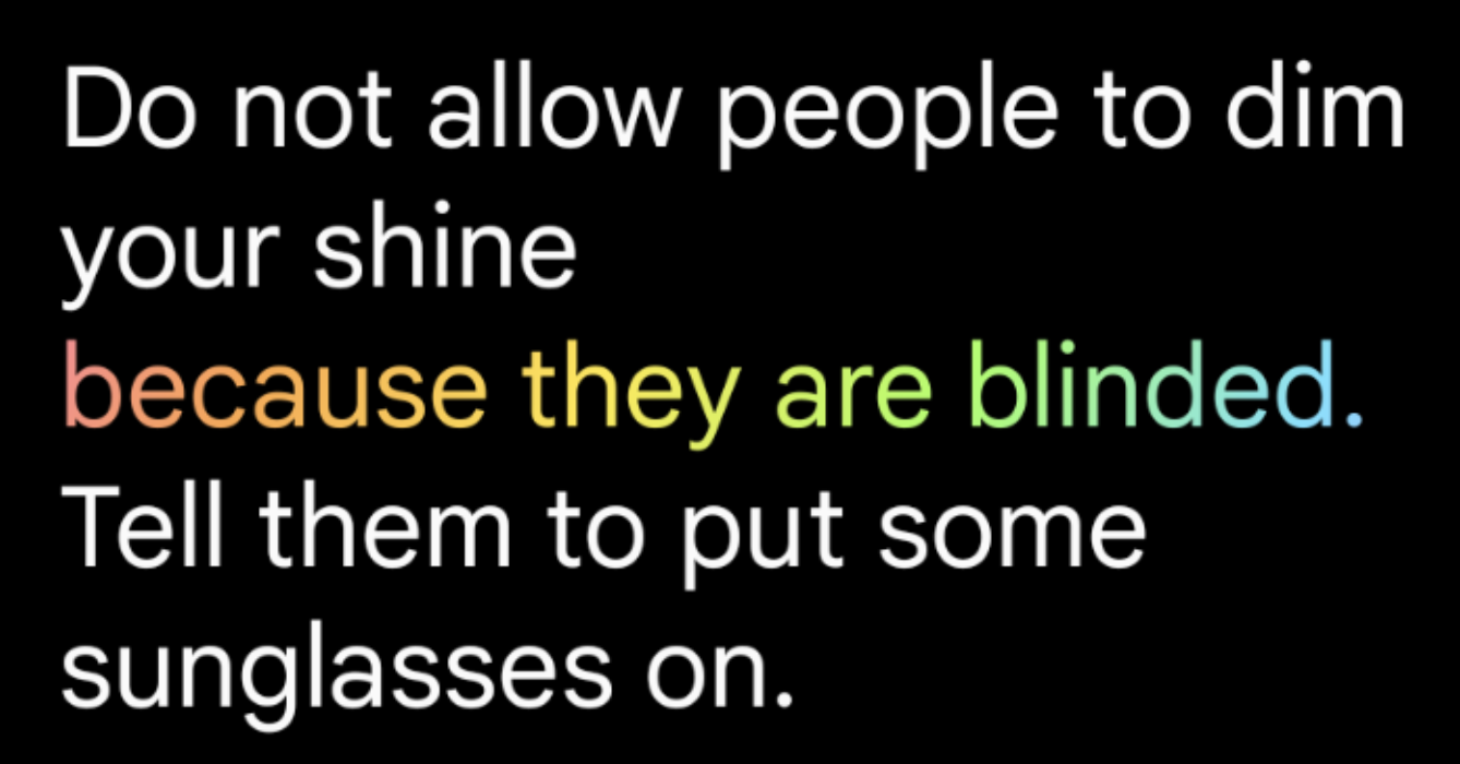
SpanStyle을 사용한 스타일 추가
- buildAnnotatedString와 SpanStyle을 사용하여 부분 적용
Text(
   text = buildAnnotatedString {
      append("Do not allow people to dim your shine\n")
      withStyle(
         SpanStyle(
            brush = Brush.linearGradient(
               colors = rainbowColors
            )
         )
      ) {
         append("because they are blinded.")
      }
      append("\nTell them to put some sunglasses on.")
   }
)
Text에 marquee 효과 적용
- basicMarquee Modifier
@OptIn(ExperimentalFoundationApi::class)
@Composable
fun BasicMarqueeSample() {
   // Marquee는 컨테츠가 최대 너비에 맞지 않는 경우에만 애니메이션이 적용
   Column(Modifier.width(400.dp)) {
      Text(
         "Learn about why it's great to use Jetpack Compose",
         modifier = Modifier.basicMarquee(),
         fontSize = 50.sp
      )
   }
}
Style paragraph
텍스트 정렬
Text의 textAlign 파라미터를 사용해서 텍스트의 가로 정렬 가능
- TextAlign.Left/TextAlign.Right 대신
TextAlign.Start/TextAlign.End을 권장
@Composable
fun CenterText() {
   Text(
      "Hello World", textAlign = TextAlign.Center, modifier = Modifier.width(150.dp)
   )
}
단락에 여러 스타일 추가
단락에 여러 스타일을 추가하려면 AnnotatedString에서 ParagraphStyle를 사용
@Composable
fun ParagraphStyle() {
   Text(
      buildAnnotatedString {
         withStyle(style = ParagraphStyle(lineHeight = 30.sp)) {
            withStyle(style = SpanStyle(color = Color.Blue)) {
               append("Hello\n")
            }
            withStyle(
               style = SpanStyle(
                  fontWeight = FontWeight.Bold, color = Color.Red
               )
            ) {
               append("World\n")
            }
            append("Compose")
         }
      }
   )
}
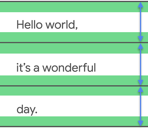
줄 높이 (line height) 및 패딩 조정
includeFontPadding : 텍스트의 첫 번째 줄 상단과 마지막 줄 하단에 글꼴 메트릭에 따라 추가 패딩을 추가하는 레거시 속성
- Compose BOM 버전 2024.01.01부터 기본적으로 false로 설정
lineHeight : 각 텍스트 줄의 높이를 설정
- 정밀도를 높이려면 ‘sp’(조정된 픽셀) 대신 텍스트 단위 ‘em’(상대 글꼴 크기)을 사용
Text(
   text = text,
   style = LocalTextStyle.current.merge(
      TextStyle(
         lineHeight = 2.5.em,
         platformStyle = PlatformTextStyle(
            includeFontPadding = false
         ),
         lineHeightStyle = LineHeightStyle(
            alignment = LineHeightStyle.Alignment.Center,
            trim = LineHeightStyle.Trim.None
         )
      )
   )
)
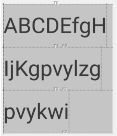
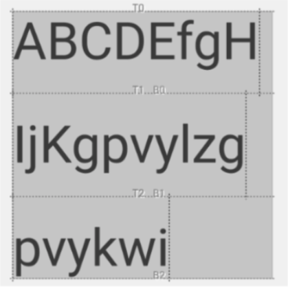
LineHeightStyle 실험용 API로 텍스트의 가운데 배치를 조정 가능
- LineHeightStyle.Alignment : Line의 공간에서 정렬 방법(Bottom/Center/Top/Proportional)
- LineHeightStyle.Trim : 첫 줄 상단과 마지막 줄 하단에 추가되는 공백을 다듬을지 여부를 정의
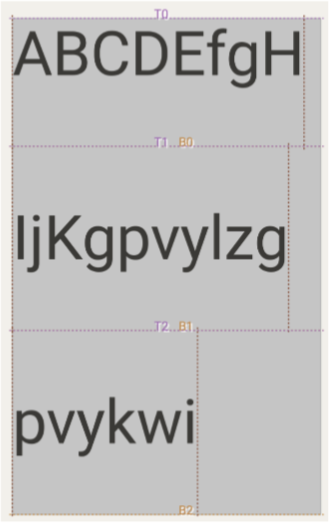
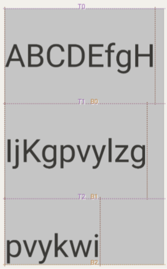
| LineHeightStyle.Trim.None | LineHeightStyle.Trim.Both |
|---|---|
 |
 |
| LineHeightStyle.Trim.FirstLineTop | LineHeightStyle.Trim.LastLineBottom |
 |
 |
Trim API는 includeFontPadding = false에서만 동작할 수 있다
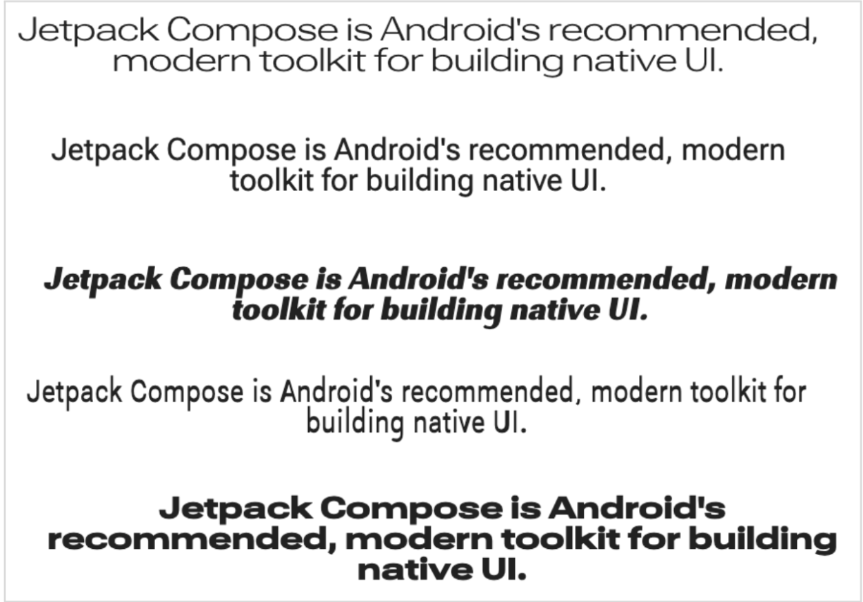
줄바꿈 처리
LineBreak : 텍스트를 여러 줄로 분할하는 기준 정의
- Simple : 빠르고 기본적인 줄 바꿈 텍스트 입력란에 권장
- Heading : (더 느슨한 규칙) 제목과 같은 짧은 텍스트에 권장
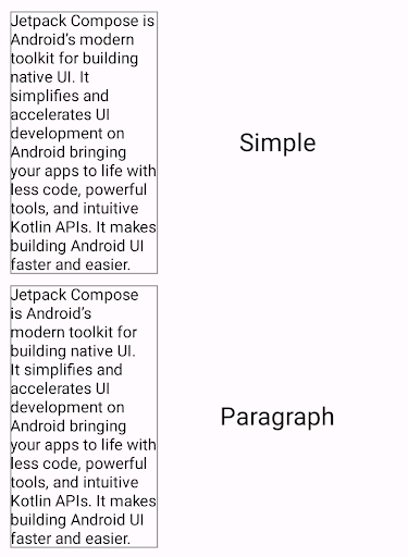
- Paragraph : (더 느린 고품질 규칙) 가독성을 개선. 단락과 같이 대량의 텍스트에 권장
TextSample(
   samples = mapOf(
      "Paragraph" to {
         Text(
            text = SAMPLE_LONG_TEXT,
            modifier = Modifier
               .width(130.dp)
               .border(BorderStroke(1.dp, Color.Gray)),
            fontSize = 14.sp,
            style = TextStyle.Default.copy(
               lineBreak = LineBreak.Paragraph
            )
         )
      }
   )
)
커스텀 줄 바꿈
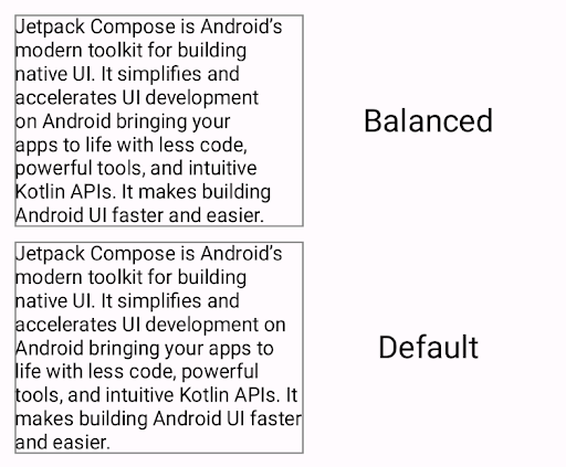
- Balanced : 텍스트의 행 길이의 균형을 조정하려고 시도하며 하이픈도 적용
- HighQuality : 하이픈 연결을 포함하여 더 읽기 쉬운 텍스트를 위해 최적화
- Simple: 기본적이고 빠른 전략. 한 줄에 들어가지 않는 단어에만 하이픈이 연결
TextSample(
   samples = mapOf(
      "Balanced" to {
         val smallScreenAdaptedParagraph =
            LineBreak.Paragraph.copy(strategy = LineBreak.Strategy.Balanced)
         Text(
            text = SAMPLE_LONG_TEXT,
            modifier = Modifier
               .width(200.dp)
               .border(BorderStroke(1.dp, Color.Gray)),
            fontSize = 14.sp,
            style = TextStyle.Default.copy(
               lineBreak = smallScreenAdaptedParagraph
            )
         )
      }
   )
)
CJK 언어용
Strictness/WordBreak API로 설정 가능
- Strictness : 줄바꿈 강도 (Default, Loose, Normal, Strict)
- WordBreak : 단어 내 줄바꿈 (Default, Phrase)
하이픈 텍스트 처리
Hyphens API로 설정 (None, Auto)
텍스트 레이아웃 구성
@Composable
fun LongText() {
   // 최대 라인
   Text("hello ".repeat(50), maxLines = 2)
   // 텍스트 오버플로 표시
   Text("Hello Compose ".repeat(50), maxLines = 2, overflow = TextOverflow.Ellipsis)
}
사용자 입력 처리
TextField 구현
사용자 텍스트 입력 구현
- TextField : 머티리얼 디자인의 구현.
- OutlinedTextField : Outlined 스타일 버전
- BasicTextField : 하드웨어/소프트웨어 키보드를 통해 텍스트를 수정 가능. Hint/Placeholder는 미제공
@Composable
fun SimpleFilledTextFieldSample() {
   var text by remember { mutableStateOf("Hello") }

   TextField(
      value = text,
      onValueChange = { text = it },
      label = { Text("Label") }
   )
}
TextField 스타일 처리
유용한 파라미터
- singleLine
- maxLines
- textStyle
Brush API로 스타일 처리
Brush API를 사용하여 고급 스타일을 지정 가능
Brush API 사용은 실험용 상태
TextStyle를 사용하여 Gradient 구현
var text by remember { mutableStateOf("") }
val brush = remember {
   Brush.linearGradient(
      colors = rainbowColors
   )
}
TextField(
   value = text, onValueChange = { text = it }, textStyle = TextStyle(brush = brush)
)

새로 입력할 때마다 TextField 상태가 변경될 때 recomposition에서 brush를 유지하려면 remember를 사용해야 함
키보드 옵션 설정
지원하는 키보드 옵션 KeyboardOptions
- capitalization : 자동으로 대문자로 사용할지 여부
- autoCorrect : 키보드에 자동 수정을 사용할지 여부
- keyboardType
- imeAction
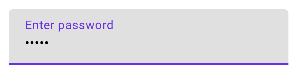
입력 형식
VisualTransformation를 사용하여 시각적 출력을 변경
@Composable
fun PasswordTextField() {
   var password by rememberSaveable { mutableStateOf("") }

   TextField(
      value = password,
      onValueChange = { password = it },
      label = { Text("Enter password") },
      visualTransformation = PasswordVisualTransformation(),
      keyboardOptions = KeyboardOptions(keyboardType = KeyboardType.Password)
   )
}
입력 지우기
onValueChange에서 전달된 텍스트를 사용하여 변환 로직을 작성 가능
@Composable
fun NoLeadingZeroes() {
   var input by rememberSaveable { mutableStateOf("") }
   TextField(
      value = input,
      onValueChange = { newText ->
         // 텍스트 앞에 "0" 문자를 제거
         input = newText.trimStart { it == '0' }
      }
   )
}
상태 관련 모범 사례
- MutableState를 사용하여 TextField 상태 표현
- StateFlow과 같은 스트림을 사용하면 비동기 지연이 발생 가능함
- 상태 업데이트로 지연 방지 : onValueChange 사용 시 TextField를 동기식으로 즉시 업데이트
// SignUpViewModel.kt
class SignUpViewModel(private val userRepository: UserRepository) : ViewModel() {
   var username by mutableStateOf("")
      private set

   fun updateUsername(input: String) {
      username = input
   }
}

// SignUpScreen.kt
@Composable
fun SignUpScreen(/*...*/) {
   OutlinedTextField(
      value = viewModel.username,
      onValueChange = { username -> viewModel.updateUsername(username) }
      /*...*/
   )
}
- 상태 정의 위치 : 입력시 TextField 상태에 비즈니스 로직 검증이 필요한 경우, 상태를 ViewModel로 호이스팅하는 것을 추천
사용자 상호 작용 설정
텍스트 선택
기본적으로 Composable은 선택 가능하지 않다.
SelectionContainer로 래핑 해야 함
@Composable
fun SelectableText() {
   SelectionContainer {
      Text("This text is selectable")
   }
}
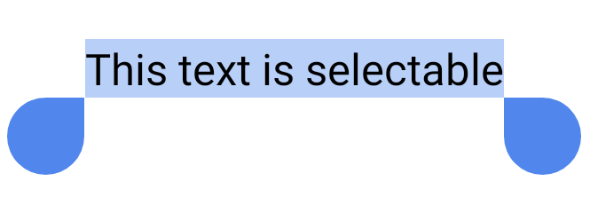
특정 영역을 선택 불가능하게 하려면 DisableSelection Composable로 래핑
텍스트 클릭 위치 확인
Text Composable내에서 클릭한 위치를 가져오기 : ClickableText를 사용
@Composable
fun SimpleClickableText() {
   ClickableText(text = AnnotatedString("Click Me"), onClick = { offset ->
      Log.d("ClickableText", "$offset -th character is clicked.")
   })
}
buildAnnotatedString의 경우
@Composable
fun AnnotatedClickableText() {
   val annotatedText = buildAnnotatedString {
      append("Click ")

      // pop() 호출될 때까지 컨텐츠에 이 URL annotation을 추가
      pushStringAnnotation(
         tag = "URL", annotation = "https://developer.android.com"
      )
      withStyle(
         style = SpanStyle(
            color = Color.Blue, fontWeight = FontWeight.Bold
         )
      ) {
         append("here")
      }

      pop()
   }

   ClickableText(text = annotatedText, onClick = { offset ->
      // 클릭한 위치의 텍스트에 URL annotation이 있는지 확인
      annotatedText.getStringAnnotations(
         tag = "URL", start = offset, end = offset
      ).firstOrNull()?.let { annotation ->
         Log.d("Clicked URL", annotation.item)
      }
   })
}
폰트 작업
폰트 설정
기본으로 제공하는 FontFamily 폰트 사용
@Composable
fun DifferentFonts() {
   Column {
      Text("Hello World", fontFamily = FontFamily.Serif)
      Text("Hello World", fontFamily = FontFamily.SansSerif)
   }
}
res/font에 정의된 폰트 사용
val firaSansFamily = FontFamily(
   Font(R.font.firasans_regular, FontWeight.Normal),
   Font(R.font.firasans_italic, FontWeight.Normal, FontStyle.Italic),
   Font(R.font.firasans_bold, FontWeight.Bold),
   ...
)

Column {
   Text(text = "text", fontFamily = firaSansFamily, fontWeight = FontWeight.Normal)
   Text(
      text = "text",
      fontFamily = firaSansFamily,
      fontWeight = FontWeight.Normal,
      fontStyle = FontStyle.Italic
   )
   Text(text = "text", fontFamily = firaSansFamily, fontWeight = FontWeight.Bold)
}
다운로드 가능한 폰트
Compose 1.2.0 지원
사용자 정의 공급자가 제공하는 다운로드 가능한 폰트는 현재 미지원
https://developer.android.com/develop/ui/compose/text/fonts
import androidx.compose.ui.text.googlefonts.GoogleFont
import androidx.compose.ui.text.font.FontFamily
import androidx.compose.ui.text.googlefonts.Font

val provider = GoogleFont.Provider(
   providerAuthority = "com.google.android.gms.fonts",
   providerPackage = "com.google.android.gms",
   certificates = R.array.com_google_android_gms_fonts_certs
)

val fontName = GoogleFont("Lobster Two")

val fontFamily = FontFamily(
   Font(googleFont = fontName, fontProvider = provider)
)
가변 폰트 (variable fonts)
가변 폰트 Android O 이상에서만 지원됩니다.
https://developer.android.com/develop/ui/compose/text/fonts#variable-fonts
// In Typography.kt
@OptIn(ExperimentalTextApi::class)
val displayLargeFontFamily =
   FontFamily(
      Font(
         R.font.robotoflex_variable,
         variationSettings = FontVariation.Settings(
            FontVariation.weight(950),
            FontVariation.width(30f),
            FontVariation.slant(-6f),
         )
      )
   )
이모티콘 표시
Compose UI 1.4에서는 API 21까지 이전 Android 버전과의 호환성을 포함하여 최신 그림 이모티콘 버전을 지원
Text, TextField, BasicText, BasicTextField에서 모두 지원함
상호 운용성
ComponentActivity에서 사용
Emoji2 라이브러리를 추가한 후 EmojiTextView를 사용
<androidx.emoji2.widget.EmojiTextView
   android:id="@+id/emoji_text_view"
   android:layout_width="match_parent"
   android:layout_height="wrap_content" />
AppCompatActivity에서 사용
-
TextView를 그대로 사용
-
ComposeView 내에서 AndroidViewBinding를 사용하는 View binding을 통해 구현
class MyActivity : AppCompatActivity() {
   override fun onCreate(savedInstanceState: Bundle?) {
      super.onCreate(savedInstanceState)

      setContentView(
         ComposeView(this).apply {
            setContent {
               Column {
                  Text(EMOJI_TEXT)

                  AndroidViewBinding(ExampleViewBinding::inflate) {
                     emojiTextView.text = EMOJI_TEXT
                  }
               }
            }
         }
      )
   }
}
- ComposeView내에서 AndroidView를 사용하는 경우, AppCompatTextView를 사용
class MyActivity : AppCompatActivity() {

   override fun onCreate(savedInstanceState: Bundle?) {
      super.onCreate(savedInstanceState)

      setContentView(
         ComposeView(this).apply {
            setContent {
               Column {
                  Text(EMOJI_TEXT)

                  AndroidView(
                     factory = { context -> AppCompatTextView(context) },
                     update = { it.text = EMOJI_TEXT }
                  )
               }
            }
         }
      )
   }
}
Subscribe
Subscribe to this blog via RSS.
Categories
Recent Posts
- Posted on 19 Apr 2026
- Posted on 15 Mar 2026
- Posted on 10 Mar 2026
- Posted on 30 Dec 2025