Android CustomView Style의 숨은 그림자
CustomView 작업 시 XML 상에서 다양한 값을 View에 전달하기 위해서 declare-styleable를 많이 사용합니다.
본 글에서는 맞춤 속성 정의시에 발생할 수 있는 실수와 이론에 대해서 언급합니다
사전 조건
- Android Studio 4.1 beta5
- viewBinding 사용
기본) 맞춤 속성 (declare-styleable) 사용하기
맞춤 속성 정의 시 가장 먼저 할 일은 <declare-styleable> 리소스를 추가하는 것입니다.
<!-- attrs_my_view.xml -->
<resources>
    <declare-styleable name="MyViewStyleable">
        <attr name="customText" format="string" />
        <attr name="customTextColor" format="color" />
        <attr name="customTextColorHint" format="color" />
    </declare-styleable>
</resources>
위 예제에서는 MyViewStyleable라는 스타일 지정 가능한 정의에 3가지의 값을 입력받을 수 있도록 선언했습니다.
- customText : String Type
- customTextColor : Color Type
- customTextColorHint : Color Type
declare-styleable 리소스로 MyViewStyleable 스타일 맞춤 속성을 정의를 했다면, 다음은 CustomView에서 정의한 속성을 사용할 차례입니다.
class MyView @JvmOverloads constructor(
    context: Context,
    attrs: AttributeSet?,
    defStyleAttr: Int = 0
) : LinearLayout(context, attrs, defStyleAttr) {
    private val binding = LayoutMyViewBinding.inflate(LayoutInflater.from(context), this)

    init {
        // Load attributes
        val a = context.obtainStyledAttributes(attrs, R.styleable.MyViewStyleable)
        // customText로 정의한 문자열 혹은 Default 문자열
        val customText = a.getString(R.styleable.MyViewStyleable_customText) ?: "Default"
        // customTextColor로 정의한 색상 혹은 #FF1DE9B6 컬러
        val customTextColor로 = a.getColor(R.styleable.MyViewStyleable_customTextColor, 0xFF1DE9B6.toInt())
        // customTextColor로 정의한 색상 혹은 #FFFF0000 컬러
        val customTextColorHint = a.getColor(R.styleable.MyViewStyleable_customTextColorHint, 0xFFFF0000.toInt())
        a.recycle()

        binding.title1.text = customText
        binding.title1.setTextColor(customTextColor로)
        binding.title1.setHintTextColor(customTextColorHint)
    }
}
TypedArray 사용 샘플
MyViewStyleable 스타일에 정의한 속성은 기본 필수 값이 아닙니다. 그래서 위 코드에서는 미 입력 시의 기본값으로 처리도 포함되어 있습니다.
- customText : 재정의한 값 혹은 “Default”
- customTextColor : 재정의한 컬러 혹은 청록색의 기본 컬러 (#1DE9B6)
- customTextColorHint : 재정의한 컬러 혹은 붉은색의 기본 컬러 (#FF0000)
예시로 작성한 MyView는 아래와 같은 레이아웃으로 구성되어 있습니다.
<merge  ...
    tools:parentTag="android.widget.LinearLayout">
    <TextView
        android:id="@+id/title1"
        ... />
</merge>
LinearLayout 레이아웃에 1개의 TextView를 가지고 있습니다.
<com.pluu.resourcestacksample.MyView
    app:customText="..."
    app:customTextColor="..."
    app:customTextColorHint="..."
    ... />
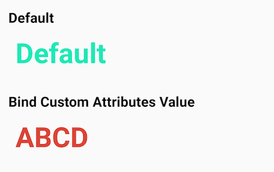
간단하게 CustomView를 사용해서 declare-styleable 사용한 모습은 아래와 같습니다. 기본 CustomView와 텍스트와 컬러를 모습입니다.
그림자 편) MyViewStyleable 스타일 맞춤 속성 업데이트
만약 여러분이 CustomView의 스타일 속성을 수정하게 되었습니다. CustomView이지만 TextView 혹은 EditText와 동일한 attribute 이름으로 호출하고 싶을 수도 있습니다. 그럴 경우 아래와 같이 속성 정의를 수정할 수 있습니다.
<!-- 수정 전 -->
<resources>
    <declare-styleable name="MyViewStyleable">
        <attr name="customText" format="string" />
        <attr name="customTextColor" format="color" />
      	<attr name="customTextColorHint" format="color" />
    </declare-styleable>
</resources>

<!-- 수정 후 -->
<resources>
    <declare-styleable name="MyViewStyleable">
        <attr name="android:text" />
        <attr name="android:textColor" />
        <attr name="android:textColorHint" />
    </declare-styleable>
</resources>
MyView CustomView 또한 EditText를 추가한 형태로 수정합니다.
<merge ...
    tools:parentTag="android.widget.LinearLayout">

    <TextView
        android:id="@+id/title1"
        ... />

    <EditText
        android:id="@+id/edit1"
        android:hint="Hint1"
        ... />

    <EditText
        android:id="@+id/edit2"
        android:hint="Hint2"
        ... />
</merge>
추가된 EditText edit1/edit2를 위한 CustomView 코드도 수정합니다.
// Load attributes
val a = context.obtainStyledAttributes(attrs, R.styleable.MyViewStyleable)

// android:text 로 재정의한 문자열 혹은 Default 문자열
val customText = a.getString(R.styleable.MyViewStyleable_android_text) ?: "Default"
// android:textColor 로 재정의한 색상 혹은 #FF1DE9B6 컬러
val customTextColor = a.getColor(R.styleable.MyViewStyleable_android_textColor, 0xFF1DE9B6.toInt())
// android:textColorHint로 정의한 색상 혹은 #FF1DE9B6 컬러
val customTextColorHint = a.getColor(R.styleable.MyViewStyleable_android_textColorHint, 0xFFFF0000.toInt())

a.recycle()

binding.title1.text = customText
binding.title1.setTextColor(customTextColor)
binding.title1.setHintTextColor(customTextColorHint)

binding.edit1.setText(customText)
binding.edit1.setTextColor(customTextColor)
binding.edit1.setHintTextColor(customTextColorHint)

binding.edit2.setTextColor(customTextColor)
binding.edit2.setHintTextColor(customTextColorHint)
declare-styleable, CustomView 코드의 일부 코드를 수정한 결과를 살펴보겠습니다.
Preview 결과
<com.pluu.resourcestacksample.MyView
    android:layout_width="match_parent"
    android:layout_height="wrap_content" />
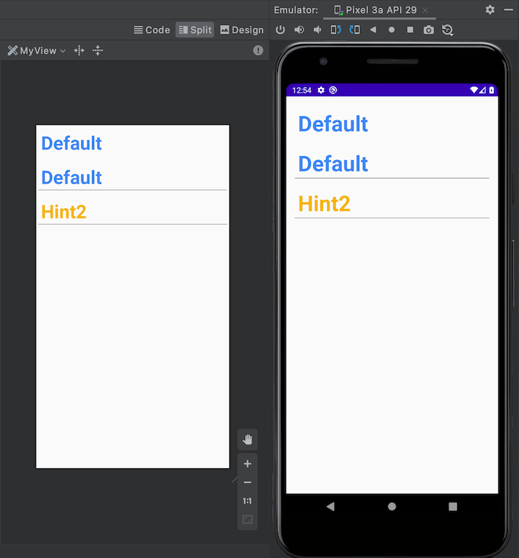
레이아웃에 CustomView를 추가하면 아래와 같은 결과를 볼 수 있습니다.
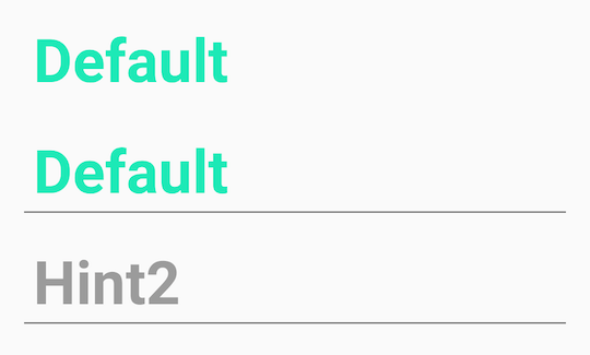
위 Preview 결과를 보고 이상한 점을 느끼셨나요?
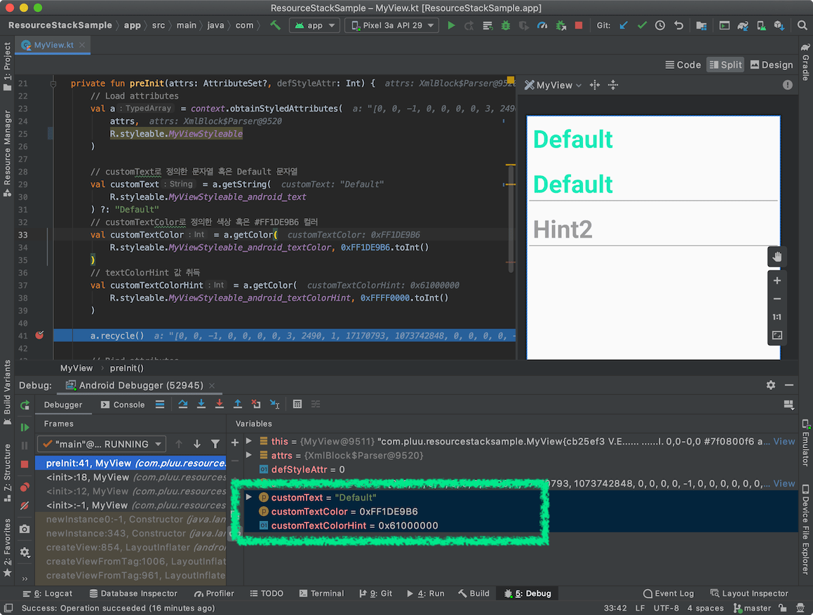
MyView CustomView 코드에서 값에서 TypedArray를 통해서 값을 취득 시에 존재하지 않는 경우 기본값 정의를 했던 것을 기억하실 겁니다.
- customText : 재정의한 값(android:text) 혹은 “Default”
- customTextColor : 재정의한 컬러(android:textColor) 혹은 청록색의 기본 컬러 (#1DE9B6)
- customTextColorHint : 재정의한 컬러(android:textColorHint) 혹은 붉은색의 기본 컬러 (#FF0000)
여기에서 customTextColorHint에 해당하는 android:textColorHint로 전달한 값이 없을 때 기본 컬러인 붉은색 (#FF0000) 사용되지 않았습니다.
이 현상에 대한 상세한 체크는 이후에서 확인해보겠습니다.
android:textColorHint 데이터 추적
android namespace로 이름 변경했을 때 값이 의도한 것과 다르게 들어오는 것을 확인할 수 있습니다.
처음 확인할 항목은 Context#obtainStyledAttributes입니다.
obtainStyledAttributes
obtainStyledAttributes 함수는 Context의 Theme에서 Style로 지정한 속성 정보 리스트를 가져오는 역할을 합니다.
public final TypedArray obtainStyledAttributes (AttributeSet set, int[] attrs)
public final TypedArray obtainStyledAttributes (AttributeSet set, int[] attrs, int defStyleAttr, int defStyleRes)
public final TypedArray obtainStyledAttributes (int resid, int[] attrs)
public final TypedArray obtainStyledAttributes (int[] attrs)
출처
public abstract class Context {
    @NonNull
    public final TypedArray obtainStyledAttributes(@StyleRes int resid,
            @NonNull @StyleableRes int[] attrs) throws Resources.NotFoundException {
        return getTheme().obtainStyledAttributes(resid, attrs);
    }

    /**
     * Return the Theme object associated with this Context.
     */
    @ViewDebug.ExportedProperty(deepExport = true)
    public abstract Resources.Theme getTheme();
}
출처 : https://android.googlesource.com/platform/frameworks/base/+/refs/heads/master/core/java/android/content/Context.java#754
Context#obtainStyledAttributes 내부 코드를 확인했을 때 getTheme() 함수를 통해 취득된 테마로부터 TypedArray 정보를 가져옵니다. 많은 경우에 CutomView에서 접근하는 Context는 Activity이며, Context의 Theme는 Activity에서 참조하는 Theme입니다.
val customTextColorHint = a.getColor(R.styleable.MyViewStyleable_android_textColorHint, ...)
TypedArray
ContextTheme를 통해 생성된 TypedArray 인스턴스에서 android_textColorHint 접근 시의 동작 내부 동작을 살펴보겠습니다.
public class TypedArray {
    @ColorInt
    public int getColor(@StyleableRes int index, @ColorInt int defValue) {
        if (mRecycled) {
            throw new RuntimeException("Cannot make calls to a recycled instance!");
        }
        final int attrIndex = index;
        index *= STYLE_NUM_ENTRIES;
        final int[] data = mData;
        final int type = data[index + STYLE_TYPE];
        if (type == TypedValue.TYPE_NULL) {
            return defValue;
        } else if (type >= TypedValue.TYPE_FIRST_INT
                && type <= TypedValue.TYPE_LAST_INT) {
            return data[index + STYLE_DATA];
        } else if (type == TypedValue.TYPE_STRING) {
            final TypedValue value = mValue;
            if (getValueAt(index, value)) {
                final ColorStateList csl = mResources.loadColorStateList(
                        value, value.resourceId, mTheme);
                return csl.getDefaultColor();
            }
            return defValue;
        } else if (type == TypedValue.TYPE_ATTRIBUTE) {
            final TypedValue value = mValue;
            getValueAt(index, value);
            throw new UnsupportedOperationException(
                    "Failed to resolve attribute at index " + attrIndex + ": " + value);
        }
        throw new UnsupportedOperationException("Can't convert value at index " + attrIndex
                + " to color: type=0x" + Integer.toHexString(type));
    }
}
출처 : https://android.googlesource.com/platform/frameworks/base/+/refs/heads/master/core/java/android/content/res/TypedArray.java#502
R.styleable.MyViewStyleable_android_textColorHint를 Index 정보로 Style에 포함된 타입 정보를 얻습니다. 그 후, 타입에 따라서 Color를 가져옵니다. 이 케이스에서는 TypedValue.TYPE_STRING 타입입니다.
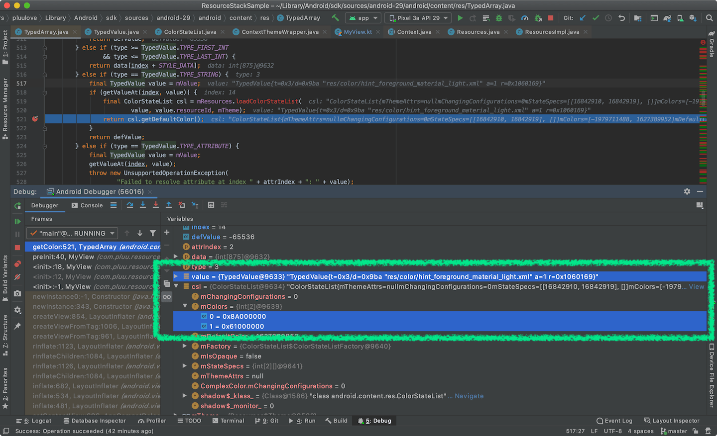
좀 더 디버깅을 하면 R.styleable.MyViewStyleable_android_textColorHint가 접근해서 가져오는 리소스 정보를 확인할 수 있습니다.
- Reousrce ID : res/color/hint_foreground_material_light.xml
- hint_foreground_material_light 내부의 컬러 정보는 아래와 같습니다.
<selector xmlns:android="http://schemas.android.com/apk/res/android">
    <item android:state_enabled="true"
          android:state_pressed="true"
          android:alpha="@dimen/hint_pressed_alpha_material_light"
          android:color="@color/foreground_material_light" />
    <item android:alpha="@dimen/hint_alpha_material_light"
          android:color="@color/foreground_material_light" />
</selector>
출처 : https://android.googlesource.com/platform/frameworks/base/+/master/core/res/res/color/hint_foreground_material_light.xml
- foreground_material_light : https://android.googlesource.com/platform/frameworks/base/+/master/core/res/res/values/colors_material.xml#20
- hint_alpha_material_light : https://android.googlesource.com/platform/frameworks/base/+/master/core/res/res/values/colors_material.xml#69
- hint_pressed_alpha_material_light : https://android.googlesource.com/platform/frameworks/base/+/master/core/res/res/values/colors_material.xml#72
위 속성 정보를 통해서 ColorStateList의 값을 계산을 해볼 수 있습니다.
- Default Color : #000000 + 0.38 (0x61)
- Pressed Color : #000000 + 0.54 (0x8A)
android:textColorHint에 hint_foreground_material_light를 정의하는 곳
<!-- Material theme (light version). -->
<resources>
    <style name="Theme.Material.Light" parent="Theme.Light">
    	...
      	<item name="textColorHint">@color/hint_foreground_material_light</item>
      	...
		</style>
</resources>
출처 : https://android.googlesource.com/platform/frameworks/base/+/master/core/res/res/values/themes_material.xml#446
Android 10 (API Level 29)에서 테스트했기 때문에 AppCompat 테마이지만, Material 테마를 사용합니다. Theme 내부에 textColorHint의 컬러 값이 사전 정의되어 있습니다.
문제 해결 방법
1. android namespace를 미사용
숨겨진 android 기본 속성이 Custom View에도 영향을 준다는 것을 이전 내용에서 확인했습니다. Theme와 영향을 낮춘 상태라면 안전하게 CustomView만을 위한 속성 정의를 선택할 수 있습니다. 그렇기에 android namespace를 사용하지 않을 수도 있습니다.
<!-- attrs_my_view.xml -->
<resources>
    <declare-styleable name="MyViewStyleable">
        <attr name="text" format="string" />
        <attr name="textColor" format="color" />
        <attr name="textColorHint" format="color" />
    </declare-styleable>
</resources>

<!-- styles_my_view.xml -->
<style name="MyViewDefaultStyle">
    <item name="textColor">#0F9D58</item>
    <item name="textColorHint">#4285F4</item>
</style>
맞춤 속성과 Style을 수정했으므로 CustomView 코드에서 styleable를 통해 값을 가져오는 부분도 수정합니다.
// customText로 정의한 문자열 혹은 Default 문자열
val customText = a.getString(R.styleable.MyViewStyleable_text) ?: "Default"
// customTextColor로 정의한 색상 혹은 #FF1DE9B6 컬러
val customTextColor = a.getColor(R.styleable.MyViewStyleable_textColor, 0xFF1DE9B6.toInt())
// textColorHint 값 취득
val customTextColorHint = a.getColor(R.styleable.MyViewStyleable_textColorHint, 0xFFFF0000.toInt())
)
android namespace를 사용했을 때의 textColorHint 문제가 수정되었습니다.
| android namespace | non namespace |
|---|---|
|
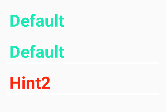 |
2-1. Theme에 영향을 받는 Attribute
여기에서는 Theme에 명시적으로 속성을 정의하는 방법입니다. 먼저, AndroidManifest.xml에서 참조하는 Theme에 android:textColor / android:textColorHint 컬러 정보를 추가합니다.
- android:textColor : #4285F4
- android:textColorHint : #F4B400
<resources xmlns:tools="http://schemas.android.com/tools">
    <style name="BaseTheme" parent="Theme.AppCompat.Light.NoActionBar">
        <item name="android:textColor">#4285F4</item>
        <item name="android:textColorHint">#F4B400</item>
        ...
    </style>
</resources>
Theme 정보로 위의 정보를 사용했다면 아래와 같이 재정의하지 않아도 CustomView에서 사용하는 Theme 정보를 참조하는 Context#obtainStyledAttributes를 정보 값으로 전달됩니다.
<com.pluu.resourcestacksample.MyView
    android:layout_width="match_parent"
    android:layout_height="wrap_content" />
기존과 같이 추가적인 속성을 재정의하지 않고 Custom View를 노출합니다.
이 경우에는 Theme에서 지정한 textColor / textColorHint의 컬러 값이 사용되었습니다. Theme에서 지정한 attribute 가 CustomView에서도 접근 가능해서 위와 같이 노출됩니다.
Theme와 동일한 컬러로 처리하고 싶은 경우에는 android namespace로 정의로 하는 것이 올바르지만, 그렇지 않다면 android namespace 처리는 조심히 다뤄야 하는 항목입니다.
2-2. (개선 - 해결법 2) Theme에 영향을 받는 기본 Style Attribute
이전까지는 Theme에 영향을 받지만 전역적으로 사용되는 android:textColor 속성에 직접적으로 CustomView도 영향을 받습니다. 이 경우 모든 CustomView를 사용하는 곳에서 명시적으로 Attribute 정보 혹은 Style 지정을 하는 방법도 존재합니다. 그러나, 기본 Style을 신경쓰는 것은 매우 반복적이며 누락하기 쉬운 작업이기도 합니다. 게다가 Theme마다 다르게 적용해야할 경우 또한 배제할 수 없습니다.
<!-- 기본 스타일을 사용하는 곳마다 지정한 예시 -->
<!-- Sample1.activity -->
<com.pluu.resourcestacksample.MyView
    style="@style/default1"
    android:layout_width="match_parent"
    android:layout_height="wrap_content" />

<com.pluu.resourcestacksample.MyView
    style="@style/default1"
    android:layout_width="match_parent"
    android:layout_height="wrap_content" />

<!-- Sample2.activity -->
<com.pluu.resourcestacksample.MyView
    style="@style/default2"
    android:layout_width="match_parent"
    android:layout_height="wrap_content" />
여기에서는 Theme에 영향을 받는 항목을 좀 더 개선해보겠습니다.
가장 먼저 정의해야 할 것은 Theme에서 Custom Style을 정의하는 것입니다. 맞춤 속성과 동일하게 declare-styleable로 정의하며 format을 refrence로 정의합니다.
<!-- attrs_my_view.xml -->
<resources ...>
    <declare-styleable name="MyViewStyle">
        <attr name="myViewStyle" format="reference" />
    </declare-styleable>
</resources>
다음으로 declare-styleable에서 정의한 myViewStyle 속성에 적용할 기본 스타일을 작성합니다.
- android:textColor : #0F9D58
- android:textColorHint : #4285F4
<!-- styles_my_view.xml -->
<resources ...>
    <style name="MyViewDefaultStyle">
        <item name="android:textColor">#0F9D58</item>
        <item name="android:textColorHint">#4285F4</item>
    </style>
</resources>
Theme에서는 정의한 myViewStyle 속성과 Theme에서 사용할 Style을 아래와 같이 작성합니다.
<!-- themes.xml -->
<resources ...>
    <style name="BaseTheme" parent="...">
        <item name="myViewStyle">@style/MyViewDefaultStyle</item>
    </style>
</resources>
마지막으로 CutomView에 기본 Style Attribute 및 Style을 정의합니다.
class MyView @JvmOverloads constructor(
    context: Context,
    attrs: AttributeSet?,
    defStyleAttr: Int = R.attr.myViewStyle // ◀ Theme에서 참조하려는 Style 속성
) : LinearLayout(context, attrs, defStyleAttr) {
    ...
    init {
        val a = context.obtainStyledAttributes(
          attrs,
          R.styleable.MyViewStyleable,
          defStyleAttr,
          R.style.MyViewDefaultStyle // ◀ 기본 Style 지정
        )
        ...
        a.recycle()
    }
}
MyView에서 수정해야 할 작업은 다음과 같습니다.
- 생성자의 3번째 파라미터인 defStyleAttr 값으로
R.attr.myViewStyle을 전달 - context#obtainStyledAttributes의 4번째 파라미터의 defStyleRes 값으로
R.style.MyViewDefaultStyle전달
이것으로 CustomView에 Theme와 기본 스타일 처리에 대한 가변적으로 대응할 수 있습니다.
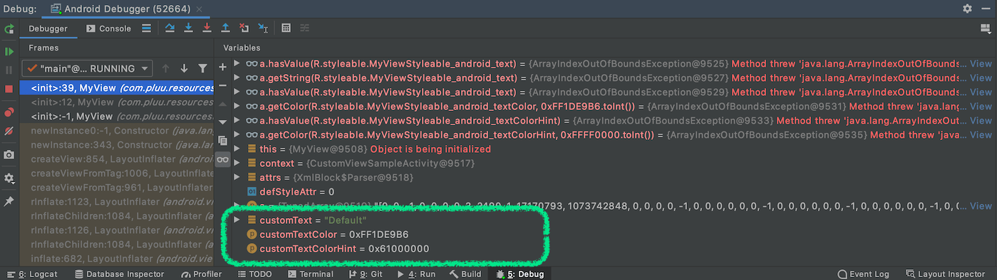
android namespace 사용 시 디버깅의 아쉬움
🚧🚧🚧 해당 부분에 오류가 있을 수 있습니다 🚧🚧🚧
android namespace를 declare-styleable에 정의한 후 코드에서 디버깅으로 확인하고 싶은 경우, TypedArray의 일부 기능이 올바르게 동작하지 않습니다.
Debug로 직접 TypedArray의 내용을 호출할 경우에 java.lang.ArrayIndexOutOfBoundsException로 노출되고 있습니다.
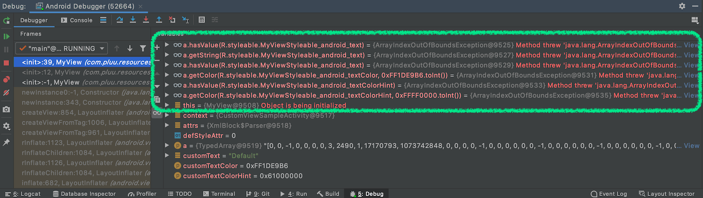
하지만, 별도 변수로 취득한 이후의 코드를 확인할 경우 올바르게 값이 들어가 있는 것을 볼 수 있습니다. 다만, 여기에서도 android:textColorHint에 해당하는 정보는 기본 컬러인 붉은색 (#FF0000) 사용되지 않았습니다.
- customText : 재정의한 값 혹은 “Default”
- customTextColor : 재정의한 컬러 혹은 청록색의 기본 컬러 (#1DE9B6)
- customTextColorHint : 재정의한 컬러 혹은 붉은색의 기본 컬러 (#FF0000)
참고 자료
- 맞춤 속성 정의 : https://developer.android.com/training/custom-views/create-view#customattr
- Developing Themes with Style (Android Dev Summit ‘19) : https://www.youtube.com/watch?v=Owkf8DhAOSo
Subscribe
Subscribe to this blog via RSS.
Categories
Recent Posts
- Posted on 08 Jun 2026
- Posted on 19 Apr 2026
- Posted on 15 Mar 2026
- Posted on 10 Mar 2026