[정리] Compose 가이드 문서 ~ Images and graphics
https://developer.android.com/develop/ui/compose/graphics
Images
Loading images
디스크에서 이미지 로드
- painterresource API를 사용하여 PNG, JPEG, WEBP, 벡터 리소스를 로드 가능
- painterResource에서 제공하는 타입
- AnimatedVectorDrawable
- BitmapDrawable (PNG, JPG, WEBP)
- ColorDrawable
- VectorDrawable
- painterResource에서 제공하는 타입
- 저수준의 비트맵 처리에 ImageBitmap 사용
Image(
   painter = painterResource(id = R.drawable.dog),
   contentDescription = stringResource(id = R.string.dog_content_description)
)
인터넷에서 이미지 로드
예시, Coil 라이브러리 사용
AsyncImage(
   model = "https://example.com/image.jpg",
   contentDescription = "Translated description of what the image contains"
)
ImageBitmap vs ImageVector
ImageBitmap
레스터 이미지
Compose에서 레스터 이미지(비트맵)를 ImageBitmap에 로드하여, BitmapPainter가 Bitmap을 그리는 작업을 담당
간단한 이미지인 경우
Image(
   painter = painterResource(id = R.drawable.dog),
   contentDescription = stringResource(id = R.string.dog_content_description)
)
커스텀 및 ImageBitmap에 접근이 필요한 경우
val imageBitmap = ImageBitmap.imageResource(R.drawable.dog)
ImageVector
벡터 이미지
VectorPainter는 ImageVector를 화면에 그리는 작업을 담당
Image(
   painter = painterResource(id = R.drawable.baseline_shopping_cart_24),
   contentDescription = stringResource(id = R.string.shopping_cart_content_desc)
)
커스텀 및 ImageVector에 접근이 필요한 경우
val imageVector = ImageVector.vectorResource(id = R.drawable.baseline_shopping_cart_24)
Material icons
Icon을 사용하려면 Compose Material/Compose Material 3 라이브러리를 사용
- 기본 색상 : LocalContentColor.current
- 기본 크기 : 24.dp
- 작은 아이콘 요소를 위한 객체로, 추가 커스텀이 필요하면 Image Composable을 사용해야 함
Icon(
   painter = painterResource(R.drawable.baseline_directions_bus_24),
   contentDescription = stringResource(id = R.string.bus_content_description)
)

// 미리 정의된 아이콘 세트 사용
Icon(
    Icons.Rounded.ShoppingCart,
    contentDescription = stringResource(id = R.string.shopping_cart_content_desc)
)
이미지 커스텀
Content scale
ContentScale 종류
- ContentScale.Fit (기본) : 종횡비를 유지. 크기보다 작은 경우 이미지는 경계에 맞게 확대
- ContentScale.Crop
- ContentScale.FillHeight : 종횡비를 유지. 높이가 일치하도록 조정
- ContentScale.FillWidth : 종횡비를 유지. 넓이가 일치하도록 조정
- ContentScale.FillBounds : 대상 Bounds에 맞게 높이/넓이를 채움
- ContentScale.Inside : 종횡비를 유지
- 대상 Bounds보다 큰 경우는 경계에 맞춰서 조정
- 대상 Bounds보다 작은 경우 ContentScale.None과 동일
- ContentScale.None : 스케일링 처리 미대응
val imageModifier = Modifier
   .size(150.dp)
   .border(BorderStroke(1.dp, Color.Black))
   .background(Color.Yellow)
Image(
   painter = painterResource(id = R.drawable.dog),
   contentDescription = stringResource(id = R.string.dog_content_description),
   contentScale = ContentScale.Fit,
   modifier = imageModifier
)
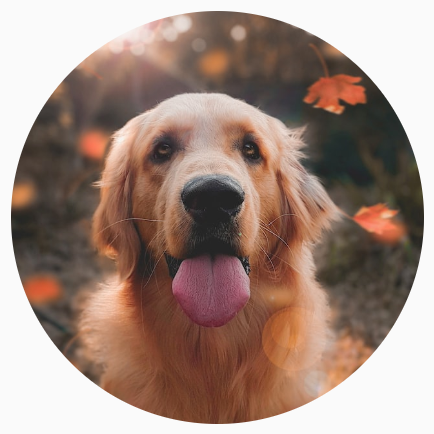
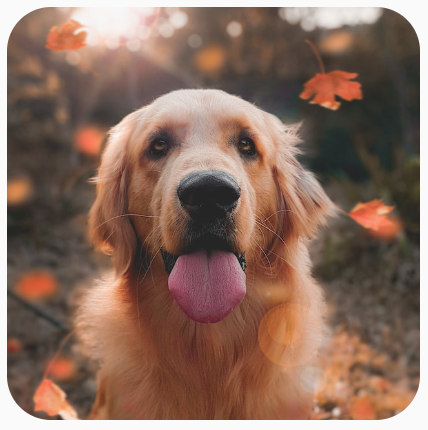
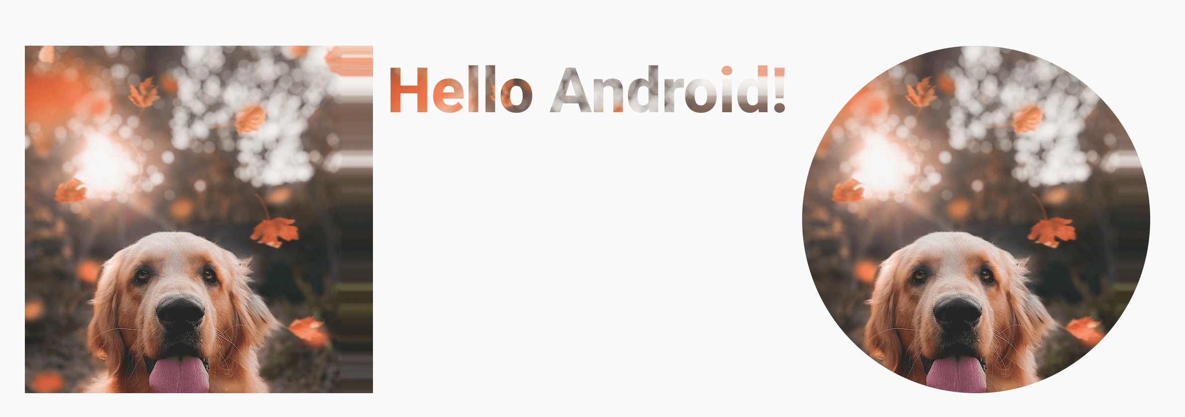
Image composable을 Shape로 자르기
// 원형으로 자르기
Image(
   painter = painterResource(id = R.drawable.dog),
   contentDescription = stringResource(id = R.string.dog_content_description),
   contentScale = ContentScale.Crop,
   modifier = Modifier
      .size(200.dp)
      .clip(CircleShape)
)
// 둥근 모서리로 자르기
Image(
   painter = painterResource(id = R.drawable.dog),
   contentDescription = stringResource(id = R.string.dog_content_description),
   contentScale = ContentScale.Crop,
   modifier = Modifier
      .size(200.dp)
      .clip(RoundedCornerShape(16.dp))
)
// 커스텀 도형
class SquashedOval : Shape {
   override fun createOutline(
      size: Size,
      layoutDirection: LayoutDirection,
      density: Density
   ): Outline {
      val path = Path().apply {
         // 너비의 1/4에서 시작하여 컨테이너 너비의 3/4에서 끝나는 타원
         addOval(
            Rect(
               left = size.width / 4f,
               top = 0f,
               right = size.width * 3 / 4f,
               bottom = size.height
            )
         )
      }
      return Outline.Generic(path = path)
   }
}

Image(
   painter = painterResource(id = R.drawable.dog),
   contentDescription = stringResource(id = R.string.dog_content_description),
   contentScale = ContentScale.Crop,
   modifier = Modifier
      .size(200.dp)
      .clip(SquashedOval())
)
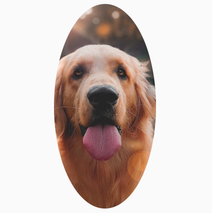
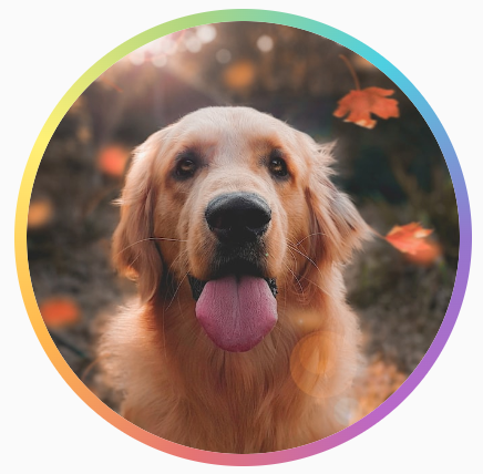
Image composable에 테두리 추가
기본적인 테두리는 Modifier.border() API를 사용
val borderWidth = 4.dp
Image(
   painter = painterResource(id = R.drawable.dog),
   contentDescription = stringResource(id = R.string.dog_content_description),
   contentScale = ContentScale.Crop,
   modifier = Modifier
      .size(150.dp)
      .border(
         BorderStroke(borderWidth, Color.Yellow),
         CircleShape
      )
      .padding(borderWidth)
      .clip(CircleShape)
)
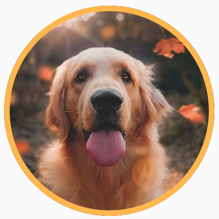
// Brush를 사용하여 그라데이션 테두리
val rainbowColorsBrush = remember {
   Brush.sweepGradient(
      listOf(
         Color(0xFF9575CD),
         Color(0xFFBA68C8),
         Color(0xFFE57373),
         Color(0xFFFFB74D),
         Color(0xFFFFF176),
         Color(0xFFAED581),
         Color(0xFF4DD0E1),
         Color(0xFF9575CD)
      )
   )
}
val borderWidth = 4.dp
Image(
   painter = painterResource(id = R.drawable.dog),
   contentDescription = stringResource(id = R.string.dog_content_description),
   contentScale = ContentScale.Crop,
   modifier = Modifier
      .size(150.dp)
      .border(
         BorderStroke(borderWidth, rainbowColorsBrush),
         CircleShape
      )
      .padding(borderWidth)
      .clip(CircleShape)
)
커스텀 가로세로 비율 설정
Modifier.aspectRatio API 사용
Image(
   painter = painterResource(id = R.drawable.dog),
   contentDescription = stringResource(id = R.string.dog_content_description),
   modifier = Modifier.aspectRatio(16f / 9f)
)
컬러 필터
이미지 색조 조정
Tint 적용 : ColorFilter.tint(color, blendMode)
Image(
   painter = painterResource(id = R.drawable.baseline_directions_bus_24),
   contentDescription = stringResource(id = R.string.bus_content_description),
   colorFilter = ColorFilter.tint(Color.Yellow)
)

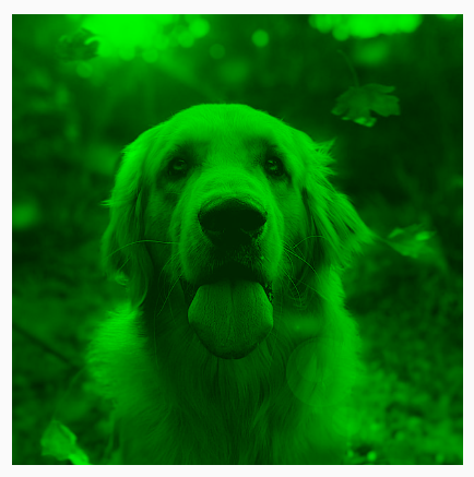
BlendMode 효과
Image(
   painter = painterResource(id = R.drawable.dog),
   contentDescription = stringResource(id = R.string.dog_content_description),
   colorFilter = ColorFilter.tint(Color.Green, blendMode = BlendMode.Darken)
)
색상 매트릭스로 Image filter 적용
// 채도가 0(흑백 이미지)인 필터 적용
Image(
   painter = painterResource(id = R.drawable.dog),
   contentDescription = stringResource(id = R.string.dog_content_description),
   colorFilter = ColorFilter.colorMatrix(ColorMatrix().apply { setToSaturation(0f) })
)
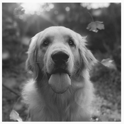
Image composable Blur 처리
Modifier.blur() API를 사용
- Blur 효과는 Android 12 이상에서만 지원
Image(
   painter = painterResource(id = R.drawable.dog),
   contentDescription = stringResource(id = R.string.dog_content_description),
   contentScale = ContentScale.Crop,
   modifier = Modifier
      .size(150.dp)
      .blur(
         radiusX = 10.dp,
         radiusY = 10.dp,
         edgeTreatment = BlurredEdgeTreatment(RoundedCornerShape(8.dp))
      )
)
커스텀 painter
Compose에서 Painter 객체는 그릴 수 있는 항목(Android의 Drawable API를 대체)을 나타내며, 이를 사용하는 Composable의 measurement/layout에 영향을 미치는 데 사용
- Painter 클래스를 확장하고 DrawScope를 사용하여 Custom Graphic을 그릴 수 있는 onDraw 메서드를 구현
- Composable에 영향을 주는 데 사용되는 intrinsicSize를 재정의 가능
class OverlayImagePainter constructor(
   private val image: ImageBitmap,
   private val imageOverlay: ImageBitmap,
   private val srcOffset: IntOffset = IntOffset.Zero,
   private val srcSize: IntSize = IntSize(image.width, image.height),
   private val overlaySize: IntSize = IntSize(imageOverlay.width, imageOverlay.height)
) : Painter() {

   private val size: IntSize = validateSize(srcOffset, srcSize)
   override fun DrawScope.onDraw() {
      // Blend 모드가 없는 첫 번째 이미지 그리기
      drawImage(
         image,
         srcOffset,
         srcSize,
         dstSize = IntSize(
            this@onDraw.size.width.roundToInt(),
            this@onDraw.size.height.roundToInt()
         )
      )
      // Overlay Blend 모드로 두 번째 이미지를 그려서 두 이미지를 혼합
      drawImage(
         imageOverlay,
         srcOffset,
         overlaySize,
         dstSize = IntSize(
            this@onDraw.size.width.roundToInt(),
            this@onDraw.size.height.roundToInt()
         ),
         blendMode = BlendMode.Overlay
      )
   }

   /**
    * ImageBitmap의 크기로 고유 너비/높이 반환
    */
   override val intrinsicSize: Size get() = size.toSize()

   private fun validateSize(srcOffset: IntOffset, srcSize: IntSize): IntSize {
      require(
         srcOffset.x >= 0 &&
            srcOffset.y >= 0 &&
            srcSize.width >= 0 &&
            srcSize.height >= 0 &&
            srcSize.width <= image.width &&
            srcSize.height <= image.height
      )
      return srcSize
   }
}

// Custom Painter를 이미지 위에 이미지를 오버레이
val rainbowImage = ImageBitmap.imageResource(id = R.drawable.rainbow)
val dogImage = ImageBitmap.imageResource(id = R.drawable.dog)
val customPainter = remember {
    OverlayImagePainter(dogImage, rainbowImage)
}
Image(
    painter = customPainter,
    contentDescription = stringResource(id = R.string.dog_content_description),
    contentScale = ContentScale.Crop,
    modifier = Modifier.wrapContentSize()
)
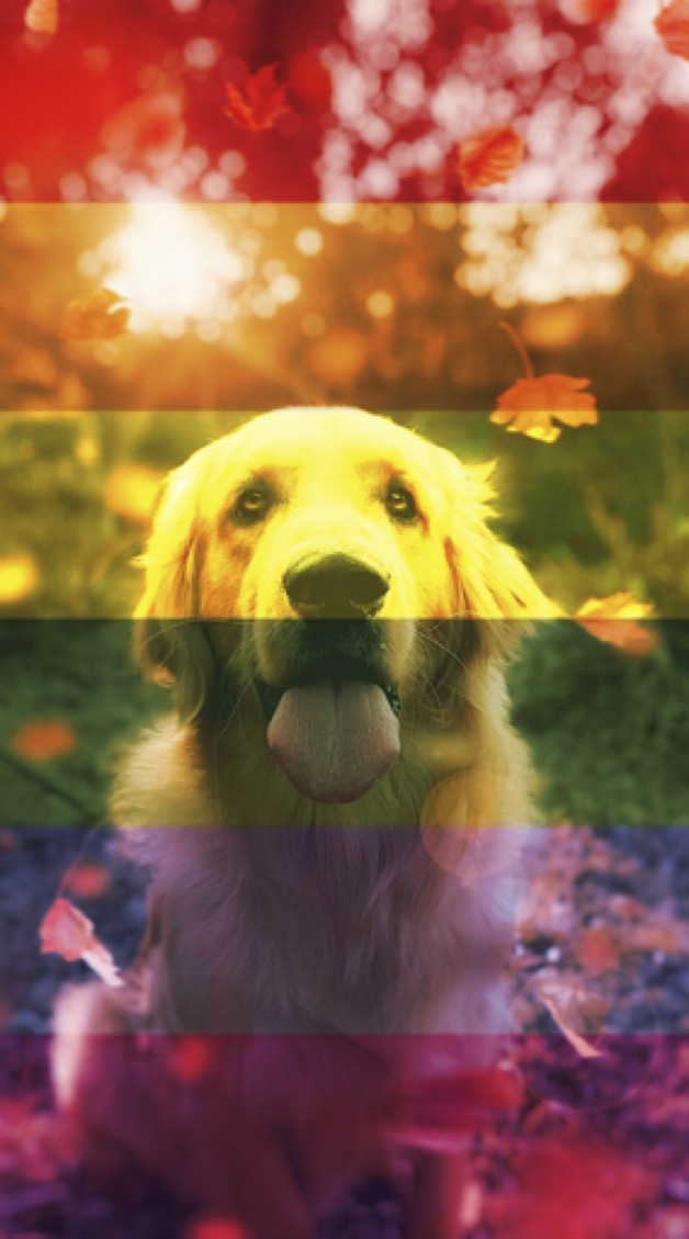
Modifier.paint(customPainter) 사용도 가능
성능 최적화
필요한 비트맵 크기만 로드
- 이미지 파일을 가능한 작게 축소
- 이미지를 JPEG/PNG 대신 WEBP으로 변환
- 가능하면 비트맵 대신 벡터 사용하기
- 다양한 화면 해상도에 대해 더 작은 이미지를 제공
- 이미지 로딩 라이브러리를 사용하여 뷰 크기에 맞게 이미지 축소
painterResource를 사용하면 이미지가 화면에 표시되는 컴포저블의 크기에 맞춰 조정되지 않는다
- ImageBitmap을 사용하는 경우 그리기 전에 prepareToDraw를 호출
- 텍스처를 GPU에 업로드하는 프로세스를 시작하려면 실제로 그리기 전에 ImageBitmap#prepareToDraw()를 호출
- GPU가 텍스처를 준비하고 화면에 시각적 효과를 표시하는 성능 개선
- Composable에 Painter 대신 Int DrawableRes/URL을 파라미터로 전달하는 것을 선호
- 이미지 처리의 복잡성으로 인해
PainterAPI는 명시적으로 Stable 클래스가 아님 -> 불필요한 재구성 발생 가능
- 이미지 처리의 복잡성으로 인해
필요 이상 비트맵을 메모리에 저장하지 않기
메모리 확보를 위한 처리가 필요 (LazyColumn/LazyRow)
대용량 이미지를 AAB/APK 파일로 패키징하지 않기
크기를 줄이거나 이미지를 서버에 두고 처리
Graphics
Modifier와 DrawScope를 사용하여 기본 그리기
Modifier의 API를 사용하여 커스텀 Draw 가능
Modifier.drawWithContentModifier.drawBehind: Composable뒤에 그리기Modifier.drawWithCache
Spacer(
   modifier = Modifier
      .fillMaxSize()
      .drawBehind {
         // this = DrawScope
      }
)
Canvas Composable : 그리기 전용 Composable
모든 그리기 Modifier는 자체 상태를 유지하는 범위 지정 그리기 환경인 DrawScope를 노출
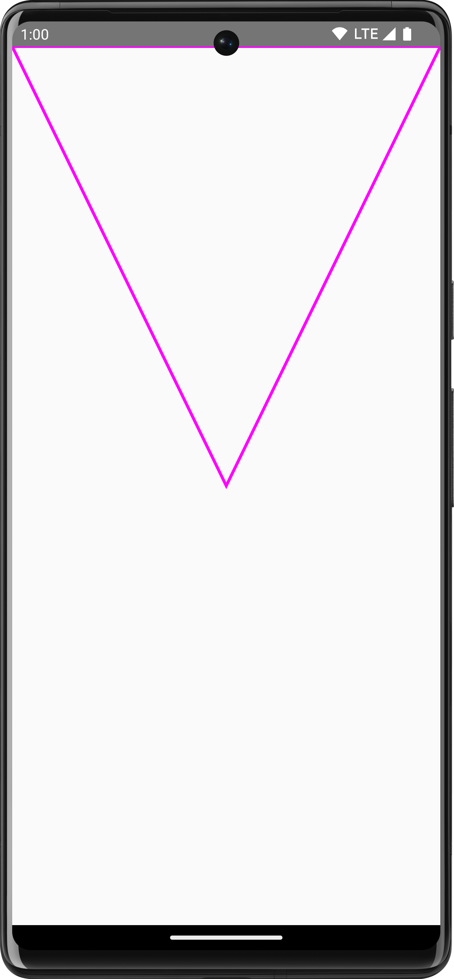
// 좌상단에 직사각형 그리기
Canvas(modifier = Modifier.fillMaxSize()) {
   val canvasQuadrantSize = size / 2F
   drawRect(
      color = Color.Magenta,
      size = canvasQuadrantSize
   )
}
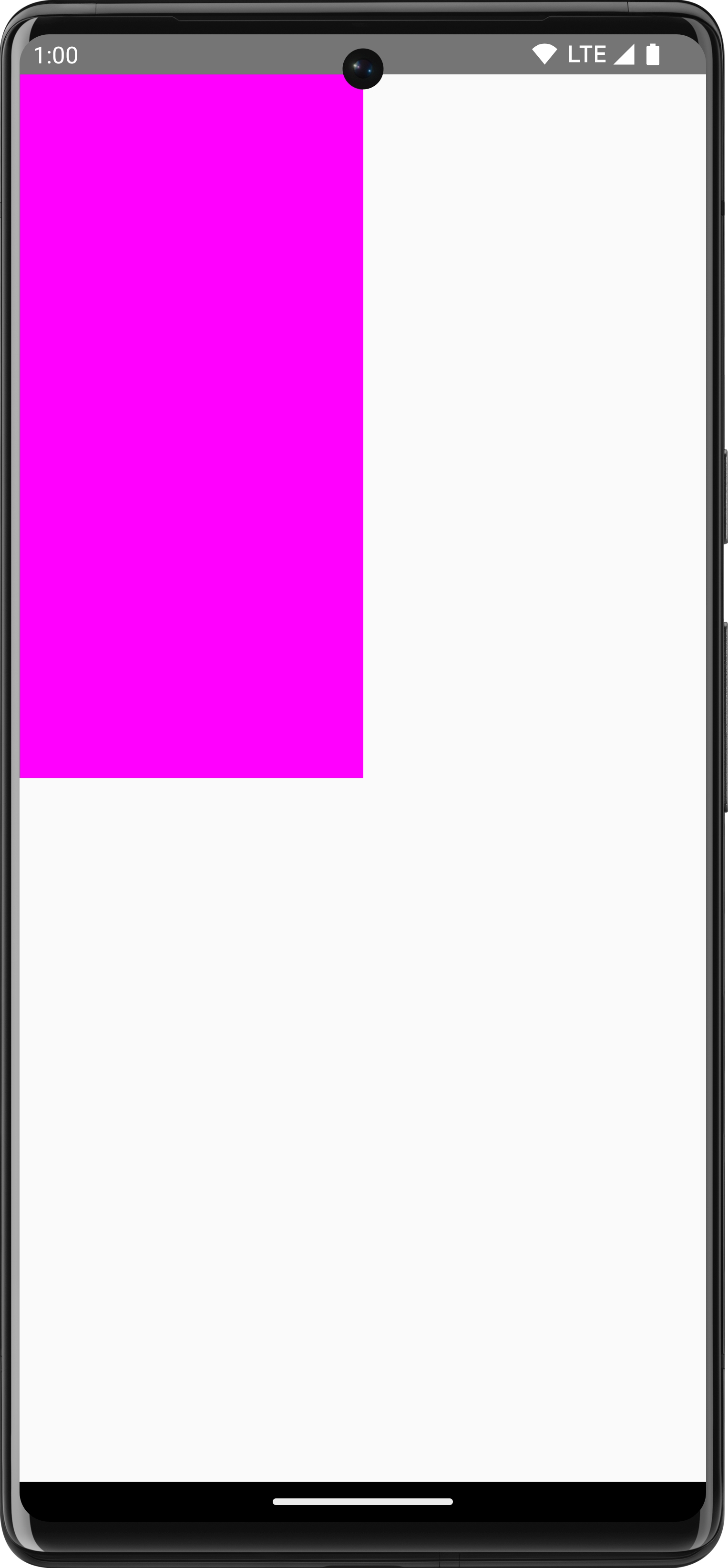
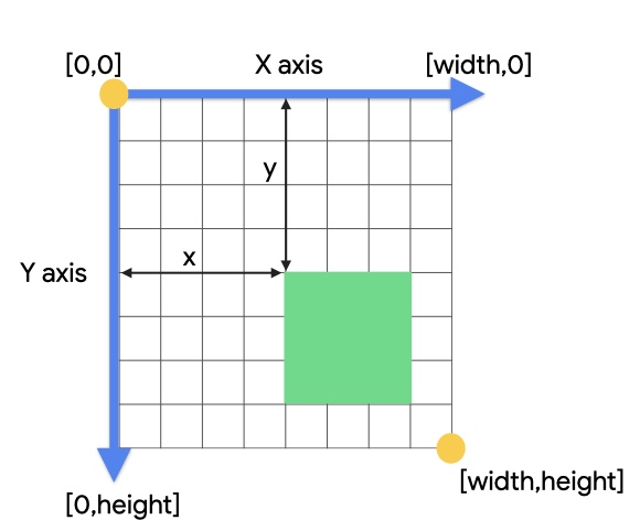
좌표계
좌표계의 원점([0,0])은 그리기 영역에서 맨 왼쪽 상단이 기준
모든 그리기 작업은 픽셀 크기를 사용
- 밀도와 화면 크기에서 항목의 크기를 일관되게 유지하려면
.toPx()를 사용하여dp에서 변환하거나 크기의 비율로 작업
// 우상단에서 좌하단으로 대각선 그리기
Canvas(modifier = Modifier.fillMaxSize()) {
   val canvasWidth = size.width
   val canvasHeight = size.height
   drawLine(
      start = Offset(x = canvasWidth, y = 0f),
      end = Offset(x = 0f, y = canvasHeight),
      color = Color.Blue
   )
}
기본 변환
Composable의 draw 단계에만 영향을 적용
Scale
// scaleX 10배, scaleY 15배 적용
Canvas(modifier = Modifier.fillMaxSize()) {
   scale(scaleX = 10f, scaleY = 15f) {
      drawCircle(Color.Blue, radius = 20.dp.toPx())
   }
}
Translate
DrawScope.translate() draw 작업을 이동
Canvas(modifier = Modifier.fillMaxSize()) {
   translate(left = 100f, top = -300f) {
      drawCircle(Color.Blue, radius = 200.dp.toPx())
   }
}
Rotate
// 직사각형을 45도 회전
Canvas(modifier = Modifier.fillMaxSize()) {
   rotate(degrees = 45F) {
      drawRect(
         color = Color.Gray,
         topLeft = Offset(x = size.width / 3F, y = size.height / 3F),
         size = size / 3F
      )
   }
}
Inset
// 그리기 경계를 변경. 사실상 패딩 추가
Canvas(modifier = Modifier.fillMaxSize()) {
   val canvasQuadrantSize = size / 2F
   inset(horizontal = 50f, vertical = 30f) {
      drawRect(color = Color.Green, size = canvasQuadrantSize)
   }
}
다중 변환
DrawScope.withTransform(). Draw에 여러 변환을 적용하는데 사용
- 모든 변환이 단일 작업으로 함께 실행되므로 개별 변환을 중첩 호출하는 것보다 더 효율적
// 직사각형에 이동/회전 적용
Canvas(modifier = Modifier.fillMaxSize()) {
   withTransform({
      translate(left = size.width / 5F)
      rotate(degrees = 45F)
   }) {
      drawRect(
         color = Color.Gray,
         topLeft = Offset(x = size.width / 3F, y = size.height / 3F),
         size = size / 3F
      )
   }
}
일반적인 그리기 작업
텍스트 그리기
// DrawScope에서 수동으로 텍스트 그리기
val textMeasurer = rememberTextMeasurer()
Canvas(modifier = Modifier.fillMaxSize()) {
   drawText(textMeasurer, "Hello")
}
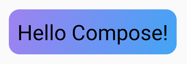
텍스트 측정
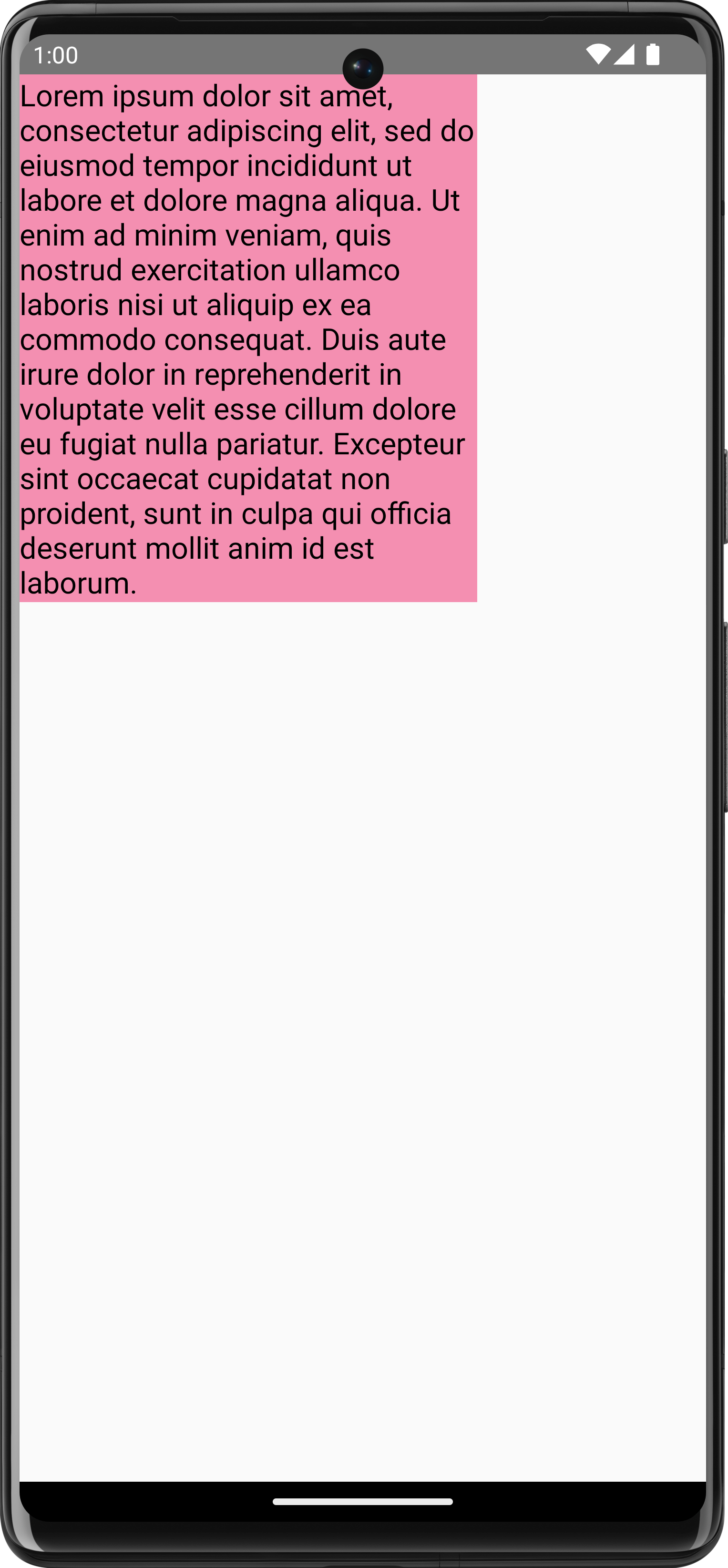
TextMeasurer를 사용하여 텍스트 크기에 접근 가능.
// 텍스트 뒤에 배경을 그리려면 TextMeasurer를 사용하여 텍스트가 차지하는 영역의 크기를 가져올 수 있다
val textMeasurer = rememberTextMeasurer()
Spacer(
   modifier = Modifier
      .drawWithCache {
         val measuredText =
            textMeasurer.measure(
               AnnotatedString(longTextSample),
               constraints = Constraints.fixedWidth((size.width * 2f / 3f).toInt()),
               style = TextStyle(fontSize = 18.sp)
            )

         onDrawBehind {
            drawRect(pinkColor, size = measuredText.size.toSize())
            drawText(measuredText)
         }
      }
      .fillMaxSize()
)
텍스트 그리기는 비용이 많이 드는 작업이다.
drawWithCache를 사용하면 그리기 영역의 크기가 변경될 때까지 만들어진 객체를 캐시 함
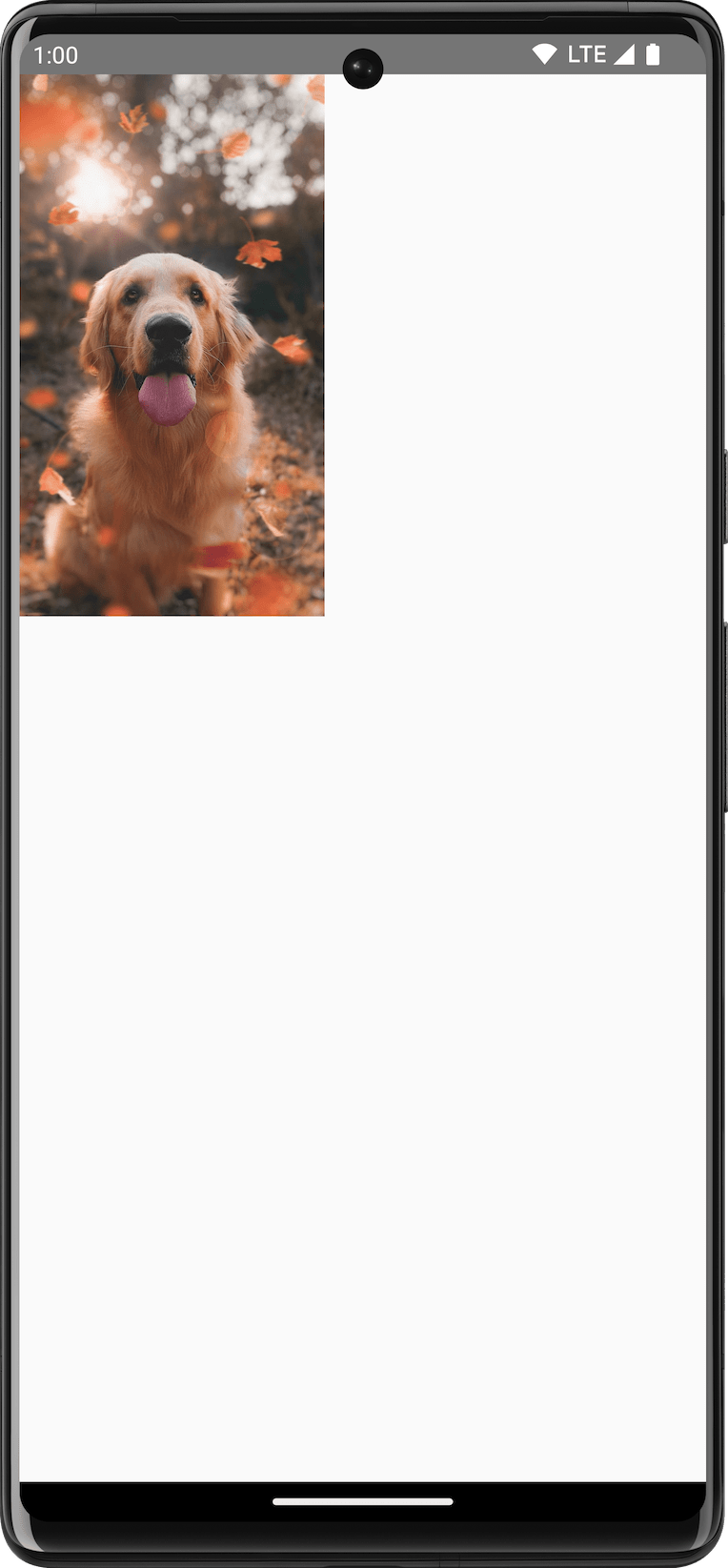
이미지 그리기
DrawScope로 ImageBitmap을 그리려면 ImageBitmap.imageResource()를 사용하여 이미지를 로드한 다음 drawImage를 호출
val dogImage = ImageBitmap.imageResource(id = R.drawable.dog)
Canvas(modifier = Modifier.fillMaxSize(), onDraw = {
   drawImage(dogImage)
})
기본 도형 그리기
drawCircle(): 원형drawRect(): 사각형drawRoundedRect(): 둥근 사각형drawLine(): 선drawOval(): 타원형drawArc(): 호drawPoints(): 점
Path 그리기
DrawScope.drawPath()를 사용하여 Path 그리기 가능
Spacer(
   modifier = Modifier
      .drawWithCache {
         val path = Path()
         path.moveTo(0f, 0f)
         path.lineTo(size.width / 2f, size.height / 2f)
         path.lineTo(size.width, 0f)
         path.close()
         onDrawBehind {
            drawPath(path, Color.Magenta, style = Stroke(width = 10f))
         }
      }
      .fillMaxSize()
)
Canvas 객체에 접근
DrawScope를 사용하면 Canvas 객체에 접근 불가능
DrawScope.drawIntoCanvas()를 사용하여 Canvas에 접근
val drawable = ShapeDrawable(OvalShape())
Spacer(
   modifier = Modifier
      .drawWithContent {
         drawIntoCanvas { canvas ->
            drawable.setBounds(0, 0, size.width.toInt(), size.height.toInt())
            drawable.draw(canvas.nativeCanvas)
         }
      }
      .fillMaxSize()
)
그래픽 Modifier
그리기 modifiers
drawWithContent: 기본 그리기 ModifierdrawBehind: Composable 컨텐츠 뒤에 그리기drawWithCache: 내부에서 onDrawBehind/onDrawWithContent 호출하고 객체를 캐시
Modifier.drawWithContent: 그리기 순서 선택
Composable 컨텐츠 앞/뒤에서 DrawScope 작업 가능
https://developer.android.com/develop/ui/compose/graphics/draw/modifiers#drawwithcontent
var pointerOffset by remember {
   mutableStateOf(Offset(0f, 0f))
}
Column(
   modifier = Modifier
      .fillMaxSize()
      .pointerInput("dragging") {
         detectDragGestures { change, dragAmount ->
            pointerOffset += dragAmount
         }
      }
      .onSizeChanged {
         pointerOffset = Offset(it.width / 2f, it.height / 2f)
      }
      .drawWithContent {
         drawContent()
         drawRect(
            Brush.radialGradient(
               listOf(Color.Transparent, Color.Black),
               center = pointerOffset,
               radius = 100.dp.toPx(),
            )
         )
      }
) {
   // Your composables here
}
Modifier.drawBehind: 컴포저블 뒤에 그리기
Modifier.drawBehind를 사용하여 Composable 컨텐츠 뒤에 DrawScope 작업을 실행
Text(
   "Hello Compose!",
   modifier = Modifier
      .drawBehind {
         drawRoundRect(
            Color(0xFFBBAAEE),
            cornerRadius = CornerRadius(10.dp.toPx())
         )
      }
      .padding(4.dp)
)
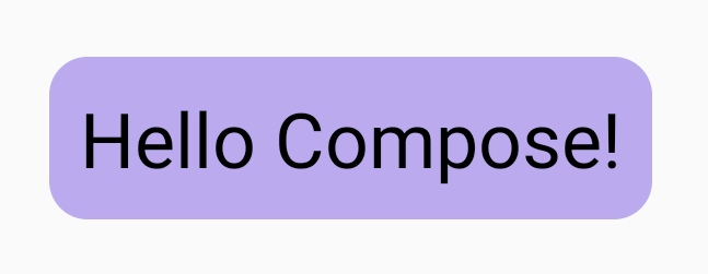
Modifier.drawWithCache: 그리기 객체 그리기 및 캐싱
Modifier.drawWithCache는 내부에서 생성된 객체를 캐시된 상태로 유지
- 그리기 영역의 크기가 같거나 상태 객체가 변경되지 않은 한 캐시
Text(
   "Hello Compose!",
   modifier = Modifier
      .drawWithCache {
         val brush = Brush.linearGradient(
            listOf(
               Color(0xFF9E82F0),
               Color(0xFF42A5F5)
            )
         )
         onDrawBehind {
            drawRoundRect(
               brush,
               cornerRadius = CornerRadius(10.dp.toPx())
            )
         }
      }
)
그래픽 modifiers
Modifier.graphicsLayer: 컴포저블에 변환 적용
Modifier.graphicsLayer는 Composable의 컨텐츠를 draw layer에 그리는 Modifier
Transformations
Scale
Image(
   painter = painterResource(id = R.drawable.sunset),
   contentDescription = "Sunset",
   modifier = Modifier
      .graphicsLayer {
         this.scaleX = 1.2f
         this.scaleY = 0.8f
      }
)
Translation
Image(
   painter = painterResource(id = R.drawable.sunset),
   contentDescription = "Sunset",
   modifier = Modifier
      .graphicsLayer {
         this.translationX = 100.dp.toPx()
         this.translationY = 10.dp.toPx()
      }
)
Rotation
Image(
   painter = painterResource(id = R.drawable.sunset),
   contentDescription = "Sunset",
   modifier = Modifier
      .graphicsLayer {
         this.rotationX = 90f
         this.rotationY = 275f
         this.rotationZ = 180f
      }
)
Origin
변환 시작 지점을 선언
Image(
   painter = painterResource(id = R.drawable.sunset),
   contentDescription = "Sunset",
   modifier = Modifier
      .graphicsLayer {
         this.transformOrigin = TransformOrigin(0f, 0f)
         this.rotationX = 90f
         this.rotationY = 275f
         this.rotationZ = 180f
      }
)
Clip과 Sahpe
Shape가 clip = true일 때 컨텐츠가 clip되는 윤곽을 지정
Column(modifier = Modifier.padding(16.dp)) {
   // graphicsLayer API 사용
   Box(
      modifier = Modifier
         .clip(RectangleShape)
         .size(200.dp)
         .border(2.dp, Color.Black)
         .graphicsLayer {
            clip = true
            shape = CircleShape
            translationY = 50.dp.toPx()
         }
         .background(Color(0xFFF06292))
   ) {
      Text(
         "Hello Compose",
         style = TextStyle(color = Color.Black, fontSize = 46.sp),
         modifier = Modifier.align(Alignment.Center)
      )
   }
   // Modifier.clip 사용
   Box(
      modifier = Modifier
         .size(200.dp)
         .clip(RoundedCornerShape(500.dp))
         .background(Color(0xFF4DB6AC))
   )
}
Alpha
Image(
   painter = painterResource(id = R.drawable.sunset),
   contentDescription = "clock",
   modifier = Modifier
      .graphicsLayer {
         this.alpha = 0.5f
      }
)
Compositing 전략
CompositingStrategy : Composable의 컨콘텐츠가 화면에 이미 그려진 다른 컨텐츠와 Composition(결합)되는 방식을 결정
- Auto : 알파가 1.0f 미만이거나 RenderEffect가 설정된 경우 레이어를 Offscreen 버퍼로 렌더링
- Offscreen : Composable의 컨텐츠는 렌더링되기 전에 항상 Offscreen 텍스처 또는 비트맵으로 래스터화된다
- BlendMode 작업을 적용하여 마스킹/복잡한 그리기 명령 집합을 렌더링하는 성능을 높이는 데 유용
상세 내용 : https://developer.android.com/develop/ui/compose/graphics/draw/modifiers#compositing-strategy
Composable의 컨텐츠를 비트맵에 쓰기
Composable 컨텐츠를 Bitmap에 복사
val coroutineScope = rememberCoroutineScope()
val graphicsLayer = rememberGraphicsLayer()
Box(
   modifier = Modifier
      .drawWithContent {
         // record를 사용하여 graphics layer의 컨텐츠를 캡처
         graphicsLayer.record {
            // Composable의 내용을 graphics layer에 그리기
            this@drawWithContent.drawContent()
         }
         // 보이는 캔버스에 graphics layer 그리기
         drawLayer(graphicsLayer)
      }
      .clickable {
         coroutineScope.launch {
            val bitmap = graphicsLayer.toImageBitmap()
            // 새로 획득한 Bitmap으로 처리
         }
      }
      .background(Color.White)
) {
   Text("Hello Android", fontSize = 26.sp)
}
커스텀 그리기 Modifier
class FlippedModifier : DrawModifier {
   override fun ContentDrawScope.draw() {
      scale(1f, -1f) {
         this@draw.drawContent()
      }
   }
}

fun Modifier.flipped() = this.then(FlippedModifier())

Text(
   "Hello Compose!",
   modifier = Modifier
      .flipped()
)
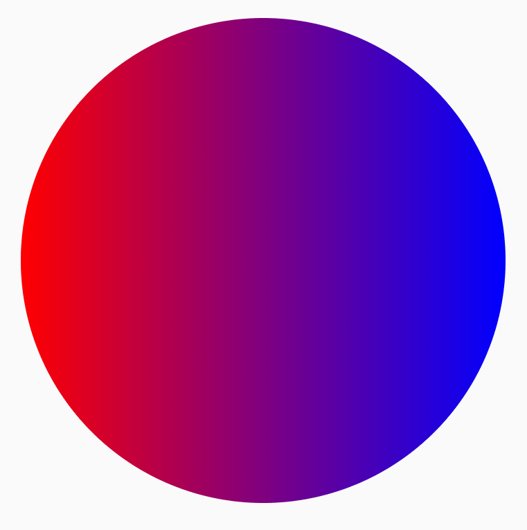
Brush
Brush는 화면에 그려지는 방식을 설명. 그리기 영역(원, 정사각형, 경로)에 그려지는 색상을 결정
val brush = Brush.horizontalGradient(listOf(Color.Red, Color.Blue))
Canvas(
   modifier = Modifier.size(200.dp),
   onDraw = {
      drawCircle(brush)
   }
)
Gradient brushes
기본 제공하는 Gradient brush
Brush.horizontalGradient(colorList)Brush.linearGradient(colorList)Brush.verticalGradient(colorList)Brush.sweepGradient(colorList)Brush.radialGradient(colorList)
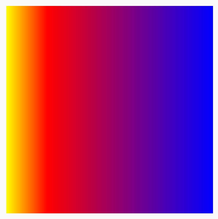
colorStops를 사용하여 색상 분포 변경
그라데이션으로 표시되는 방식을 커스텀하려면 각 색상의 colorStops 값을 조정
- 0과 1사이의 값으로 지정
val colorStops = arrayOf(
   0.0f to Color.Yellow,
   0.2f to Color.Red,
   1f to Color.Blue
)
Box(
   modifier = Modifier
      .requiredSize(200.dp)
      .background(Brush.horizontalGradient(colorStops = colorStops))
)
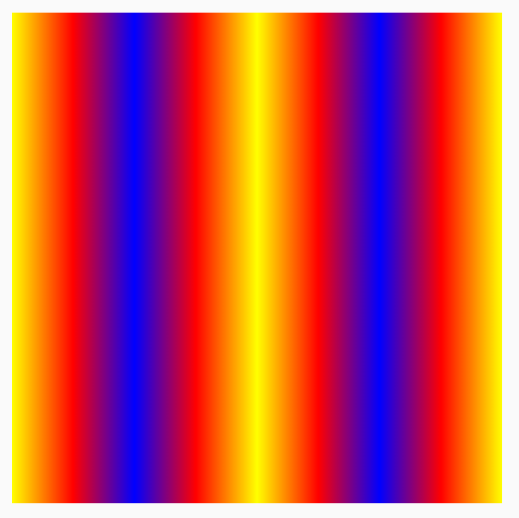
TileMode으로 패턴 반복
각 Brush의 TileMode를 설정하는 옵션을 사용
TileMode.RepeatedTileMode.MirrorTileMode.Clamp: 가장자리가 최종 색상으로 고정. 나머지 영역에 가장 가까운 색을 칠함TileMode.Decal
// 패턴이 4번 반복
val listColors = listOf(Color.Yellow, Color.Red, Color.Blue)
val tileSize = with(LocalDensity.current) {
   50.dp.toPx()
}
Box(
   modifier = Modifier
      .requiredSize(200.dp)
      .background(
         Brush.horizontalGradient(
            listColors,
            endX = tileSize,
            tileMode = TileMode.Repeated
         )
      )
)
Brush 크기 변경
Draw 영역의 크기를 모르는 경우(예: 브러시가 텍스트에 할당된 경우) Shader를 확장하고 createShader 함수에서 Draw 영역의 크기를 활용 가능
val listColors = listOf(Color.Yellow, Color.Red, Color.Blue)
val customBrush = remember {
   object : ShaderBrush() {
      override fun createShader(size: Size): Shader {
         return LinearGradientShader(
            colors = listColors,
            from = Offset.Zero,
            to = Offset(size.width / 4f, 0f),
            tileMode = TileMode.Mirror
         )
      }
   }
}
Box(
   modifier = Modifier
      .requiredSize(200.dp)
      .background(customBrush)
)
이미지를 브러시로 사용
val imageBrush =
   ShaderBrush(ImageShader(ImageBitmap.imageResource(id = R.drawable.dog)))

// background에 ImageShader Brush 사용
Box(
   modifier = Modifier
      .requiredSize(200.dp)
      .background(imageBrush)
)

// TextStyle에 ImageShader Brush 사용
Text(
   text = "Hello Android!",
   style = TextStyle(
      brush = imageBrush,
      fontWeight = FontWeight.ExtraBold,
      fontSize = 36.sp
   )
)

// DrawScope#drawCircle()과 함께 ImageShader Brush 사용
Canvas(onDraw = {
   drawCircle(imageBrush)
}, modifier = Modifier.size(200.dp))
Shape
다각형 Shape 만들기가 가능
implementation “androidx.graphics:graphics-shapes:1.0.0-alpha05”
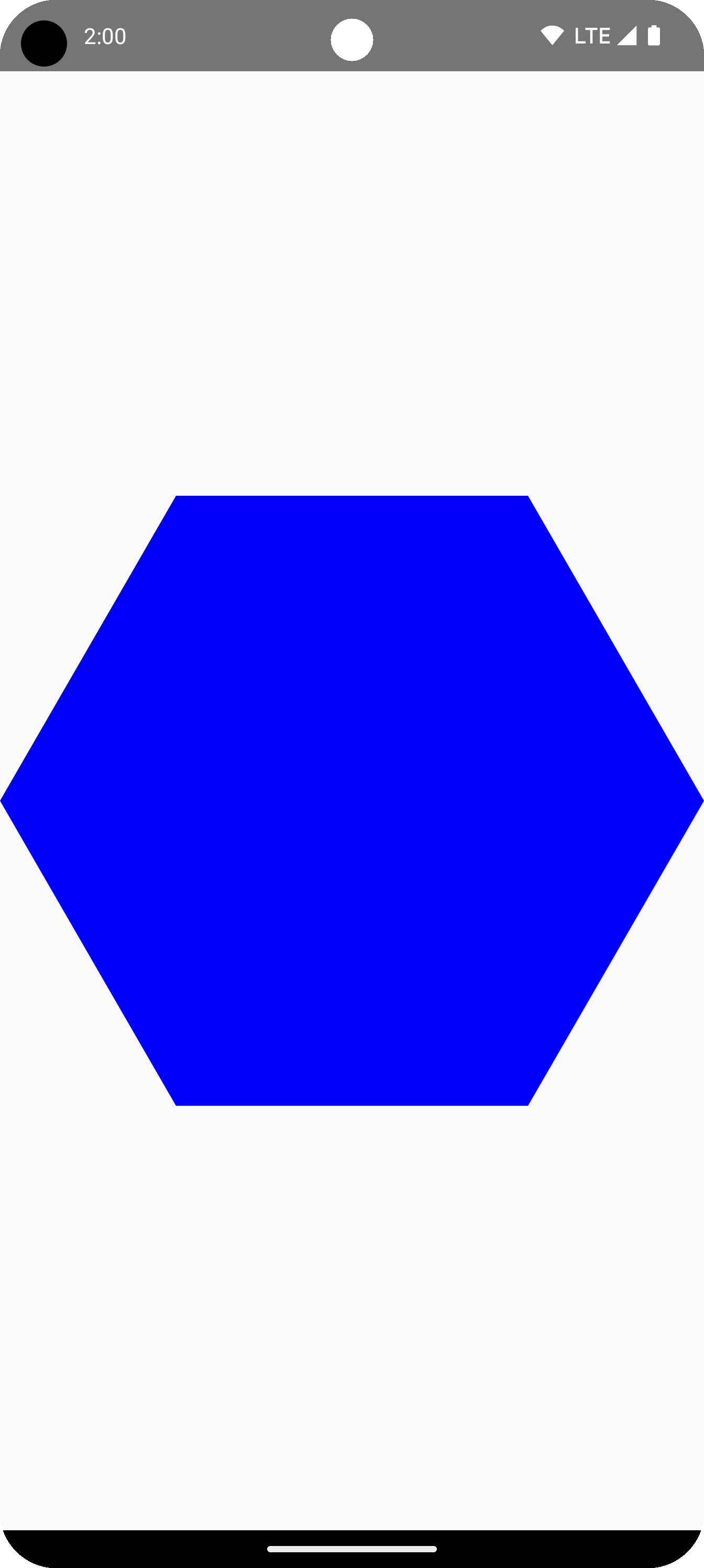
다각형 만들기
Box(
   modifier = Modifier
      .drawWithCache {
         val roundedPolygon = RoundedPolygon(
            numVertices = 6,
            radius = size.minDimension / 2,
            centerX = size.width / 2,
            centerY = size.height / 2
         )
         val roundedPolygonPath = roundedPolygon.toPath().asComposePath()
         onDrawBehind {
            drawPath(roundedPolygonPath, color = Color.Blue)
         }
      }
      .fillMaxSize()
)
다각형의 둥근 모서리
CornerRounding 파라미터를 사용하여 Polygon 생성
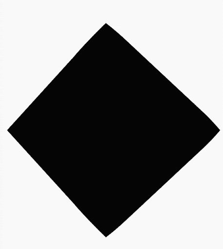
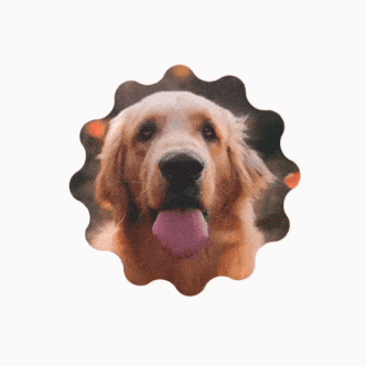
Morph shapes
Morph 객체는 두 다각형 도형 간의 애니메이션을 나타내는 새로운 도형
val infiniteAnimation = rememberInfiniteTransition(label = "infinite animation")
val morphProgress = infiniteAnimation.animateFloat(
   initialValue = 0f,
   targetValue = 1f,
   animationSpec = infiniteRepeatable(
      tween(500),
      repeatMode = RepeatMode.Reverse
   ),
   label = "morph"
)
Box(
   modifier = Modifier
      .drawWithCache {
         val triangle = RoundedPolygon(
            numVertices = 3,
            radius = size.minDimension / 2f,
            centerX = size.width / 2f,
            centerY = size.height / 2f,
            rounding = CornerRounding(
               size.minDimension / 10f,
               smoothing = 0.1f
            )
         )
         val square = RoundedPolygon(
            numVertices = 4,
            radius = size.minDimension / 2f,
            centerX = size.width / 2f,
            centerY = size.height / 2f
         )

         val morph = Morph(start = triangle, end = square)
         val morphPath = morph
            .toPath(progress = morphProgress.value)
            .asComposePath()

         onDrawBehind {
            drawPath(morphPath, color = Color.Black)
         }
      }
      .fillMaxSize()
)
다각형을 Clip으로 사용
// 다각형 생성
fun RoundedPolygon.getBounds() = calculateBounds().let { Rect(it[0], it[1], it[2], it[3]) }
class RoundedPolygonShape(
   private val polygon: RoundedPolygon,
   private var matrix: Matrix = Matrix()
) : Shape {
   private var path = Path()
   override fun createOutline(
      size: Size,
      layoutDirection: LayoutDirection,
      density: Density
   ): Outline {
      path.rewind()
      path = polygon.toPath().asComposePath()
      matrix.reset()
      val bounds = polygon.getBounds()
      val maxDimension = max(bounds.width, bounds.height)
      matrix.scale(size.width / maxDimension, size.height / maxDimension)
      matrix.translate(-bounds.left, -bounds.top)

      path.transform(matrix)
      return Outline.Generic(path)
   }
}

// Clip으로 사용
val hexagon = remember {
   RoundedPolygon(
      6,
      rounding = CornerRounding(0.2f)
   )
}
val clip = remember(hexagon) {
   RoundedPolygonShape(polygon = hexagon)
}

// Text에 Clip 사용
Box(
   modifier = Modifier
      .clip(clip)
      .background(MaterialTheme.colorScheme.secondary)
      .size(200.dp)
) {
   Text(
      "Hello Compose",
      color = MaterialTheme.colorScheme.onSecondary,
      modifier = Modifier.align(Alignment.Center)
   )
}

// Image에 Clip 사용
Box(
   modifier = Modifier.fillMaxSize(),
   contentAlignment = Alignment.Center
) {
   Image(
      painter = painterResource(id = R.drawable.dog),
      contentDescription = "Dog",
      contentScale = ContentScale.Crop,
      modifier = Modifier
         .graphicsLayer {
            this.shadowElevation = 6.dp.toPx()
            this.shape = clip
            this.clip = true
            this.ambientShadowColor = Color.Black
            this.spotShadowColor = Color.Black
         }
         .size(200.dp)
   )
}
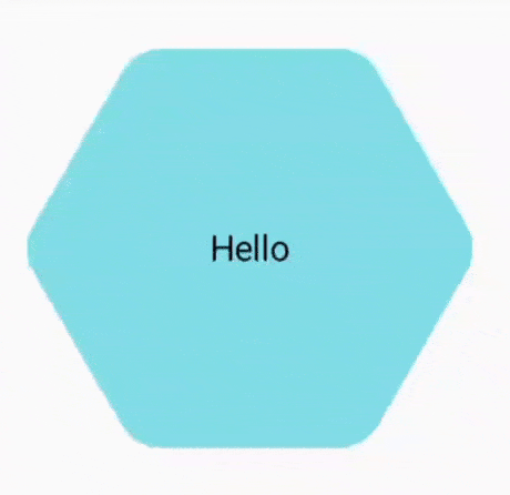
| 텍스트 | 이미지 |
|---|---|
 |
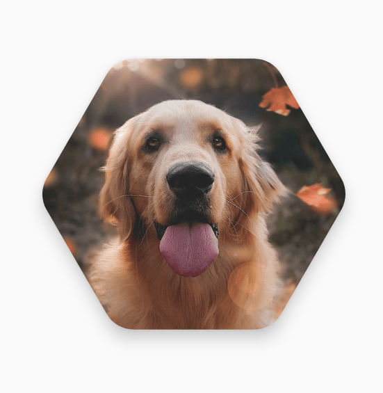 |
클릭시 Morph 버튼
도형 모핑에 무한히 애니메이션 적용
커스텀 폴리곤
val rounding = remember {
    val roundingNormal = 0.6f
    val roundingNone = 0f
    listOf(
        CornerRounding(roundingNormal),
        CornerRounding(roundingNone),
        CornerRounding(roundingNormal),
        CornerRounding(roundingNormal),
        CornerRounding(roundingNone),
        CornerRounding(roundingNormal),
    )
}

val polygon = remember(vertices, rounding) {
    RoundedPolygon(
        vertices = vertices,
        perVertexRounding = rounding
    )
}
Box(
    modifier = Modifier
        .drawWithCache {
            val roundedPolygonPath = polygon.toPath().asComposePath()
            onDrawBehind {
                scale(size.width * 0.5f, size.width * 0.5f) {
                    translate(size.width * 0.5f, size.height * 0.5f) {
                        drawPath(roundedPolygonPath, color = Color(0xFFF15087))
                    }
                }
            }
        }
        .size(400.dp)
)

Polygon대신 Path 클래스로 커스텀 도형도 가능
Subscribe
Subscribe to this blog via RSS.
Categories
Recent Posts
- Posted on 19 Apr 2026
- Posted on 15 Mar 2026
- Posted on 10 Mar 2026
- Posted on 30 Dec 2025