[정리] Compose 가이드 문서 ~ Animation
https://developer.android.com/develop/ui/compose/animation/introduction
Animation API 선택
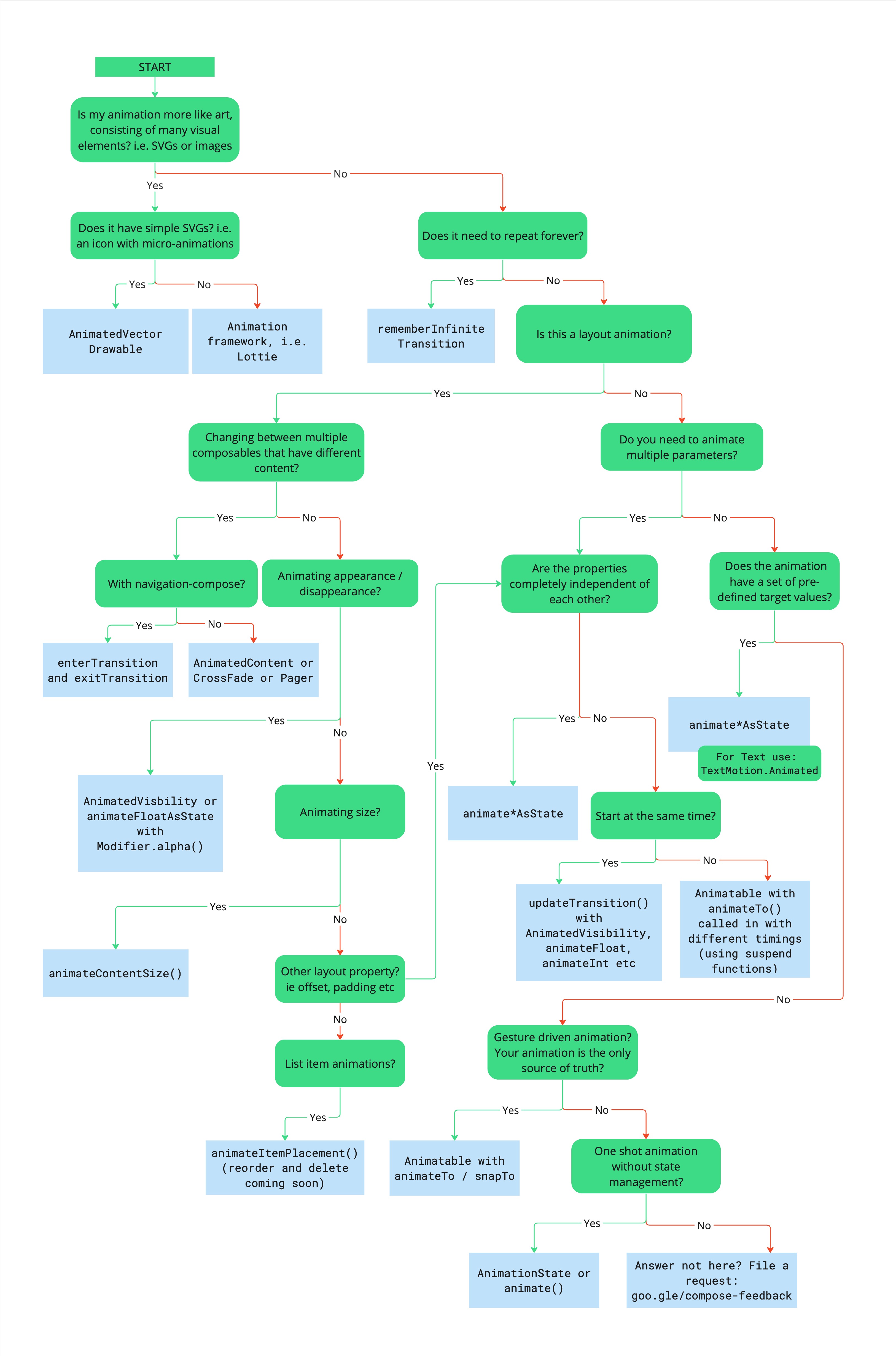
- 애니메이션에 많은 시각적 요소(SVG/이미지)로 구성된 예술에 더 가깝나요?
- 예: 간단한 SVG가 있나요? 즉, 마이크로 애니메이션이 포함된 아이콘
- 예:
AnimatedVectorDrawable - 아니요: 타사 애니메이션 프레임워크, 즉
Lottie
- 예:
- 아니요: 계속 반복해야 하나요?
- 예:
rememberInfiniteTransition - 아니요: 레이아웃 애니메이션인가요?
- 예: 콘텐츠가 다른 여러 Composable 간에 변경하나요?
- 예: navigation-compose를 사용 중인가요?
- 예:
composable()(enterTransition및exitTransition)이 설정 - 아니요:
AnimatedContent,Crossfade또는Pager
- 예:
- 아니오: 등장 / 사라짐에 애니메이션을 적용하나요?
- 예 :
AnimatedVisibility또는animateFloatAsState(Modifier.alpha()) - 아니오: 크기에 애니메이션을 적용하나요?
- 예:
Modifier.animateContentSize - 아니요: 다른 레이아웃 속성(오프셋, 패딩 등)
- 예: “속성이 서로 완전히 독립적입니까?”를 참고하세요.
- 아니요: List 항목 애니메이션?
- 예:
animateItemPlacement()(재주문 및 삭제 예정)
- 예:
- 예:
- 예 :
- 예: navigation-compose를 사용 중인가요?
- 아니요: 여러 속성에 애니메이션을 적용해야 하나요?
- 예: 속성이 서로 완전히 독립적인가요?
- 예:
animate*AsState, 텍스트의 경우TextMotion.Animated사용 - 아니요: 동시에 시작할까요?
- 예:
updateTransition(AnimatedVisibility,animateFloat,animateInt등 사용) - 아니요:
animateTo가 포함된 Animatable가 다른 타이밍으로 호출되었습니다 (suspend 함수 사용).
- 예:
- 예:
- 아니요: 애니메이션에 사전 정의된 타겟 값 세트가 있나요?
- 예:
animate*AsState, 텍스트의 경우TextMotion.Animated사용 - 아니오: 동작 기반 애니메이션인가요? 애니메이션이 유일한 정보 소스인가요?
- 예:
AnimatableanimateTo/snapTo - 아니요: 상태 관리 없이 일회성 애니메이션?
- 예:
AnimationState또는animate - 아니요: 여기에 답변이 없나요? 기능 요청 제출
- 예:
- 예:
- 예:
- 예: 속성이 서로 완전히 독립적인가요?
- 예: 콘텐츠가 다른 여러 Composable 간에 변경하나요?
- 예:
- 예: 간단한 SVG가 있나요? 즉, 마이크로 애니메이션이 포함된 아이콘
빠른 가이드
일반적인 Composable 속성에 애니메이션 적용
애니메이션 표시/사라짐
AnimatedVisibility를 사용하여 숨기거나 표시.
AnimatedVisibility 내부의 자식은 Modifier.animateEnterExit()를 사용하여 자체 enter/exit transition 가능
var visible by remember {
   mutableStateOf(true)
}
// Animated visibility는 애니메이션이 완료되면 Composition에서 항목을 제거
AnimatedVisibility(visible) {
    // your composable here
    // ...
}
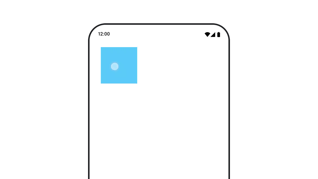
배경색 애니메이션
drawBehind 이 옵션은 Modifier.background()를 사용하는 것보다 성능이 좋다.
Modifier.background() : 단발성 색상 설정에는 사용. 색상 애니메이션시에는 필요 이상으로 Recomposition될 수 있다.
val animatedColor by animateColorAsState(
   if (animateBackgroundColor) colorGreen else colorBlue,
   label = "color"
)
Column(
   modifier = Modifier.drawBehind {
      drawRect(animatedColor)
   }
) {
   // your composable here
}
Composable 크기에 애니메이션 적용
animateContentSize()를 사용하여 Composable 크기 변경 사이에 애니메이션을 적용
var expanded by remember { mutableStateOf(false) }
Box(
   modifier = Modifier
      .background(colorBlue)
      .animateContentSize()
      .height(if (expanded) 400.dp else 200.dp)
      .fillMaxWidth()
      .clickable(
         interactionSource = remember { MutableInteractionSource() },
         indication = null
      ) {
         expanded = !expanded
      }

) {
}
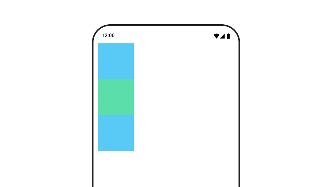
Composable 위치 애니메이션 처리
Modifier.offset{}과 animateIntOffsetAsState()를 함께 사용
offset은 실제 배치되는 위치에는 영향을 안주며, offset 하위에만 영향을 준다
var moved by remember { mutableStateOf(false) }
val pxToMove = with(LocalDensity.current) {
   100.dp.toPx().roundToInt()
}
val offset by animateIntOffsetAsState(
   targetValue = if (moved) {
      IntOffset(pxToMove, pxToMove)
   } else {
      IntOffset.Zero
   },
   label = "offset"
)

Box(
   modifier = Modifier
      .offset {
         offset
      }
      .background(colorBlue)
      .size(100.dp)
      .clickable(
          interactionSource = remember { MutableInteractionSource() },
          indication = null
      ) {
         moved = !moved
      }
)
Composable 애니메이션 처리 시 겹쳐지지 않게 하려면 Modifier.layout{}을 사용해야 한다.
var toggled by remember {
   mutableStateOf(false)
}
val interactionSource = remember {
   MutableInteractionSource()
}
Column(
   modifier = Modifier
      .padding(16.dp)
      .fillMaxSize()
      .clickable(indication = null, interactionSource = interactionSource) {
         toggled = !toggled
      }
) {
   val offsetTarget = if (toggled) {
      IntOffset(150, 150)
   } else {
      IntOffset.Zero
   }
   val offset = animateIntOffsetAsState(
      targetValue = offsetTarget, label = "offset"
   )
   Box(
      modifier = Modifier
         .size(100.dp)
         .background(colorBlue)
   )
   Box(
      modifier = Modifier
         .layout { measurable, constraints ->
            val offsetValue = if (isLookingAhead) offsetTarget else offset.value
            val placeable = measurable.measure(constraints)
            layout(placeable.width + offsetValue.x, placeable.height + offsetValue.y) {
               placeable.placeRelative(offsetValue)
            }
         }
         .size(100.dp)
         .background(colorGreen)
   )
   Box(
      modifier = Modifier
         .size(100.dp)
         .background(colorBlue)
   )
}
Composable의 padding 애니메이션
Modifier.padding()과 결합된 animateDpAsState를 사용
var toggled by remember {
   mutableStateOf(false)
}
val animatedPadding by animateDpAsState(
   if (toggled) {
      0.dp
   } else {
      20.dp
   },
   label = "padding"
)
Box(
   modifier = Modifier
      .aspectRatio(1f)
      .fillMaxSize()
      .padding(animatedPadding)
      .background(Color(0xff53D9A1))
      .clickable(
         interactionSource = remember { MutableInteractionSource() },
         indication = null
      ) {
         toggled = !toggled
      }
)
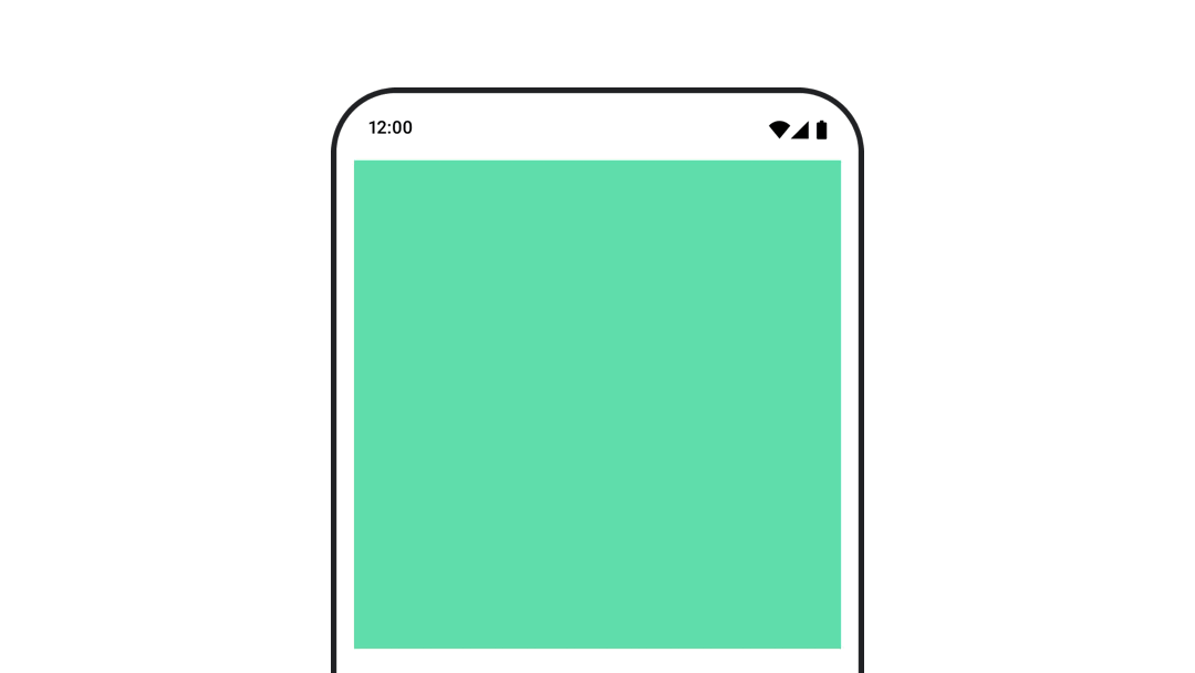
Composable의 elevation 애니메이션
animateDpAsState와 Modifier.graphicsLayer{}를 함께 사용.
단발성의 경우 Modifier.shadow()를 사용
val mutableInteractionSource = remember {
   MutableInteractionSource()
}
val pressed = mutableInteractionSource.collectIsPressedAsState()
val elevation = animateDpAsState(
   targetValue = if (pressed.value) {
      32.dp
   } else {
      8.dp
   },
   label = "elevation"
)
Box(
   modifier = Modifier
      .size(100.dp)
      .align(Alignment.Center)
      .graphicsLayer {
         this.shadowElevation = elevation.value.toPx()
      }
      .clickable(interactionSource = mutableInteractionSource, indication = null) {
      }
      .background(colorGreen)
) {
}
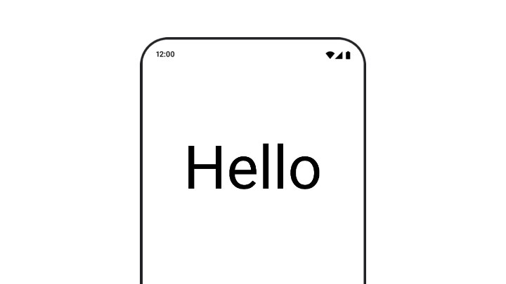
텍스트 scale, translation, rotation 애니메이션 처리
TextStyle의 textMotion 매개변수를 TextMotion.Animated로 설정. 텍스트 애니메이션 간의 전환이 더 원활해짐
Modifier.graphicsLayer{ }를 사용하여 텍스트를 변환, 회전 또는 크기 조정할 수 있습니다.
val infiniteTransition = rememberInfiniteTransition(label = "infinite transition")
val scale by infiniteTransition.animateFloat(
   initialValue = 1f,
   targetValue = 8f,
   animationSpec = infiniteRepeatable(tween(1000), RepeatMode.Reverse),
   label = "scale"
)
Box(modifier = Modifier.fillMaxSize()) {
   Text(
      text = "Hello",
      modifier = Modifier
         .graphicsLayer {
            scaleX = scale
            scaleY = scale
            transformOrigin = TransformOrigin.Center
         }
         .align(Alignment.Center),
      // 기본 Text composable에서는 TextMotion 파라미터를 사용안해도 된다.
      style = LocalTextStyle.current.copy(textMotion = TextMotion.Animated)
   )
}
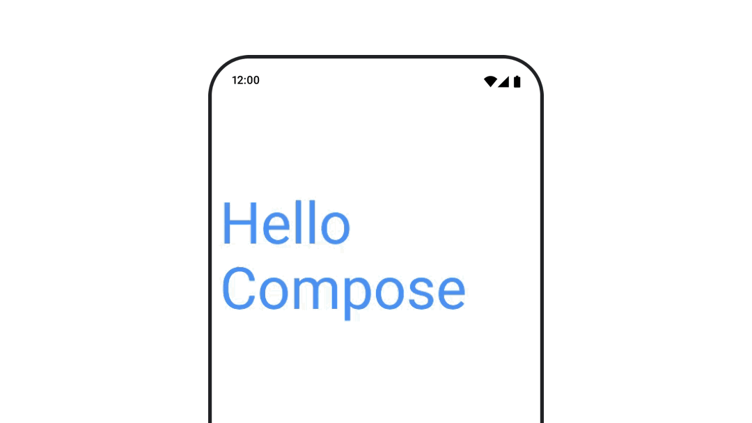
text color 애니메이션
val infiniteTransition = rememberInfiniteTransition(label = "infinite transition")
val animatedColor by infiniteTransition.animateColor(
   initialValue = Color(0xFF60DDAD),
   targetValue = Color(0xFF4285F4),
   animationSpec = infiniteRepeatable(tween(1000), RepeatMode.Reverse),
   label = "color"
)

BasicText(
   text = "Hello Compose",
   color = {
      animatedColor
   },
   // ...
)
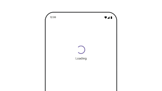
다양한 유형의 콘텐츠 간 전환
다른 Composable 간에 애니메이션을 적용하려면 AnimatedContent를 사용.
커스텀으로 enter/exit transition 정의 가능
var state by remember {
   mutableStateOf(UiState.Loading)
}
AnimatedContent(
   state,
   transitionSpec = {
      fadeIn(
         animationSpec = tween(3000)
      ) togetherWith fadeOut(animationSpec = tween(3000))
   },
   modifier = Modifier.clickable(
      interactionSource = remember { MutableInteractionSource() },
      indication = null
   ) {
      state = when (state) {
         UiState.Loading -> UiState.Loaded
         UiState.Loaded -> UiState.Error
         UiState.Error -> UiState.Loading
      }
   },
   label = "Animated Content"
) { targetState ->
   when (targetState) {
      UiState.Loading -> {
         LoadingScreen()
      }
      UiState.Loaded -> {
         LoadedScreen()
      }
      UiState.Error -> {
         ErrorScreen()
      }
   }
}
navigation에서 different destinations로 이동 애니메이션
navigation composable 사용 시 transition 애니메이션 사용 시 enterTransition/exitTransition을 지정
val navController = rememberNavController()
NavHost(
   navController = navController, startDestination = "landing",
   enterTransition = { EnterTransition.None },
   exitTransition = { ExitTransition.None }
) {
   composable("landing") {
      ScreenLanding(
         // ...
      )
   }
   composable(
      "detail/{photoUrl}",
      arguments = listOf(navArgument("photoUrl") { type = NavType.StringType }),
      enterTransition = {
         fadeIn(
            animationSpec = tween(
               300, easing = LinearEasing
            )
         ) + slideIntoContainer(
            animationSpec = tween(300, easing = EaseIn),
            towards = AnimatedContentTransitionScope.SlideDirection.Start
         )
      },
      exitTransition = {
         fadeOut(
            animationSpec = tween(
               300, easing = LinearEasing
            )
         ) + slideOutOfContainer(
            animationSpec = tween(300, easing = EaseOut),
            towards = AnimatedContentTransitionScope.SlideDirection.End
         )
      }
   ) { backStackEntry ->
      ScreenDetails(
         // ...
      )
   }
}
반복 애니메이션
애니메이션을 계속 반복하려면 infiniteRepeatable animationSpec과 함께 rememberInfiniteTransition을 사용
- 횟수만큼 반복하려면 finiteRepeatable 사용
val infiniteTransition = rememberInfiniteTransition(label = "infinite")
val color by infiniteTransition.animateColor(
   initialValue = Color.Green,
   targetValue = Color.Blue,
   animationSpec = infiniteRepeatable(
      animation = tween(1000, easing = LinearEasing),
      repeatMode = RepeatMode.Reverse
   ),
   label = "color"
)
Column(
   modifier = Modifier.drawBehind {
      drawRect(color)
   }
) {
   // your composable here
}
Composable 실행 시 애니메이션 시작
LaunchedEffect와 Animatable를 animateTo 메서드와 함께 사용하여 애니메이션 시작
val alphaAnimation = remember {
   Animatable(0f)
}
LaunchedEffect(Unit) {
   alphaAnimation.animateTo(1f)
}
Box(
   modifier = Modifier.graphicsLayer {
      alpha = alphaAnimation.value
   }
)
Lazy Layout에서
LaunchedEffects를 사용 시, 아이템이 Composition을 다시 시작하면 재실행된다
순차 애니메이션 만들기
Animatable coroutine API를 사용하여 순차/동시 애니메이션을 실행.
Animatable의 animateTo가 suspend 함수이므로 차례로 호출하면 순차로 진행된다.
val alphaAnimation = remember { Animatable(0f) }
val yAnimation = remember { Animatable(0f) }

LaunchedEffect("animationKey") {
   alphaAnimation.animateTo(1f)
   yAnimation.animateTo(100f)
   yAnimation.animateTo(500f, animationSpec = tween(100))
}
동시 애니메이션 만들기
Coroutine API(Animatable#animateTo() 또는 animate) 또는 Transition API를 사용하여 동시 애니메이션을 구현
val alphaAnimation = remember { Animatable(0f) }
val yAnimation = remember { Animatable(0f) }

LaunchedEffect("animationKey") {
   launch {
      alphaAnimation.animateTo(1f)
   }
   launch {
      yAnimation.animateTo(100f)
   }
}
updateTransition API를 사용하면 동일한 상태를 사용하여 여러 가지 프로퍼티 애니메이션을 동시에 실행 가능
var currentState by remember { mutableStateOf(BoxState.Collapsed) }
val transition = updateTransition(currentState, label = "transition")

val rect by transition.animateRect(label = "rect") { state ->
   when (state) {
      BoxState.Collapsed -> Rect(0f, 0f, 100f, 100f)
      BoxState.Expanded -> Rect(100f, 100f, 300f, 300f)
   }
}
val borderWidth by transition.animateDp(label = "borderWidth") { state ->
   when (state) {
      BoxState.Collapsed -> 1.dp
      BoxState.Expanded -> 0.dp
   }
}
애니메이션 성능 최적화
Compose의 composition, layout, draw 단계가 있으므로, 애니메이션을 draw 단계에서 발생하면 layout 단계에서 실행할 때보다 해야 할 일이 적기 때문에 성능이 더 좋다.
- Modifier의 Lambda를 사용 추천 : Recomposition을 건너뛰고 Composition 단계 외부에서 애니메이션을 수행
- Modifier.graphicsLayer{} : 이 Modifier는 항상 draw 단계에서 실행
애니메이션 시간 변경
Compose는 대부분의 애니메이션에 spring 애니메이션을 사용하여 타이밍을 조정 가능
애니메이션 Modifier와 Composable
기본 애니메이션 Composable
AnimatedVisibility로 나타났다가 사라지는 애니메이션 처리
애니메이션 visibility는 애니메이션이 완료되면 Composition에서 항목을 제거
// 커스텀 EnterTransition/ExitTransition를 지정 가능
var visible by remember { mutableStateOf(true) }
val density = LocalDensity.current
AnimatedVisibility(
   visible = visible,
   enter = slideInVertically {
      // 상단에서 40dp부터 밀어 넣음
      with(density) { -40.dp.roundToPx() }
   } + expandVertically(
      // 위에서부터 펼치기
      expandFrom = Alignment.Top
   ) + fadeIn(
      // 초기 알파 0.3f로 fadeIn
      initialAlpha = 0.3f
   ),
   exit = slideOutVertically() + shrinkVertically() + fadeOut()
) {
   Text("Hello", Modifier.fillMaxWidth().height(200.dp))
}
EnterTransition/ExitTransition 예제
https://developer.android.com/develop/ui/compose/animation/composables-modifiers#enter-exit-transition
AnimatedVisibility는 MutableTransitionState를 사용하는 형태도 가능
AnimatedVisibility가 Composition Tree에 추가되는 즉시 애니메이션을 트리거 가능
// AnimatedVisibility에 대한 MutableTransitionState<Boolean> 생성
val state = remember {
   MutableTransitionState(false).apply {
      // 애니메이션을 즉시 시작
      targetState = true
   }
}
Column {
   AnimatedVisibility(visibleState = state) {
      Text(text = "Hello, world!")
   }

   // MutableTransitionState를 사용하여 AnimatedVisibility의 현재 애니메이션 상태를 확인
   Text(
      text = when {
         state.isIdle && state.currentState -> "Visible"
         !state.isIdle && state.currentState -> "Disappearing"
         state.isIdle && !state.currentState -> "Invisible"
         else -> "Appearing"
      }
   )
}
하위 요소를 위한 enter/exit 애니메이션
AnimatedVisibility 내의 컨텐츠(직접/자식)는 animateEnterExit Modifier 사용하여 각각에 대해 서로 다른 애니메이션 지정가능
- EnterTransition.None/ExitTransition.None : 애니메이션 미적용
var visible by remember { mutableStateOf(true) }

AnimatedVisibility(
   visible = visible,
   enter = fadeIn(),
   exit = fadeOut()
) {
   // background/foreground를 Fade in/out 처리
   Box(Modifier.fillMaxSize().background(Color.DarkGray)) {
      Box(
         Modifier
            .align(Alignment.Center)
            .animateEnterExit(
               // Box에서 Slide in/out 처리
               enter = slideInVertically(),
               exit = slideOutVertically()
            )
            .sizeIn(minWidth = 256.dp, minHeight = 64.dp)
            .background(Color.Red)
      ) {
         // TODO
      }
   }
}
커스텀 애니메이션
var visible by remember { mutableStateOf(true) }

AnimatedVisibility(
   visible = visible,
   enter = fadeIn(),
   exit = fadeOut()
) { // this: AnimatedVisibilityScope
   // AnimatedVisibilityScope#transition을 사용하여 AnimatedVisibility에 커스텀 애니메이션을 추가
   val background by transition.animateColor(label = "color") { state ->
      if (state == EnterExitState.Visible) Color.Blue else Color.Gray
   }
   Box(modifier = Modifier.size(128.dp).background(background))
}
Animate based on target state with AnimatedContent
AnimatedContent composable은 컨텐츠가 변경될 때 애니메이션이 동작
Row {
   var count by remember { mutableStateOf(0) }
   Button(onClick = { count++ }) {
      Text("Add")
   }
   // 기본적으로 fade in/out 애니메이션이 적용
   AnimatedContent(targetState = count) { targetCount ->
      // count 대신 targetCount를 사용해야 함
      Text(text = "Count: $targetCount")
   }
}
transitionSpec 파라미터에 ContentTransform 객체를 지정하여 커스텀 애니메이션 정의 가능
AnimatedContent(
    targetState = count,
    transitionSpec = {
        // 수신 번호와 이전 번호를 비교
        if (targetState > initialState) {
            // target 숫자가 더 크면 Slide up + Fade in
            // 초기(작은) 숫자는 Slide Up + Fade out
            slideInVertically { height -> height } + fadeIn() with
                slideOutVertically { height -> -height } + fadeOut()
        } else {
            // target 숫자가 더 작으면 Slide down + Fade in
            // 초기 숫자는 Slide down + Fade out
            slideInVertically { height -> -height } + fadeIn() with
                slideOutVertically { height -> height } + fadeOut()
        }.using(
            // Slide in/out이 범위를 벗어나므로 클리핑을 비활성화
            SizeTransform(clip = false)
        )
    }
) { targetCount ->
    Text(text = "$targetCount")
}
- EnterTransition : 컨텐츠가 표시되는 방식 정의
- ExitTransition : 컨텐츠가 사라지는 방식 정의
SizeTransform: 초기 컨텐츠와 타겟 컨텐츠 사이에 크기 애니메이션되는 방식을 정의
var expanded by remember { mutableStateOf(false) }
Surface(
   color = MaterialTheme.colorScheme.primary,
   onClick = { expanded = !expanded }
) {
   AnimatedContent(
      targetState = expanded,
      transitionSpec = {
         fadeIn(animationSpec = tween(150, 150)) with
            fadeOut(animationSpec = tween(150)) using
            SizeTransform { initialSize, targetSize ->
               if (targetState) {
                  keyframes {
                     // 먼저 가로로 확장
                     IntSize(targetSize.width, initialSize.height) at 150
                     durationMillis = 300
                  }
               } else {
                  keyframes {
                     // 먼저 세로로 축소
                     IntSize(initialSize.width, targetSize.height) at 150
                     durationMillis = 300
                  }
               }
            }
      }
   ) { targetExpanded ->
      if (targetExpanded) {
         Expanded()
      } else {
         ContentIcon()
      }
   }
}
하위 요소의 enter/exit transition
animateEnterExit Modifier로 EnterAnimation/ExitAnimation 적용 가능
커스텀 애니메이션
transition 필드는 AnimatedContent 컨텐츠 람다 내에서 사용
AnimatedContent 전환과 동시에 실행되는 맞춤 애니메이션 효과를 만드는 데 사용
Crossfade를 사용하여 두 레이아웃 간 애니메이션 처리
crossfade 애니메이션을 사용하여 두 레이아웃 사이의 전환을 애니메이션 처리
var currentPage by remember { mutableStateOf("A") }
Crossfade(targetState = currentPage) { screen ->
   when (screen) {
      "A" -> Text("Page A")
      "B" -> Text("Page B")
   }
}
기본 제공 애니메이션 modifiers
animateContentSize를 사용하여 Composable 크기 변경에 애니메이션 적용
var expanded by remember { mutableStateOf(false) }
Box(
   modifier = Modifier
      .background(colorBlue)
      .animateContentSize()
      .height(if (expanded) 400.dp else 200.dp)
      .fillMaxWidth()
      .clickable(
          interactionSource = remember { MutableInteractionSource() },
          indication = null
      ) {
          expanded = !expanded
      }
) {
}
Value 기반 애니메이션
animate*AsState를 사용하여 단일 값에 애니메이션 적용
animate*AsState 함수 : 단일 값을 처리하는 간단한 애니메이션 API
- 내부적으로
Animatable첫 번째 값을 초기 값으로 사용하여서 애니메이션 개체가 생성되고 기억 - 기본 제공되는 타입 : Float, Color, Dp, Size, Offset, Rect, Int, IntOffset, IntSize
// alpha 애니메이션
var enabled by remember { mutableStateOf(true) }
val alpha: Float by animateFloatAsState(if (enabled) 1f else 0.5f)
Box(
   Modifier.fillMaxSize()
      .graphicsLayer(alpha = alpha)
      .background(Color.Red)
)
애니메이션 중에 이 Composable은 Recomposition되고 매 프레임마다 업데이트된 애니메이션 값을 반환
transition으로 여러 속성에 동시 애니메이션 적용
Transition는 하나 이상의 애니메이션을 하위 요소로 관리하고 여러 상태 간에 동시 실행
updateTransition는 Transition 인스턴스를 생성+기억하며 상태를 업데이트
var currentState by remember { mutableStateOf(BoxState.Collapsed) }
val transition = updateTransition(currentState, label = "box state")

val rect by transition.animateRect(label = "rectangle") { state ->
   when (state) {
      BoxState.Collapsed -> Rect(0f, 0f, 100f, 100f)
      BoxState.Expanded -> Rect(100f, 100f, 300f, 300f)
   }
}
val borderWidth by transition.animateDp(label = "border width") { state ->
   when (state) {
      BoxState.Collapsed -> 1.dp
      BoxState.Expanded -> 0.dp
   }
}
transitionSpec 파라미터를 전달하여 서로 다른 애니메이션 스펙 대응 가능
val color by transition.animateColor(
   transitionSpec = {
      when {
         BoxState.Expanded isTransitioningTo BoxState.Collapsed ->
            spring(stiffness = 50f)
         else ->
            tween(durationMillis = 500)
      }
   }, label = "color"
) { state ->
   when (state) {
      BoxState.Collapsed -> MaterialTheme.colorScheme.primary
      BoxState.Expanded -> MaterialTheme.colorScheme.background
   }
}
Collapsed 상태에서 시작하여 즉시 Expanded 상태로 애니메이션 적용
var currentState = remember { MutableTransitionState(BoxState.Collapsed) }
currentState.targetState = BoxState.Expanded
val transition = updateTransition(currentState, label = "box state")
// ……
좀 더 복잡한 transition의 경우 createChildTransition을 사용하여 하위 transition 가능
enum class DialerState { DialerMinimized, NumberPad }

@Composable
fun DialerButton(isVisibleTransition: Transition<Boolean>) {
   ...
}

@Composable
fun NumberPad(isVisibleTransition: Transition<Boolean>) {
   ...
}

@Composable
fun Dialer(dialerState: DialerState) {
   val transition = updateTransition(dialerState, label = "dialer state")
   Box {
      // NumberPad/DialerButton에 별도의 하위 transition 생성
      NumberPad(
         transition.createChildTransition {
            it == DialerState.NumberPad
         }
      )
      DialerButton(
         transition.createChildTransition {
            it == DialerState.DialerMinimized
         }
      )
   }
}
AnimatedVisibility 및 AnimatedContent로 transition 사용
AnimatedVisibility와 AnimatedContent는 Transition의 확장 함수로도 사용 가능
var selected by remember { mutableStateOf(false) }
val transition = updateTransition(selected, label = "selected state")
val borderColor by transition.animateColor(label = "border color") { isSelected ->
if (isSelected) Color.Magenta else Color.White
}
val elevation by transition.animateDp(label = "elevation") { isSelected ->
if (isSelected) 10.dp else 2.dp
}
Surface(
onClick = { selected = !selected },
shape = RoundedCornerShape(8.dp),
border = BorderStroke(2.dp, borderColor),
elevation = elevation
) {
Column(modifier = Modifier.fillMaxWidth().padding(16.dp)) {
Text(text = "Hello, world!")
// AnimatedVisibility as a part of the transition.
transition.AnimatedVisibility(
visible = { targetSelected -> targetSelected },
enter = expandVertically(),
exit = shrinkVertically()
) {
Text(text = "It is fine today.")
}
// AnimatedContent as a part of the transition.
transition.AnimatedContent { targetState ->
if (targetState) {
Text(text = "Selected")
} else {
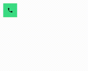
Icon(imageVector = Icons.Default.Phone, contentDescription = "Phone")
}
}
}
}
transition을 캡슐화하고 재사용 가능하도록 설정
여러 애니메이션 값으로 구성된 복잡한 구성요소를 사용하는 경우 애니메이션 구현을 Composable UI와 분리
- 애니메이션 로직을 중앙집중식으로 처리하거나 복잡한 애니메이션을 재사용 가능하도록 설정해야 하는 경우에 유용
enum class BoxState { Collapsed, Expanded }

@Composable
fun AnimatingBox(boxState: BoxState) {
   val transitionData = updateTransitionData(boxState)
   Box(
      modifier = Modifier
         .background(transitionData.color)
         .size(transitionData.size)
   )
}

// animation value 보유
private class TransitionData(
   color: State<Color>,
   size: State<Dp>
) {
   val color by color
   val size by size
}

// Transition을 생성하고 애니메이션 값을 반환
@Composable
private fun updateTransitionData(boxState: BoxState): TransitionData {
   val transition = updateTransition(boxState, label = "box state")
   val color = transition.animateColor(label = "color") { state ->
      when (state) {
         BoxState.Collapsed -> Color.Gray
         BoxState.Expanded -> Color.Red
      }
   }
   val size = transition.animateDp(label = "size") { state ->
      when (state) {
         BoxState.Collapsed -> 64.dp
         BoxState.Expanded -> 128.dp
      }
   }
   return remember(transition) { TransitionData(color, size) }
}
rememberInfiniteTransition로 무한 반복되는 애니메이션 만들기
InfiniteTransition에는 Transition와 같은 하위 애니메이션이 하나 이상 포함되지만, Composition을 시작하자마자 애니메이션이 실행되기 시작하며 삭제되지 않는 한 중지되지 않음
- animateColor, animatedFloat, animatedValue 사용 가능
val infiniteTransition = rememberInfiniteTransition()
val color by infiniteTransition.animateColor(
   initialValue = Color.Red,
   targetValue = Color.Green,
   animationSpec = infiniteRepeatable(
      animation = tween(1000, easing = LinearEasing),
      repeatMode = RepeatMode.Reverse
   )
)

Box(Modifier.fillMaxSize().background(color))
하위 수준 Animation API
모든 상위 수준 Animation API는 하위 수준 Animation API를 기반으로 빌드
Animatable을 제외하고 모두 Composable이며, 컴포지션 외부에서 이러한 애니메이션 생성 가능

Animatable: 코루틴 기반 단일 값 애니메이션
Animatable는 값이 animateTo를 통해 변경될 때 값을 애니메이션으로 표시할 수 있는 값 홀더
- 기능이 suspend로 제공
animate*AsState구현을 지원하는 API
// Start out gray and animate to green/red based on `ok`
val color = remember { Animatable(Color.Gray) }
LaunchedEffect(ok) {
    color.animateTo(if (ok) Color.Green else Color.Red)
}
Box(Modifier.fillMaxSize().background(color.value))
Animatable
- 첫 번째 타겟 값과 다른 초깃값을 설정 가능
Animatable은 콘텐츠 값에 관한 추가 작업(snapTo및animateDecay)을 제공snapTo는 현재 값을 즉시 타겟 값으로 설정
Animation : 수동 제어 애니메이션
Animation은 사용 가능한 가장 낮은 수준의 애니메이션 API
Animation은 애니메이션 시간을 수동으로 제어하는 데만 사용해야 함. Stateless이고 수명 주기 개념이 없다.
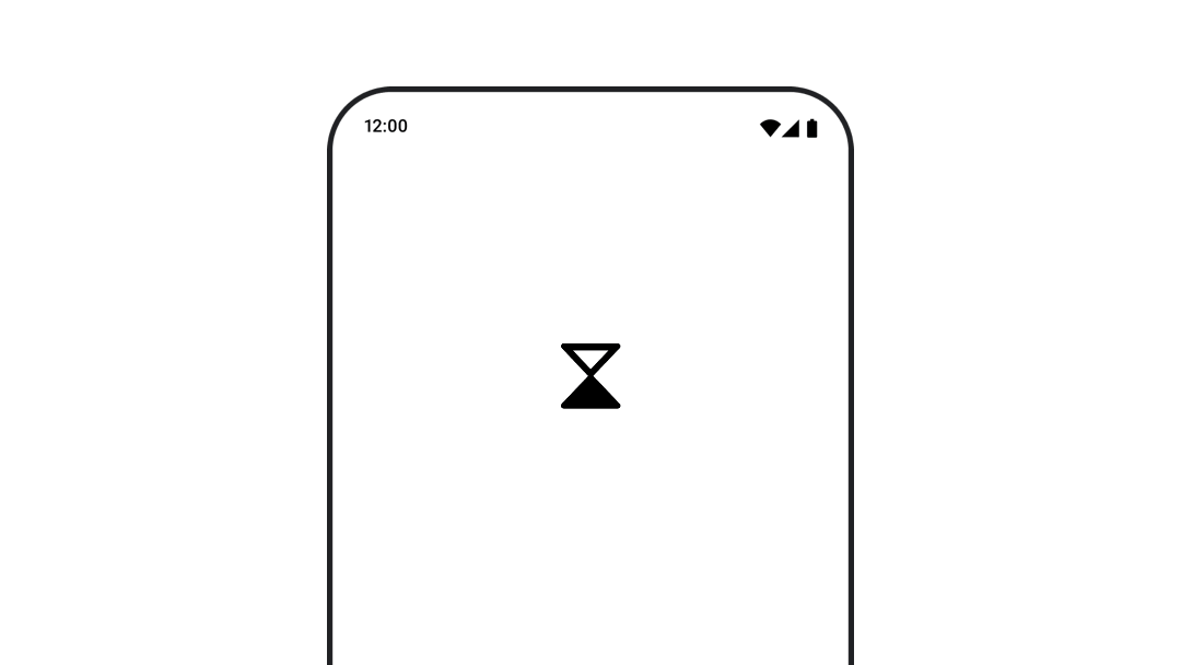
Compose의 애니메이션 벡터 이미지
벡터 이미지 적용하는 방법
AnimatedVectorDrawable파일 형식 (실험 버전)- Compose Animation API의
ImageVector - Lottie와 외부 라이브러리
// AnimatedImageVector 사용 예시
@Composable
fun AnimatedVectorDrawable() {
   val image = AnimatedImageVector.animatedVectorResource(R.drawable.ic_hourglass_animated)
   var atEnd by remember { mutableStateOf(false) }
   Image(
      painter = rememberAnimatedVectorPainter(image, atEnd),
      contentDescription = "Timer",
      modifier = Modifier.clickable {
         atEnd = !atEnd
      },
      contentScale = ContentScale.Crop
   )
}
고급 애니메이션의 예시
고급 애니메이션 예시: 제스처
@Composable
fun Gesture() {
   val offset = remember { Animatable(Offset(0f, 0f), Offset.VectorConverter) }
   Box(
      modifier = Modifier
         .fillMaxSize()
         .pointerInput(Unit) {
            coroutineScope {
               while (true) {
                  // 탭 이벤트를 감지하고 위치를 파악
                  awaitPointerEventScope {
                     val position = awaitFirstDown().position

                     launch {
                        // 탭 위치에 애니메이션을 적용
                        offset.animateTo(position)
                     }
                  }
               }
            }
         }
   ) {
      Circle(modifier = Modifier.offset { offset.value.toIntOffset() })
   }
}

private fun Offset.toIntOffset() = IntOffset(x.roundToInt(), y.roundToInt())
애니메이션 값을 드래그와 같은 터치 이벤트에서 발생하는 값과 동기화하기
SwipeToDismissComposable 대신 Modifier로 구현
fun Modifier.swipeToDismiss(
   onDismissed: () -> Unit
): Modifier = composed {
   val offsetX = remember { Animatable(0f) }
   pointerInput(Unit) {
      // fling decay를 계산하는 데 사용
      val decay = splineBasedDecay<Float>(this)
      // 터치 이벤트 및 Animatable에 일시 중단 기능을 사용
      coroutineScope {
         while (true) {
            val velocityTracker = VelocityTracker()
            // 진행 중인 애니메이션을 중지
            offsetX.stop()
            awaitPointerEventScope {
               // 터치다운 이벤트 감지
               val pointerId = awaitFirstDown().id

               horizontalDrag(pointerId) { change ->
                  // 터치 이벤트로 애니메이션 값을 업데이트
                  launch {
                     offsetX.snapTo(
                        offsetX.value + change.positionChange().x
                     )
                  }
                  velocityTracker.addPosition(
                     change.uptimeMillis,
                     change.position
                  )
               }
            }
            // 더 이상 터치 이벤트를 수신하지 않는다. 애니메이션을 준비
            val velocity = velocityTracker.calculateVelocity().x
            val targetOffsetX = decay.calculateTargetValue(
               offsetX.value,
               velocity
            )
            // 애니메이션은 경계에 도달하면 중지
            offsetX.updateBounds(
               lowerBound = -size.width.toFloat(),
               upperBound = size.width.toFloat()
            )
            launch {
               if (targetOffsetX.absoluteValue <= size.width) {
                  // 속도가 충분하지 않으므로 뒤로 슬라이드
                  offsetX.animateTo(
                     targetValue = 0f,
                     initialVelocity = velocity
                  )
               } else {
                  // element가 스와이프 됨
                  offsetX.animateDecay(velocity, decay)
                  onDismissed()
               }
            }
         }
      }
   }
   .offset { IntOffset(offsetX.value.roundToInt(), 0) }
}
커스텀 애니메이션
AnimationSpec 파라미터로 애니메이션 커스텀
대부분의 Animation API에서 AnimationSpec 파라미터로 애니메이션 사양을 커스텀 가능
val alpha: Float by animateFloatAsState(
   targetValue = if (enabled) 1f else 0.5f,
   // 애니메이션 duration/easing 정의
   animationSpec = tween(durationMillis = 300, easing = FastOutSlowInEasing)
)
spring로 물리 기반 애니메이션 만들기
시작 값과 끝 값 사이에 물리학 기반 애니메이션 생성
- dampingRatio : 스프링의 탄성 (기본값 Spring.DampingRatioNoBouncy)
- stiffness : 스프링이 종료 값으로 이동하는 속도 (기본값 Spring.StiffnessMedium)
val value by animateFloatAsState(
   targetValue = 1f,
   animationSpec = spring(
      dampingRatio = Spring.DampingRatioHighBouncy,
      stiffness = Spring.StiffnessMedium
   )
)
spring은 애니메이션 도중 타겟 값이 변경될 때 속도의 연속성을 보장하므로 AnimationSpec 유형보다 원활하게 중단을 처리 가능
비교 영상 : https://developer.android.com/static/develop/ui/compose/images/animations/tween_vs_spring.mp4
tween를 사용하여 easing 곡선으로 시작/끝 값 간 애니메이션 처리
easing 곡선을 사용하여 지정된 durationMillis 동안 시작 값과 끝 값 간에 애니메이션을 처리
val value by animateFloatAsState(
   targetValue = 1f,
   animationSpec = tween(
      durationMillis = 300,
      delayMillis = 50, // 애니메이션 시작 연기
      easing = LinearOutSlowInEasing
   )
)
keyframes를 사용하여 특정 타이밍에서 특정 값에 애니메이션 적용
애니메이션 기간에 여러 타임스탬프에서 지정된 스냅샷 값을 기반으로 애니메이션을 처리
- 키프레임마다 easing을 지정하여 보간 곡선을 지정 가능
val value by animateFloatAsState(
   targetValue = 1f,
   animationSpec = keyframes {
      durationMillis = 375
      0.0f at 0 with LinearOutSlowInEasing // for 0-15 ms
      0.2f at 15 with FastOutLinearInEasing // for 15-75 ms
      0.4f at 75 // ms
      0.4f at 225 // ms
   }
)
repeatable로 애니메이션 반복
지정된 반복 횟수에 도달할 때까지 애니메이션을 반복 실행
- repeatable API
val value by animateFloatAsState(
   targetValue = 1f,
   animationSpec = repeatable(
      iterations = 3,
      animation = tween(durationMillis = 300),
      repeatMode = RepeatMode.Reverse // 애니메이션 반복 방법
   )
)
infiniteRepeatable로 애니메이션 무한 반복
val value by animateFloatAsState(
   targetValue = 1f,
   animationSpec = infiniteRepeatable(
      animation = tween(durationMillis = 300),
      repeatMode = RepeatMode.Reverse
   )
)
snap를 사용하여 즉시 끝 값에 맞추기
값을 즉시 최종 값으로 전환하는 특수 AnimationSpec
val value by animateFloatAsState(
   targetValue = 1f,
   animationSpec = snap(delayMillis = 50)
)
커스텀 easing 함수 설정
easing은 0과 1.0 사이의 분수 값을 가져와 부동 소수점 수를 반환하는 함수
기본 제공 Easing
- FastOutSlowInEasing
- LinearOutSlowInEasing
- FastOutLinearEasing
- LinearEasing
- CubicBezierEasing
- 기타
val CustomEasing = Easing { fraction -> fraction * fraction }

@Composable
fun EasingUsage() {
   val value by animateFloatAsState(
      targetValue = 1f,
      animationSpec = tween(
         durationMillis = 300,
         easing = CustomEasing
      )
   )
   // ……
}
AnimationVector로 변환하여 커스텀 데이터 유형에 애니메이션 적용
애니메이션 중에 모든 애니메이션 값은 AnimationVector로 표시
값은 애니메이션 시스템이 균일하게 처리할 수 있도록 TwoWayConverter에 의해 AnimationVector로 변환되며 그 반대로도 변환
val IntToVector: TwoWayConverter<Int, AnimationVector1D> =
   TwoWayConverter({ AnimationVector1D(it.toFloat()) }, { it.value.toInt() })
Color는 빨간색, 녹색, 파란색, 알파 등 네 값의 집합이므로 AnimationVector4D로 변환
Color.VectorConverterDp.VectorConverterOffset.VectorConverterInt.VectorConverterFloat.VectorConverterIntSize.VectorConverter
data class MySize(val width: Dp, val height: Dp)

@Composable
fun MyAnimation(targetSize: MySize) {
   val animSize: MySize by animateValueAsState(
      targetSize,
      TwoWayConverter(
         convertToVector = { size: MySize ->
            // 각 `Dp` 필드에서 float 값을 추출
            AnimationVector2D(size.width.value, size.height.value)
         },
         convertFromVector = { vector: AnimationVector2D ->
            MySize(vector.v1.dp, vector.v2.dp)
         }
      )
   )
}
Shared Element
상위 수준 API
SharedTransitionLayout: shared element transitions을 구현하는 데 필요한 가장 바깥쪽 레이아웃SharedTransitionScope를 제공- shared element modifiers를 사용하려면 Composable이
SharedTransitionScope에 있어야 함
Modifier.sharedElement(): 다른 Composable과 일치해야 하는 Composable을SharedTransitionScope에 표시하는 modifierModifier.sharedBounds(): Composable의 경계가 transition이 발생해야 하는 컨테이너 경계로 사용되어야 함을SharedTransitionScope에 알리는 modifiersharedElement()와 달리sharedBounds()는 시각적으로 다른 컨텐츠 용도
기본 사용법
var showDetails by remember {
   mutableStateOf(false)
}
SharedTransitionLayout {
   AnimatedContent(
      showDetails,
      label = "basic_transition"
   ) { targetState ->
      if (!targetState) {
         MainContent(
            onShowDetails = {
               showDetails = true
            },
            animatedVisibilityScope = this@AnimatedContent,
            sharedTransitionScope = this@SharedTransitionLayout
         )
      } else {
         DetailsContent(
            onBack = {
               showDetails = false
            },
            animatedVisibilityScope = this@AnimatedContent,
            sharedTransitionScope = this@SharedTransitionLayout
         )
      }
   }
}

@Composable
private fun MainContent(
   onShowDetails: () -> Unit,
   modifier: Modifier = Modifier,
   sharedTransitionScope: SharedTransitionScope,
   animatedVisibilityScope: AnimatedVisibilityScope
) {
   Row(
      // ...
   ) {
      with(sharedTransitionScope) {
         Image(
            painter = painterResource(id = R.drawable.cupcake),
            contentDescription = "Cupcake",
            modifier = Modifier
               .sharedElement(
                  rememberSharedContentState(key = "image"),
                  animatedVisibilityScope = animatedVisibilityScope
               )
               .size(100.dp)
               .clip(CircleShape),
            contentScale = ContentScale.Crop
         )
         // ...
      }
   }
}

@Composable
private fun DetailsContent(
   modifier: Modifier = Modifier,
   onBack: () -> Unit,
   sharedTransitionScope: SharedTransitionScope,
   animatedVisibilityScope: AnimatedVisibilityScope
) {
   Column(
      // ...
   ) {
      with(sharedTransitionScope) {
         Image(
            painter = painterResource(id = R.drawable.cupcake),
            contentDescription = "Cupcake",
            modifier = Modifier
               .sharedElement(
                  rememberSharedContentState(key = "image"),
                  animatedVisibilityScope = animatedVisibilityScope
               )
               .size(200.dp)
               .clip(CircleShape),
            contentScale = ContentScale.Crop
         )
         // ...
      }
   }
}
Shared bounds와 shared element 비교
Modifier.sharedBounds()는 Modifier.sharedElement()와 유사
sharedBounds()는 시각적으로 다르지만 상태 간에 동일한 영역을 공유하는 용도.sharedElement()는 컨텐츠가 동일할 것으로 예상sharedBounds()를 사용하면 두 상태 사이를 전환하는 동안 화면에 enter/exit 컨텐츠가 표시.sharedElement()를 사용하면 대상 컨텐츠만 변형 바운드에 렌더링- Modifier.sharedBounds()에는 컨텐츠 전환 방식 정의용 enter/exit 파라미터가 존재
- sharedBounds()는 container transform pattern. sharedElement()는 hero transition용
- Text composable에서의 이탤릭체/bold/색상 변경 등의 글꼴 변경은
sharedBounds()를 추천
Modifier.sharedBounds() 샘플
@Composable
private fun MainContent(
   onShowDetails: () -> Unit,
   modifier: Modifier = Modifier,
   sharedTransitionScope: SharedTransitionScope,
   animatedVisibilityScope: AnimatedVisibilityScope
) {
   with(sharedTransitionScope) {
      Row(
         modifier = Modifier
            .padding(8.dp)
            .sharedBounds(
               rememberSharedContentState(key = "bounds"),
               animatedVisibilityScope = animatedVisibilityScope,
               enter = fadeIn(),
               exit = fadeOut(),
               resizeMode = SharedTransitionScope.ResizeMode.ScaleToBounds()
            )
            // ...
      ) {
         // ...
      }
   }
}

@Composable
private fun DetailsContent(
   modifier: Modifier = Modifier,
   onBack: () -> Unit,
   sharedTransitionScope: SharedTransitionScope,
   animatedVisibilityScope: AnimatedVisibilityScope
) {
   with(sharedTransitionScope) {
      Column(
         modifier = Modifier
            .padding(top = 200.dp, start = 16.dp, end = 16.dp)
            .sharedBounds(
               rememberSharedContentState(key = "bounds"),
               animatedVisibilityScope = animatedVisibilityScope,
               enter = fadeIn(),
               exit = fadeOut(),
               resizeMode = SharedTransitionScope.ResizeMode.ScaleToBounds()
            )
            // ...
      ) {
         // ...
      }
   }
}
추가 리소스
애니메이션 치트 시트
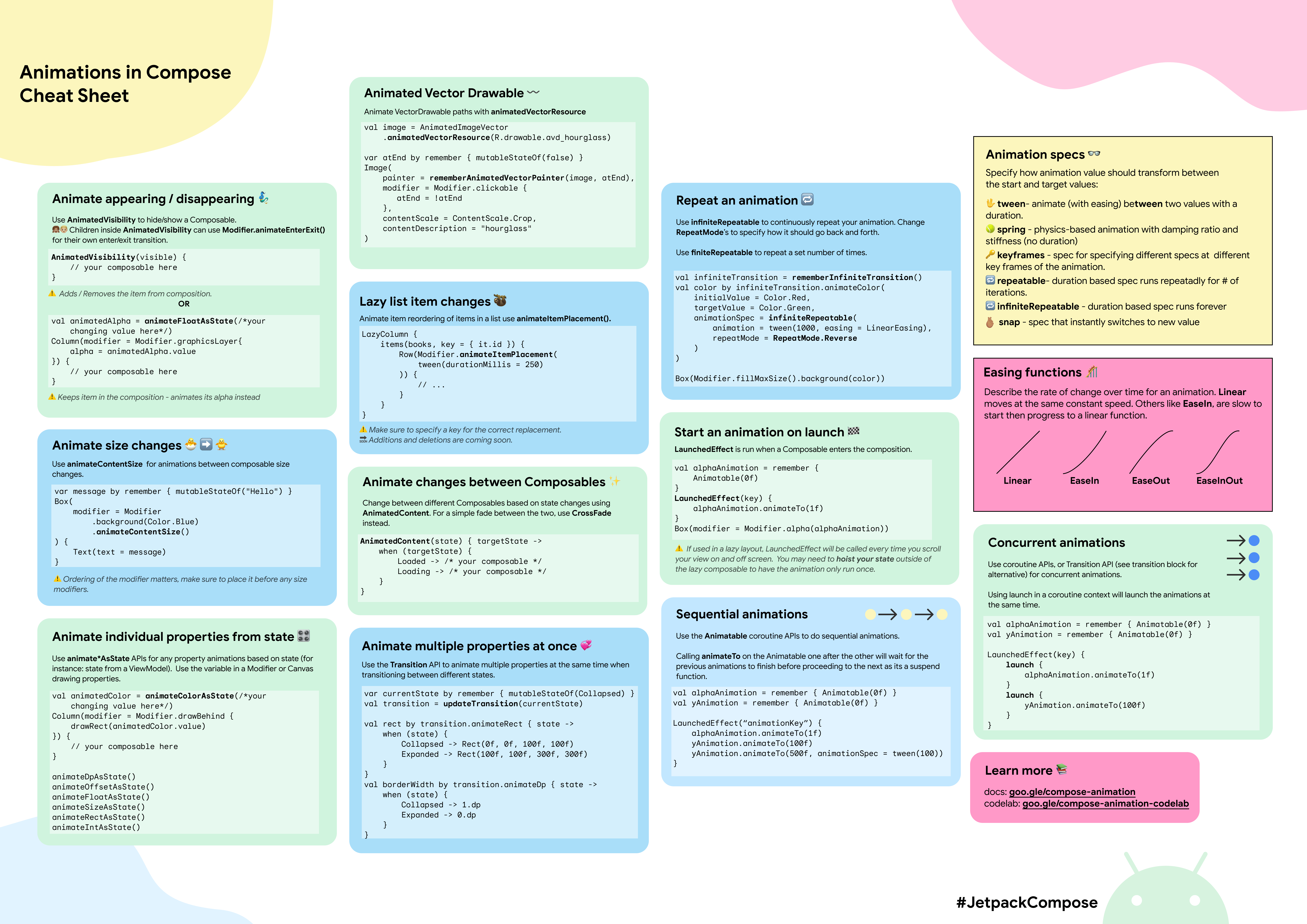
원본 링크 : https://developer.android.com/develop/ui/compose/animation/resources
Subscribe
Subscribe to this blog via RSS.
Categories
Recent Posts
- Posted on 08 Jun 2026
- Posted on 19 Apr 2026
- Posted on 15 Mar 2026
- Posted on 10 Mar 2026