[메모] Compose 가이드 문서 ~ Components
Component에서 사용하는 컬러는 ColorSchemeKeyTokens에서 정의된 enum과 ColorScheme를 매칭해서 사용
internal fun ColorScheme.fromToken(value: ColorSchemeKeyTokens): Color {
   return when (value) {
      ColorSchemeKeyTokens.Background -> background
      ColorSchemeKeyTokens.Error -> error
      ColorSchemeKeyTokens.ErrorContainer -> errorContainer
      ColorSchemeKeyTokens.InverseOnSurface -> inverseOnSurface
      ColorSchemeKeyTokens.InversePrimary -> inversePrimary
      ColorSchemeKeyTokens.InverseSurface -> inverseSurface
      ColorSchemeKeyTokens.OnBackground -> onBackground
      ColorSchemeKeyTokens.OnError -> onError
      ColorSchemeKeyTokens.OnErrorContainer -> onErrorContainer
      ColorSchemeKeyTokens.OnPrimary -> onPrimary
      ColorSchemeKeyTokens.OnPrimaryContainer -> onPrimaryContainer
      ColorSchemeKeyTokens.OnSecondary -> onSecondary
      ColorSchemeKeyTokens.OnSecondaryContainer -> onSecondaryContainer
      ColorSchemeKeyTokens.OnSurface -> onSurface
      ColorSchemeKeyTokens.OnSurfaceVariant -> onSurfaceVariant
      ColorSchemeKeyTokens.SurfaceTint -> surfaceTint
      ColorSchemeKeyTokens.OnTertiary -> onTertiary
      ColorSchemeKeyTokens.OnTertiaryContainer -> onTertiaryContainer
      ColorSchemeKeyTokens.Outline -> outline
      ColorSchemeKeyTokens.OutlineVariant -> outlineVariant
      ColorSchemeKeyTokens.Primary -> primary
      ColorSchemeKeyTokens.PrimaryContainer -> primaryContainer
      ColorSchemeKeyTokens.Scrim -> scrim
      ColorSchemeKeyTokens.Secondary -> secondary
      ColorSchemeKeyTokens.SecondaryContainer -> secondaryContainer
      ColorSchemeKeyTokens.Surface -> surface
      ColorSchemeKeyTokens.SurfaceVariant -> surfaceVariant
      ColorSchemeKeyTokens.Tertiary -> tertiary
      ColorSchemeKeyTokens.TertiaryContainer -> tertiaryContainer
   }
}
Material 3 기준으로 정리됨
App bars

TopAppBar → (private) SingleRowTopAppBar
- SingleRowTopAppBar에 centeredTitle를 false로 전달
CenterAlignedTopAppBar → (private) SingleRowTopAppBar
- SingleRowTopAppBar에 centeredTitle를 true로 전달
MediumTopAppBar → (private) TwoRowsTopAppBar
LargeTopAppBar → (private) TwoRowsTopAppBar
- 주로 MediumTopAppBar/LargeTopAppBar 둘 다 Collapsed/Expanded 관련 높이값을 다르게 대응
Button

Filled button : Button → Filled button
Outlined button : OutlinedButton → Button
- shape: Shape = ButtonDefaults.outlinedShape
- colors: ButtonColors = ButtonDefaults.outlinedButtonColors()
- border: BorderStroke? = ButtonDefaults.outlinedButtonBorder(enabled)
FAB

FAB / Small / Large / Extended 종류 있음
FAB : FloatingActionButton → Surface + Box
SmallFloatingActionButton → FloatingActionButton
- modifier로 sizeIn API 사용
FloatingActionButton(
   ...
   modifier = modifier.sizeIn(
      minWidth = FabPrimarySmallTokens.ContainerWidth,
      minHeight = FabPrimarySmallTokens.ContainerHeight,
   ),
)
LargeFloatingActionButton → FloatingActionButton
- modifier로 sizeIn API 사용
ExtendedFloatingActionButton → FloatingActionButton → Row + AnimatedVisibility 조합
Card

Card → Surface + Column
ElevatedCard → Card
OutlinedCard → Card
Chip

AssistChip → (private) Chip
- Chip의 왼쪽에 아이콘 (leadingIcon)을 표시
FilterChip → (private) SelectableChip
- Chip 선택 여부를 표시 (selected 파라미터)
- leadingIcon
InputChip → (private) SelectableChip
SuggestionChip → (private) Chip
- 가장 기본적인 Chip
Dialog

(expect) AlertDialog → (internal) AlertDialogImpl
- title: 대화 상자 상단에 표시
- text: 대화 상자 내 중앙에 표시
- icon: 대화 상자 상단에 표시
- onDismissRequest: Dialog를 닫을 때 호출되는 함수
- dismissButton: 닫기 버튼
- confirmButton: 확인 버튼
Dialog → DialogWrapper + DialogLayout
- 복잡한 케이스는 Dialog Composable를 활용
DialogProperties : Dialog의 동작을 커스텀시 사용되는 속성
- dismissOnBackPress: Boolean : 뒤로 버튼을 눌러 Dialog을 닫을 수 있는지 여부
- dismissOnClickOutside: Boolean : 경계 밖을 클릭하여 Dialog를 닫을 수 있는지 여부
- securePolicy: SecureFlagPolicy : Dialog에 WindowManager.LayoutParams.FLAG_SECURE를 설정
- usePlatformDefaultWidth: Boolean : Dialog의 width를 화면 width보다 작은 플랫폼 기본값으로 제한할지 여부
- decorFitsSystemWindows: Boolean : WindowCompat.setDecorFitsSystemWindows 값 설정 여부
Progress indicators

progress indicator 타입
- Determinate : 얼마나 진행되었는지 표시
- Indeterminate : 진행 상황에 관계없는 애니메이션
표시 형태
- Linear : LinearProgressIndicator → Canvas
- Circular : CircularProgressIndicator → Canvas
Slider
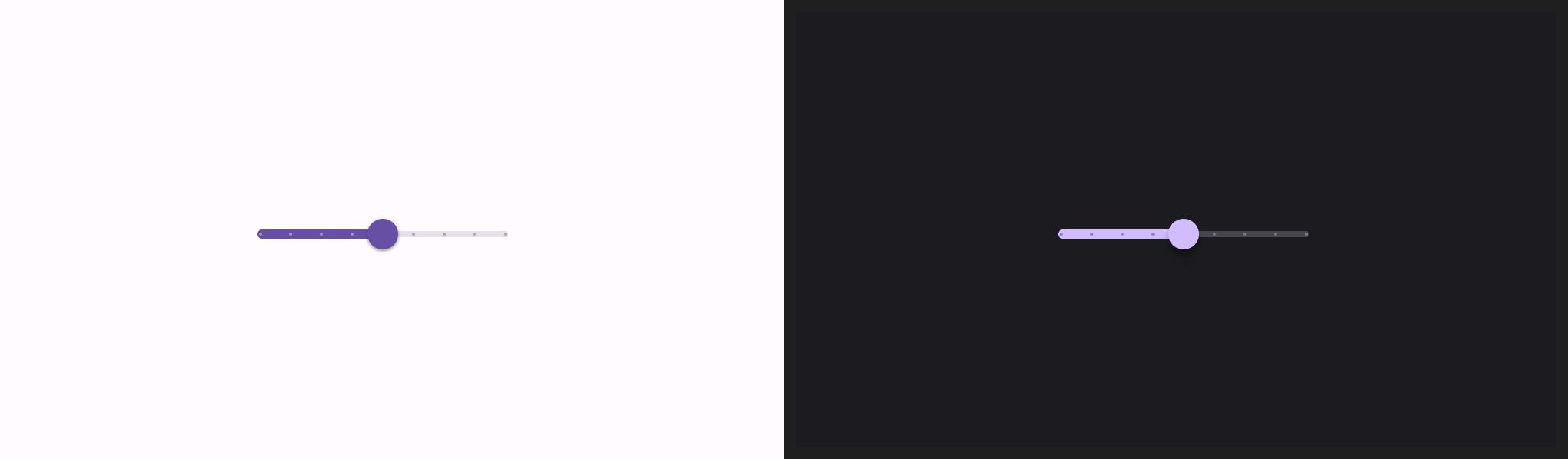
Slider → (private) SliderImpl
- steps : slider의 notche 수
- valueRange : slider가 취할 수 있는 값의 범위 (기본 : 0.0 ~ 1.0)
- onValueChange : 값이 변경될 때마다 호출되는 람다
RangeSlider → (private) RangeSliderImpl
Switch
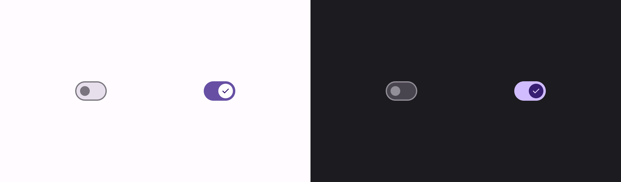
Switch → (private) SwitchImpl
- thumbContent : thumb 모양을 정의
- onCheckedChange : Switch 상태가 변경될 때 호출되는 콜백
Checkbox

Checkbox → TriStateCheckbox
- checked 파라미터의 true/false에 따라서 ToggleableState On/Off로 변환하여 TriStateCheckbox를 호출
TriStateCheckbox → CheckboxImpl
Bottom sheets
ModalBottomSheet → ModalBottomSheetDialog + Column
- SheetState를 사용하여 ModalBottomSheet의 Swipe 위치와 관련된 상태/애니메이션을 포함
Navigation drawer
Slide-in Menu 형태의 Composable : ModalNavigationDrawer
- drawerContent : Drawer에 노출할 컨텐츠
- content : Screen에 노출할 컨텐츠
- gesturesEnabled : 제스처로 drag할 지 여부
DrawerState로 Drawer를 제어
Snackbar
화면 하단에 표시하는 알림 형태
- 스낵바를 구현하려면 먼저 SnackbarHost 속성을 포함하는 SnackbarHostState를 생성
- SnackbarHostState는 Snackbar를 표시하는 데 사용할 수 있는
showSnackbar()함수 제공
Scaffold의 snackbarHost에 SnackbarHostState를 전달해서 사용 가능
val scope = rememberCoroutineScope()
val snackbarHostState = remember { SnackbarHostState() }
Scaffold(
   snackbarHost = {
      SnackbarHost(hostState = snackbarHostState)
   },
   floatingActionButton = {
      ExtendedFloatingActionButton(
         text = { Text("Show snackbar") },
         icon = { Icon(Icons.Filled.Image, contentDescription = "") },
         onClick = {
            // Case1. 단일 텍스트 노출
            scope.launch {
               snackbarHostState.showSnackbar("Snackbar")
            }

            // Case2. Action이 있는 형태
            val result = snackbarHostState
               .showSnackbar(
                  message = "Snackbar",
                  actionLabel = "Action",
                  // Defaults to SnackbarDuration.Short
                  duration = SnackbarDuration.Indefinite
               )
            when (result) {
               SnackbarResult.ActionPerformed -> {
                  /* Handle snackbar action performed */
               }
               SnackbarResult.Dismissed -> {
                  /* Handle snackbar dismissed */
               }
            }
         }
      )
   }
) { contentPadding ->
   // Screen content
}
Lists and grids
Column에 스크롤이 필요한 경우, verticalScroll() Modifier를 사용
Lazy lists
- LazyColumn : 세로 스크롤 → (internal) LazyList
- LazyRow : 가로 스크롤 → (internal) LazyList
LazyListScope block으로 컨텐츠를 정의할 DSL을 제공
- item() : 단일 항목
- items(Int) : 복수 항목
- items() : 복수 항목
LazyColumn {
   // Add a single item
   item {
      Text(text = "First item")
   }

   // Add 5 items
   items(5) { index ->
      Text(text = "Item: $index")
   }

   // Add another single item
   item {
      Text(text = "Last item")
   }
}
LazyColumn {
   items(messages) { message ->
      MessageRow(message)
   }
}
Lazy grids
LazyVerticalGrid → (internal) LazyGrid
- columns : GridCells(Adaptive/Fixed/FixedSize)으로 형태를 정의
LazyHorizontalGrid → (internal) LazyGrid
- rows : GridCells(Adaptive/Fixed/FixedSize)으로 형태를 정의
GridCells
- Adaptive : 모든 cell에
최소 크기 이상의 공간이 있고 모든 여분의 공간이 균등하게 분포되어 있는 조건 정의 - Fixed : cell로 정의할 column/row 개수
- FixedSize : 모든 cell이
정확한 크기의 공간을 차지한다는 조건 정의
LazyGridScope block으로 컨텐츠를 정의할 DSL을 제공
Lazy staggered grid
LazyVerticalStaggeredGrid → (internal) LazyStaggeredGrid
LazyHorizontalStaggeredGrid → (internal) LazyStaggeredGrid
StaggeredGridCells
- Adaptive
- Fixed
- FixedSize
Content padding
컨텐츠 가장자리에 패딩을 추가할 때 사용
LazyColumn(
   contentPadding = PaddingValues(horizontal = 16.dp, vertical = 8.dp),
) {
   // ...
}
Content spacing
Arrangement.spacedBy()를 사용하여 내용 간의 간격 정의
LazyColumn(
   verticalArrangement = Arrangement.spacedBy(4.dp),
) {
   // ...
}
Item keys
기본적으로 각 item의 상태는 list/grid에서 항목의 위치에 대해 키가 지정됨. 다만, 데이터 세트가 변경되면 위치가 변경된 항목은 기억된 상태(remembered state)를 잃게 된다.
LazyColumn {
   items(
      items = messages,
      key = { message ->
         // Return a stable + unique key for the item
         message.id
      }
   ) { message ->
      MessageRow(message)
   }
}
Item animations
animateItemPlacement API를 사용
LazyColumn {
   items(books, key = { it.id }) {
      Row(Modifier.animateItemPlacement()) {
         // ...
      }
   }
}
Sticky headers (experimental)
stickyHeader API를 사용
@OptIn(ExperimentalFoundationApi::class)
@Composable
fun ListWithHeader(items: List<Item>) {
   LazyColumn {
      stickyHeader {
         Header()
      }
      ...
   }
}
스크롤 위치에 반응하기
LazyListState 상태에 있는 API를 활용
@OptIn(ExperimentalAnimationApi::class)
@Composable
fun MessageList(messages: List<Message>) {
   Box {
      val listState = rememberLazyListState()

      LazyColumn(state = listState) {
         // ...
      }

      // firstVisibleItemIndex이 첫 번째 항목을 지나면 버튼을 표시
      // 불필요한 composition을 최소화하기 위해 remember+derivedStateOf를 사용
      val showButton by remember {
         derivedStateOf {
            listState.firstVisibleItemIndex > 0
         }
      }

      AnimatedVisibility(visible = showButton) {
         ScrollToTopButton()
      }
   }
}
동일한 composition에서 이벤트를 처리할 필요하다면 snapshotFlow()를 사용
val listState = rememberLazyListState()

LazyColumn(state = listState) {
   // ...
}

LaunchedEffect(listState) {
   snapshotFlow { listState.firstVisibleItemIndex }
      .map { index -> index > 0 }
      .distinctUntilChanged()
      .filter { it }
      .collect {
         MyAnalyticsService.sendScrolledPastFirstItemEvent()
      }
}
스크롤 위치 제어
LazyListState 상태에 있는 API를 활용
@Composable
fun MessageList(messages: List<Message>) {
   val listState = rememberLazyListState()
   // Remember a CoroutineScope to be able to launch
   val coroutineScope = rememberCoroutineScope()

   LazyColumn(state = listState) {
      // ...
   }

   ScrollToTopButton(
      onClick = {
         coroutineScope.launch {
            // 첫 번째 항목으로 스크롤 애니메이션 적용
            listState.animateScrollToItem(index = 0)
         }
      }
   )
}
Paging을 사용한 데이터
Compose 지원은 Paging 3.0 이상에서만 제공
[Flow<PagingData
@Composable
fun MessageList(pager: Pager<Int, Message>) {
   val lazyPagingItems = pager.flow.collectAsLazyPagingItems()

   LazyColumn {
      items(
         lazyPagingItems.itemCount,
         key = lazyPagingItems.itemKey { it.id }
      ) { index ->
         val message = lazyPagingItems[index]
         if (message != null) {
            MessageRow(message)
         } else {
            MessagePlaceholder()
         }
      }
   }
}
Lazy 레이아웃 사용에 대한 팁
- 0픽셀 크기의 item 사용을 금지
- 같은 방향으로 스크롤 가능한 components 중첩 금지
- 하나의 item에 여러 item을 넣는 것을 주의
- 모든 요소를 composed/measured 해야 하므로 과도하게 사용하면 성능이 저하
- scrollToItem/animateScrollToItem 에도 방해
- contentType 지정을 고려
- Compose 1.2부터 Lazy 레이아웃의 성능을 올리기 위해서 contentType 추가 권장
- 같은 Type의 item 간에만 Composition을 재사용 가능하다. 비슷한 구조의 item을 작성할 때 재사용이 더 효율적
LazyColumn {
   items(elements, contentType = { it.type }) {
      // ...
   }
}
Measuring 성능
- Release 모드에서 실행되고 R8 최적화가 활성화된 경우에만 Lazy 레이아웃의 성능을 안정적으로 측정 가능
- Debug 빌드에서는 Lazy layout의 스크롤이 느리게 나타날 수 있다
comments powered by Disqus
Subscribe
Subscribe to this blog via RSS.
Categories
Recent Posts
- Posted on 03 Jun 2025
-
[요약] What's new in Android development tools (Google I/O '25)
Posted on 25 May 2025 -
Jetpack Compose: LazyColumn/LazyRow 내부 코드 분석 ~ 3부 LazyLayout
Posted on 20 Apr 2025 - Posted on 28 Mar 2025