[메모] Compose 가이드 문서 ~ Theming
https://developer.android.com/develop/ui/compose/designsystems
Material Design 3
Compose Material 3 종속성 추가 필요
implementation “androidx.compose.material3:material3:$material3_version”
MaterialTheme(
   colorScheme = /* ...
   typography = /* ...
   shapes = /* ...
) {
   // M3 app content
}
Material theming
Color Scheme
// 낮밤에 대한 ColorScheme 정의
private val LightColorScheme = lightColorScheme(
   primary = md_theme_light_primary,
   onPrimary = md_theme_light_onPrimary,
   primaryContainer = md_theme_light_primaryContainer,
   // ..
)
private val DarkColorScheme = darkColorScheme(
   primary = md_theme_dark_primary,
   onPrimary = md_theme_dark_onPrimary,
   primaryContainer = md_theme_dark_primaryContainer,
   // ..
)

@Composable
fun ReplyTheme(
   darkTheme: Boolean = isSystemInDarkTheme(), // 다크 모드 활성화 여부
   content: @Composable () -> Unit
) {
   val colorScheme =
      if (!darkTheme) {
         LightColorScheme
      } else {
         DarkColorScheme
      }
   MaterialTheme(
      colorScheme = colorScheme,
      content = content
   )
}

// 컬러 사용
Text(
   text = "Hello theming",
   color = MaterialTheme.colorScheme.primary
)
isSystemInDarkTheme() 정의 내부적으로 LocalConfiguration의 uiMode에 NIGHT로 체크 중
@Composable
@ReadOnlyComposable
internal actual fun _isSystemInDarkTheme(): Boolean {
   val uiMode = LocalConfiguration.current.uiMode
   return (uiMode and Configuration.UI_MODE_NIGHT_MASK) == Configuration.UI_MODE_NIGHT_YES
}
Dynamic color schemes
Dynamic color는 지원 여부를 체크하여 처리 가능
// Dynamic color is available on Android 12+
val dynamicColor = Build.VERSION.SDK_INT >= Build.VERSION_CODES.S
val colors = when {
   dynamicColor && darkTheme -> dynamicDarkColorScheme(LocalContext.current)
   dynamicColor && !darkTheme -> dynamicLightColorScheme(LocalContext.current)
   darkTheme -> DarkColorScheme
   else -> LightColorScheme
}
Typography
Material Design 2 + Type scale로 정의 (기본 15개의 Typo 제공)
- display, headline, title, body, label
- large, medium, small
typography 정의 : Font 스타일 및 글꼴
val replyTypography = Typography(
   titleLarge = TextStyle(
      fontWeight = FontWeight.SemiBold,
      fontFamily = FontFamily.SansSerif,
      fontStyle = FontStyle.Italic,
      fontSize = 22.sp,
      lineHeight = 28.sp,
      letterSpacing = 0.sp,
      baselineShift = BaselineShift.Subscript
   ),
   // ..
)

MaterialTheme(
   typography = replyTypography,
) {
   // M3 app Content
}

// 텍스트 스타일 사용
Text(
   text = "Hello M3 theming",
   style = MaterialTheme.typography.titleLarge
)
Shapes
5개의 크기로 각 컴포넌트 모양을 정의 가능
- Extra Small, Small, Medium, Large, Extra Large
 |
 |
shape 정의
val replyShapes = Shapes(
   extraSmall = RoundedCornerShape(4.dp),
   small = RoundedCornerShape(8.dp),
   medium = RoundedCornerShape(12.dp),
   large = RoundedCornerShape(16.dp),
   extraLarge = RoundedCornerShape(24.dp)
)

MaterialTheme(
   shapes = replyShapes,
) {
   // M3 app Content
}

// Shape 사용
Card(shape = MaterialTheme.shapes.medium) { /* card content */ }
이미 정의된 Shape
디자인 강조 방법
- surface 색상은 on-surface/on-surface-variant/surface-variant를 사용하여 강조
- text : FontWeight를 사용하여 가중치 부여
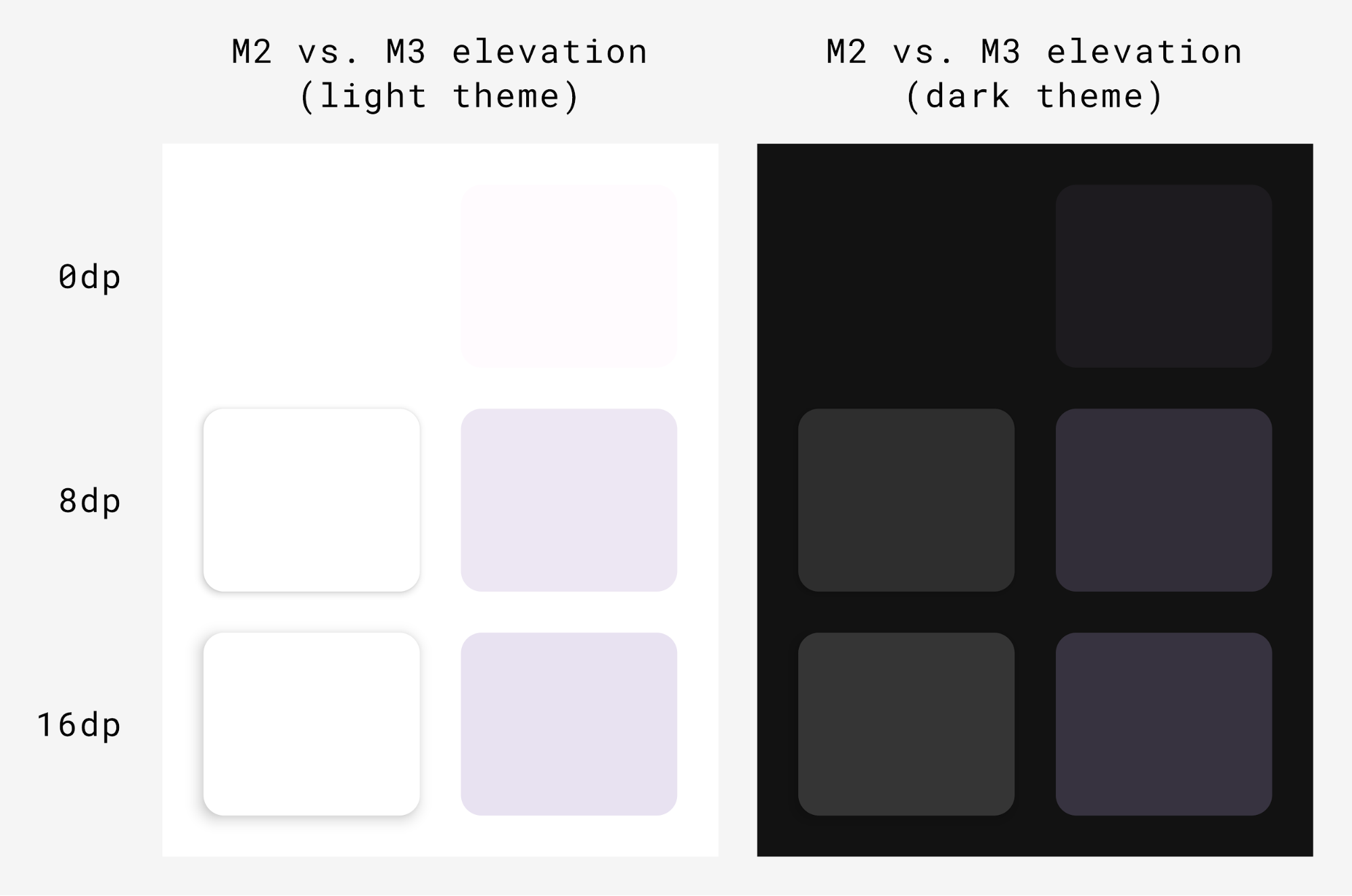
Elevation
Material 3에서는 tonal color overlays를 사용하여 높이를 표현
Surface(
   modifier = Modifier,
   tonalElevation = /*...
   shadowElevation = /*...
) {
   Column(content = content)
}
Material components
- NavigationBar : 5개 이하의 아이템 혹은 작은 단말
- NavigationRail : 중소형 크기의 태블릿/휴대폰 단말
- PermanentNavigationDrawer/ModalNavigationDrawer/NavigationRail : 중대형 크기의 태블릿
System UI
Ripple
- 내부적으로 RippleDrawable 사용
Overscroll
- 스크롤 끝의 늘리기 효과를 사용
- LazyColumn, LazyRow, LazyVerticalGrid 에서 기본적으로 활성화
Material 2에서 Material 3으로 마이그레이션
하나의 앱에서 M2/M3를 혼용해서 사용해서는 안된다.
https://developer.android.com/develop/ui/compose/designsystems/material2-material3#m2_3
Material 2
MaterialTheme(
   colors = // ...
   typography = // ...
   shapes = // ...
) {
   // app content
}
Color
낮밤 테마 컬러 정의
private val Yellow200 = Color(0xffffeb46)
private val Blue200 = Color(0xff91a4fc)
// ...

private val DarkColors = darkColors(
   primary = Yellow200,
   secondary = Blue200,
   // ...
)
private val LightColors = lightColors(
   primary = Yellow500,
   primaryVariant = Yellow400,
   secondary = Blue700,
   // ...
)

// 테마에 컬러 적용
MaterialTheme(
   colors = if (darkTheme) DarkColors else LightColors
) {
   // app content
}

// 컬러 사용
Text(
   text = "Hello theming",
   color = MaterialTheme.colors.primary
)
Surface/contentColor
Composable의 색상을 설정 가능하며, 컨텐츠의 기본 색상도 제공 가능
- contentColorFor() 메소드로 적절한 색상을 찾음
Surface(
   color = MaterialTheme.colors.surface,
   contentColor = contentColorFor(color),
   // ...
) { /* ... */ }

TopAppBar(
   backgroundColor = MaterialTheme.colors.primarySurface,
   contentColor = contentColorFor(backgroundColor),
   // ...
) { /* ... */ }
실제 contentColorFor는 이미 정의된 Color에 맞는 contentColor를 가져오는 형태로 구현되어 있음.
색상을 찾지 못하면 Color.Unspecified가 사용됨
Content alpha
CompositionLocal을 사용하여 LocalContentAlpha에 값을 지정
CompositionLocalProvider(LocalContentAlpha provides ContentAlpha.medium) {
   Text(
      // ...
   )
}
MaterialTheme의 LocalContentAlpha 기본 값은 ContentAlpha.high
Dark theme
// MaterialTheme에 Light/Dark theme에 따른 Colors 정의
@Composable
fun MyTheme(
   darkTheme: Boolean = isSystemInDarkTheme(),
   content: @Composable () -> Unit
) {
   MaterialTheme(
      colors = if (darkTheme) DarkColors else LightColors,
      /*...*/
      content = content
   )
}

// 테마에 따른 Drawable 리소스 지정
val isLightTheme = MaterialTheme.colors.isLight
Icon(
   painterResource(
      id = if (isLightTheme) {
         R.drawable.ic_sun_24
      } else {
         R.drawable.ic_moon_24
      }
   ),
   contentDescription = "Theme"
)
Elevation overlays
- 기본적으로 자동으로 적용
Surface(
   elevation = 2.dp,
   color = MaterialTheme.colors.surface, // elevation에 따라 색상이 조정
   /*...*/
) { /*...*/ }

// Elevation overlays
// Surface에서 구현
val color = MaterialTheme.colors.surface
val elevation = 4.dp
val overlaidColor = LocalElevationOverlay.current?.apply(
   color, elevation
)

// 동작을 중지하려면 null을 제공
CompositionLocalProvider(LocalElevationOverlay provides null) {
   // Content without elevation overlays
}
강조색 표현
Surface(
   color = MaterialTheme.colors.primarySurface,
   /*...*/
) { /*...*/ }
Shape
컴포넌트에 따라서 Shape가 적용됨
https://m2.material.io/design/shape/applying-shape-to-ui.html#shape-scheme
val shapes = Shapes(
   small = RoundedCornerShape(percent = 50),
   medium = RoundedCornerShape(0f),
   large = CutCornerShape(
      topStart = 16.dp,
      topEnd = 0.dp,
      bottomEnd = 0.dp,
      bottomStart = 16.dp
   )
)

MaterialTheme(shapes = shapes, /*...*/) {
   /*...*/
}
기본 스타일 컴포넌트 정의
새로운 버튼 스타일을 만들려면 Button을 Composable 함수로 감싸고, 변경하려는 파라미터 정의 및 노출하면 된다.
@Composable
fun MyButton(
   onClick: () -> Unit,
   modifier: Modifier = Modifier,
   content: @Composable RowScope.() -> Unit
) {
   Button(
      colors = ButtonDefaults.buttonColors(
         backgroundColor = MaterialTheme.colors.secondary
      ),
      onClick = onClick,
      modifier = modifier,
      content = content
   )
}
Theme overlays
View 기반 화면을 Compose로 이전할 때 android:theme 속성을 대신, Compose UI 트리의 관련 부분에 새로운 MaterialTheme로 정의가 필요할 수 있다.
@Composable
fun DetailsScreen(/* ... */) {
   PinkTheme {
      // other content
      RelatedSection()
   }
}

@Composable
fun RelatedSection(/* ... */) {
   BlueTheme {
      // content
   }
}
Component states
컴포넌트 상태에 따라서 color/elevation을 적용 가능
Button(
   onClick = { /* ... */ },
   enabled = true,
   // Custom colors for different states
   colors = ButtonDefaults.buttonColors(
      backgroundColor = MaterialTheme.colors.secondary,
      disabledBackgroundColor = MaterialTheme.colors.onBackground
         .copy(alpha = 0.2f)
         .compositeOver(MaterialTheme.colors.background)
      // Also contentColor and disabledContentColor
   ),
   // Custom elevation for different states
   elevation = ButtonDefaults.elevation(
      defaultElevation = 8.dp,
      disabledElevation = 2.dp,
      // Also pressedElevation
   )
) { /* ... */ }
Ripple
MaterialTheme을 사용하는 경우 clickable/indication과 같은 Modifier에서 리플이 사용됨
RippleTheme를 사용하여 color/alpha 변경 가능
@Composable
fun MyApp() {
   MaterialTheme {
      CompositionLocalProvider(
         LocalRippleTheme provides SecondaryRippleTheme
      ) {
         // App content
      }
   }
}

@Immutable
private object SecondaryRippleTheme : RippleTheme {
   @Composable
   override fun defaultColor() = RippleTheme.defaultRippleColor(
      contentColor = MaterialTheme.colors.secondary,
      lightTheme = MaterialTheme.colors.isLight
   )

   @Composable
   override fun rippleAlpha() = RippleTheme.defaultRippleAlpha(
      contentColor = MaterialTheme.colors.secondary,
      lightTheme = MaterialTheme.colors.isLight
   )
}
맞춤 테마
커스텀 디자인 시스템을 만드는 방법
MaterialTheme 확장
1) 추가 값은 MaterialTheme를 사용하여 Color, Typo, Shape를 확장
// Use with MaterialTheme.colors.snackbarAction
val Colors.snackbarAction: Color
   get() = if (isLight) Red300 else Red700

// Use with MaterialTheme.typography.textFieldInput
val Typography.textFieldInput: TextStyle
   get() = TextStyle(/* ... */)

// Use with MaterialTheme.shapes.card
val Shapes.card: Shape
   get() = RoundedCornerShape(size = 20.dp)
2) MaterialTheme를 랩핑하여 값을 정의
@Immutable
data class ExtendedColors(
   val tertiary: Color,
   val onTertiary: Color
)

val LocalExtendedColors = staticCompositionLocalOf {
   ExtendedColors(
      tertiary = Color.Unspecified,
      onTertiary = Color.Unspecified
   )
}

@Composable
fun ExtendedTheme(
   /* ... */
   content: @Composable () -> Unit
) {
   val extendedColors = ExtendedColors(
      tertiary = Color(0xFFA8EFF0),
      onTertiary = Color(0xFF002021)
   )
   CompositionLocalProvider(LocalExtendedColors provides extendedColors) {
      MaterialTheme(
         /* colors = ..., typography = ..., shapes = ... */
         content = content
      )
   }
}

// Use with eg. ExtendedTheme.colors.tertiary
object ExtendedTheme {
   val colors: ExtendedColors
      @Composable
      get() = LocalExtendedColors.current
}

@Composable
fun ExtendedButton(
   onClick: () -> Unit,
   modifier: Modifier = Modifier,
   content: @Composable RowScope.() -> Unit
) {
   Button(
      colors = ButtonDefaults.buttonColors(
         containerColor = ExtendedTheme.colors.tertiary,
         contentColor = ExtendedTheme.colors.onTertiary
         /* Other colors use values from MaterialTheme */
      ),
      onClick = onClick,
      modifier = modifier,
      content = content
   )
}
Material System 교체
자체 Composable 함수로 래핑하여 관련 시스템의 값을 직접 설정
- ProvideTextStyle를 사용하여 텍스트 스타일을 지정 가능 -> LocalTextStyle로 사용됨
@Immutable
data class ReplacementTypography(
   val body: TextStyle,
   val title: TextStyle
)

val LocalReplacementTypography = staticCompositionLocalOf {
   ReplacementTypography(
      body = TextStyle.Default,
      title = TextStyle.Default
   )
}

@Composable
fun ReplacementTheme(
   /* ... */
   content: @Composable () -> Unit
) {
   val replacementTypography = ReplacementTypography(
      body = TextStyle(fontSize = 16.sp),
      title = TextStyle(fontSize = 32.sp)
   )
   CompositionLocalProvider(
      LocalReplacementTypography provides replacementTypography
   ) {
      MaterialTheme(
         /* colors = ... */
            content = content
      )
   }
}

// Use with eg. ReplacementTheme.typography.body
object ReplacementTheme {
   val typography: ReplacementTypography
      @Composable
      get() = LocalReplacementTypography.current
}

@Composable
fun ReplacementButton(
   onClick: () -> Unit,
   modifier: Modifier = Modifier,
   content: @Composable RowScope.() -> Unit
) {
   Button(
      shape = ReplacementTheme.shapes.component,
      onClick = onClick,
      modifier = modifier,
      content = {
         ProvideTextStyle(
            value = ReplacementTheme.typography.body
         ) {
            content()
         }
      }
   )
}
커스텀 디자인 시스템 구현
기존 시스템을 수정하고 새로운 class/type으로 새로운 시스템 테마를 정의 가능
@Composable
fun CustomButton(
   onClick: () -> Unit,
   modifier: Modifier = Modifier,
   content: @Composable RowScope.() -> Unit
) {
   Button(
      colors = ButtonDefaults.buttonColors(
         containerColor = CustomTheme.colors.component,
         contentColor = CustomTheme.colors.content,
         disabledContainerColor = CustomTheme.colors.content
            .copy(alpha = 0.12f)
            .compositeOver(CustomTheme.colors.component),
         disabledContentColor = CustomTheme.colors.content
            .copy(alpha = ContentAlpha.disabled)
      ),
      shape = ButtonShape,
      elevation = ButtonDefaults.elevatedButtonElevation(
         defaultElevation = CustomTheme.elevation.default,
         pressedElevation = CustomTheme.elevation.pressed
         /* disabledElevation = 0.dp */
      ),
      onClick = onClick,
      modifier = modifier,
      content = {
         ProvideTextStyle(
            value = CustomTheme.typography.body
         ) {
            content()
         }
      }
   )
}

val ButtonShape = RoundedCornerShape(percent = 50)
XML 테마를 Compose로 마이그레이션
Material Theme Builder를 사용하여 XML 테마에서 Compose 테마로 마이그레이션 가능
Subscribe
Subscribe to this blog via RSS.
Categories
Recent Posts
- Posted on 08 Jun 2026
- Posted on 19 Apr 2026
- Posted on 15 Mar 2026
- Posted on 10 Mar 2026